Our team at Dover was honored with the 2019 NARI Contractor of the Year (CotY) Award: 2nd Place, Residential Addition, for this beautiful project. For the next few weeks, designer and guest blogger Amy Tilow will take you on a behind-the-scenes tour of this award-winning renovation which includes a 560-sq.-ft. addition featuring an expanded, remodeled kitchen, a new first floor half-bath, a new laundry/mudroom and a fresh master bedroom and master bath. Enjoy the design inspiration.
BLOG #2 of 3 IN A SERIES:
CotY Award Winner: Second Place, Residential Addition: $175,001 – $250,000
A modern-day dream home—more than 100 years in the making
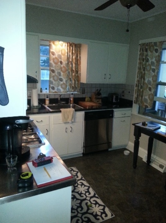
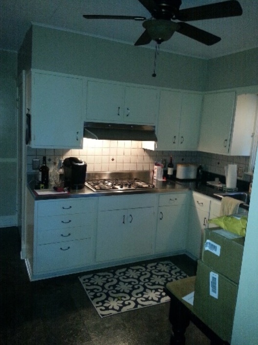
Tired. Dated. Cramped. This kitchen had seen its day. The dated cabinets and counters, narrow passageways and acoustic tiled ceiling had to go!
Kitchen Before:
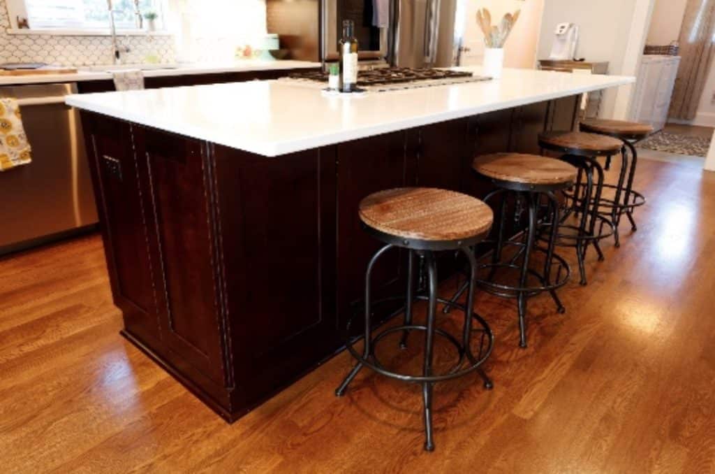
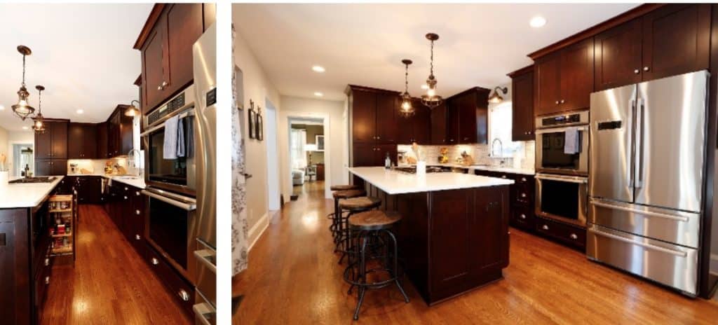
Our charge was to create an updated kitchen that echoed the home’s traditional style. But being in their mid-thirties, these homeowners also wanted to bring a bit of modern into the mix to avoid looking stale. We choose dark-stained cherry cabinets in a Shaker door style (Reliable Cabinets, Waypoint Cherry/Java) to honor the home’s historic profile and paired those with pure white quartz counters to add a crisp, contemporary feel.
Kitchen After:
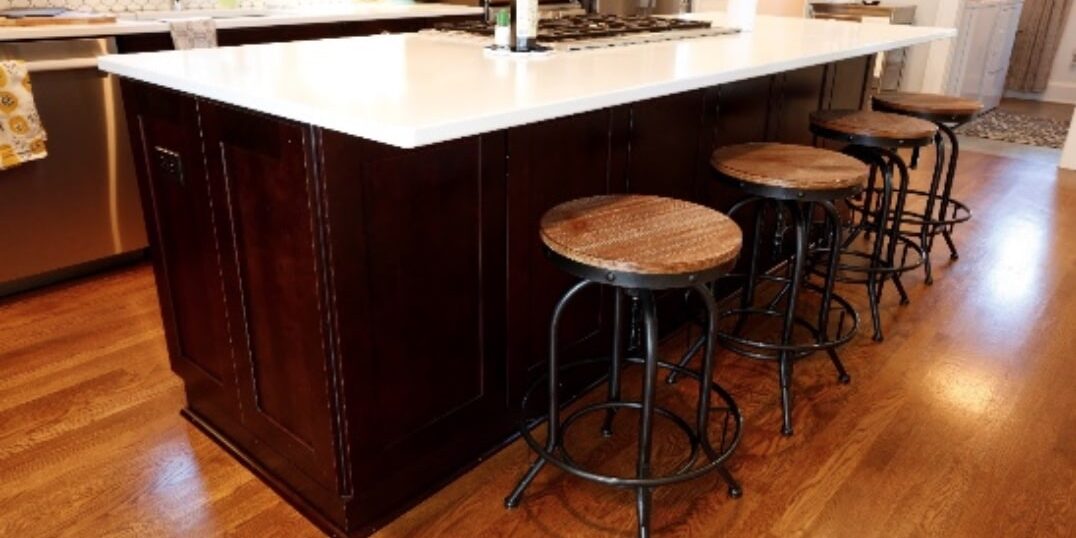
The family now has an eat-in kitchen with a spacious 9’ island that seats four comfortably.
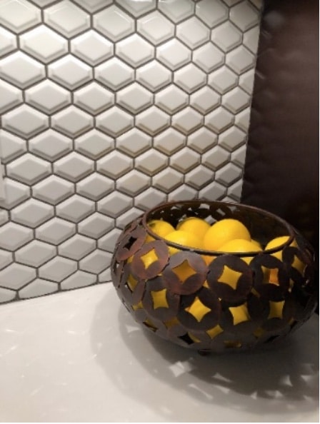
The wife initially indicated she wanted subway tile for the backsplash. To add a punch of style, we presented an alternative: a beveled diamond mosaic tile in gloss white (Shaw: Elegance). This unexpected touch lends a modern element to the traditional kitchen design.
Kitchen Before:
The old kitchen had minimal counter space and poor lighting, making it less than ideal for food prep.
The wife loves to cook, so space and functionality were a priority! The new kitchen is loaded with all the bells and whistles: A 36” pantry with roll-out shelves, spice and tray pull-out cabinets, expansive counter space and lots of storage. The island also houses a built-in microwave and a downdraft cooktop.
Kitchen After:
To create a more open, free-flowing space, we widened the doorway leading into the family rom. New red oak flooring was installed to coordinate with the existing floor. To make it cohesive, all floors on the first floor were refinished to create a seamless look.
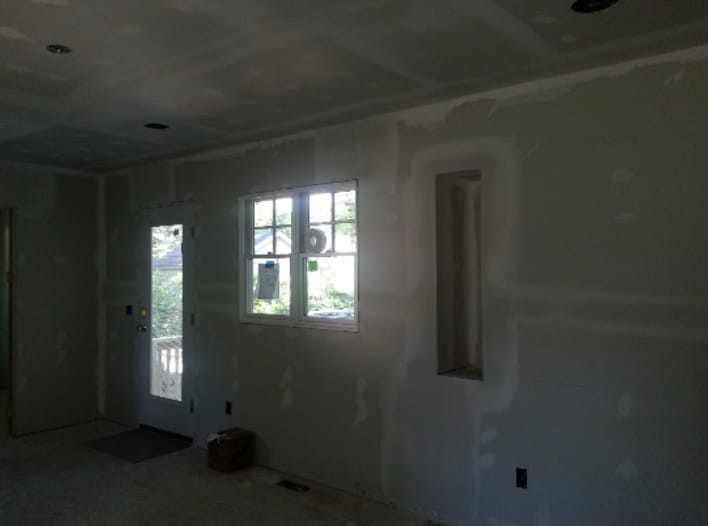
Where the old pantry and appliances once stood, we added a new window and glass door to take advantage of the southern exposure for beautiful natural light throughout the expanded kitchen.
Before:
During:
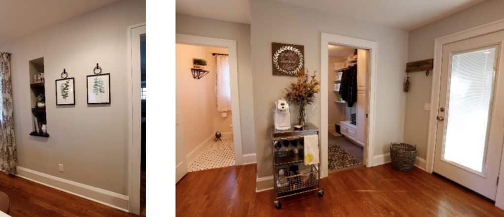
After:
In the old kitchen, shoes were stored at the door and in the adjoining pantry.
Before:
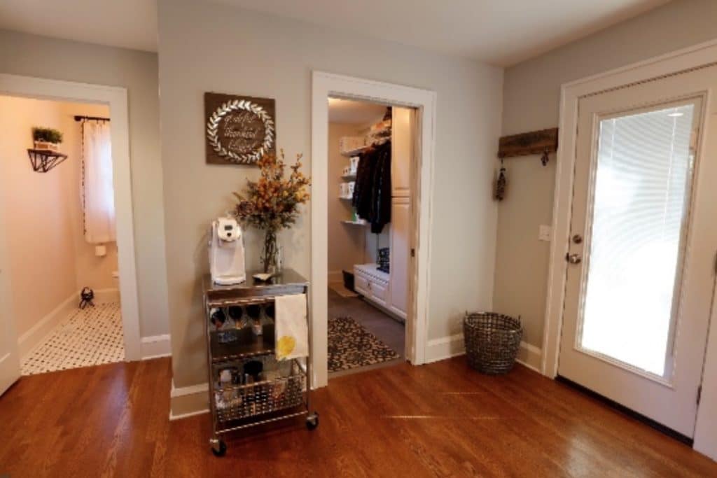
Now, at the end of the expanded kitchen, is a new laundry/mudroom. With a break from tradition, we used luxury vinyl tile flooring (Mannington Adura Vinyl Tile, Steel and Pewter) in this area, knowing it would be durable enough for this family of four, plus two cats. Installing tall storage cabinets and providing a place to hang coats with a bench for seating completes the space.
After:
Adding windows and a new glass exterior door (with integrated blinds) provides more natural light which also helps create a lighter, airy kitchen space.
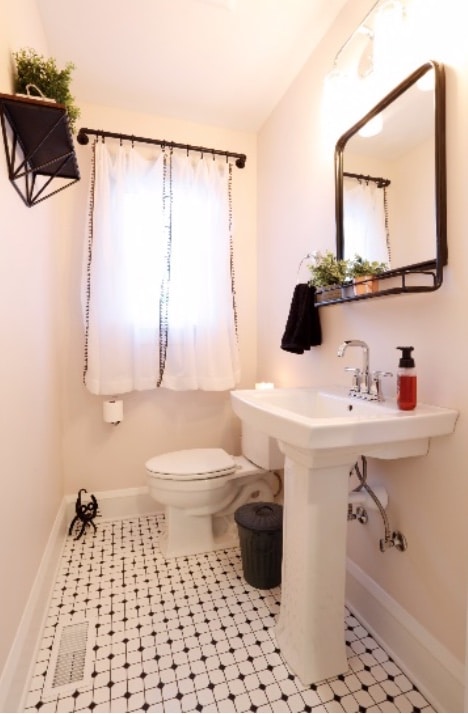
On the other side of the mudroom, a new half-bath, with white-and-black-dot floor tile (CTI Expression Daylight Mosaic with Black Dot) and a pedestal sink honors the 100-year-old home. This gives the homeowners a bath on the first floor.
Next week, in the final blog in this series, I’ll move upstairs where we removed an old screened-in porch and created a fabulous, all-new master suite. Don’t miss it!
Amy Tilow
