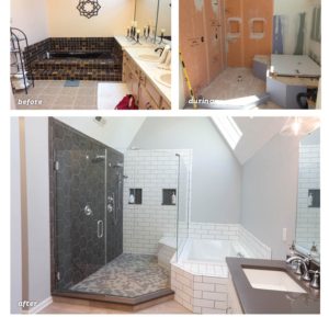
This blog series provides a glimpse into a recent project managed by Dover Home Remodelers; it details the challenges, solutions, and the customer selections and design style that shaped this luxe master bathroom renovation.
Gladly leaving the outdated brown bathroom behind, this post is on a clean, clear path toward a brighter space,  and picks up where we left off in my last blog…
When I first met with the homeowners, the wife had a difficult time articulating her design style and preferences. So, I encouraged her to use Houzz to gather design ideas and inspiration. When we sat down to review her design boards, it was clear: Every bathroom image she saved featured subway tile; and most had grey tones throughout. We used that to establish the grey and white palette for her new bathroom.
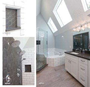
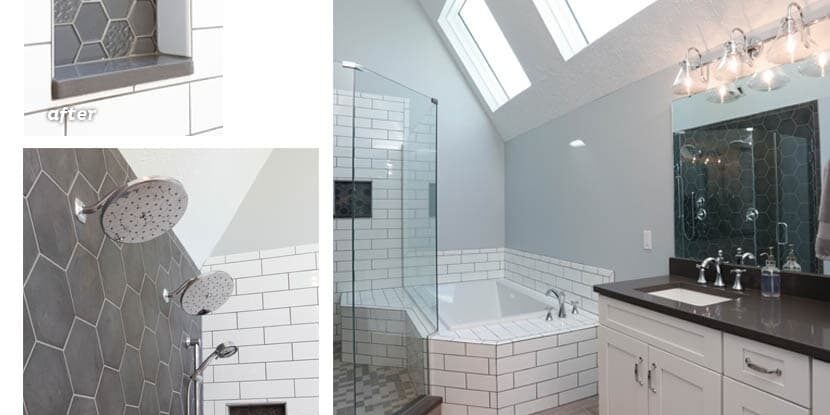
The large shower with dual rain showerhead fixtures and a slim soaking tub became the focal point of the new room. Glossy white 4”x12” subway tile with grey grout was used throughout with a contrasting slate grey tile on the shower floor—a custom mix that we hand-picked for the project. A clear, frameless glass enclosure gave the room a lofty, open feel.
We used 8” matte grey octagon tile for the left wall of the shower and grey glass octagon tile in various textures for inside the niches. The quartz countertops were an exact color match.  Sometimes a grey and white scheme can be a bit sterile, but by combining different shapes, sizes and finishes of tile, the effect was fresh and very luxe.
The homeowner took an active role in the project and was excited to weigh in on the design selections. She also enjoyed a unique perspective on the project: Most homeowners see progress every day; but because her job required out-of-town travel, she would come home after a full week, delighted to see big changes and significant progress. That made the project even more rewarding for me.
In my final post, I’ll detail the design changes we made to better utilize the bathroom space.
The Best Is Yet To Come,
Beth Orr Schroeder


