Moving on Up – Penthouse Renovation on Lakewood’s Gold Coast
Blog #2 of 3 in a series
Our team at Dover was honored with the 2017 NARI Contractor of the Year (CotY) Award: 1st Place, Interior Renovation, for an upscale penthouse transformation. For the next two weeks, designer and guest blogger Shelley Bujdos will take you on a behind-the-scenes tour of this award-winning project. Enjoy the fabulous design, the beautiful finishes—and the spectacular view!
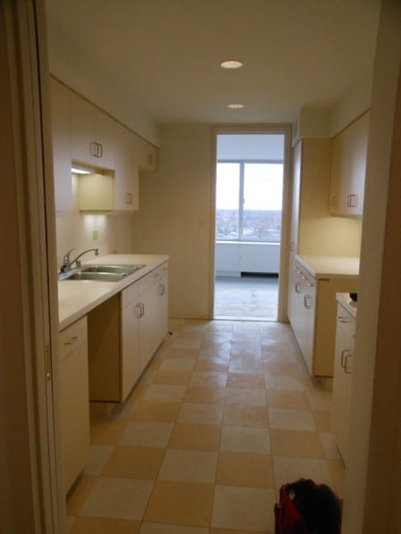
Picking up where I left off last week, we will move on to the design in the penthouse. The original condo layout needed help; it featured a narrow, galley-style kitchen that had no natural light, lacked storage and was closed off from the rest of the condo.
THE KITCHEN: BEFORE
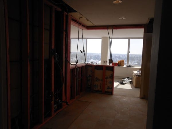
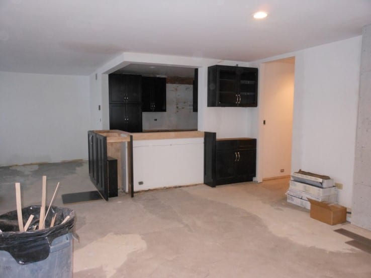
While the homeowners would like to have completely blown out the kitchen wall to open the space into the living room (for an unrestricted lake and skyline view) a portion of the existing wall could not be removed due to mechanicals common with those on the stories below.
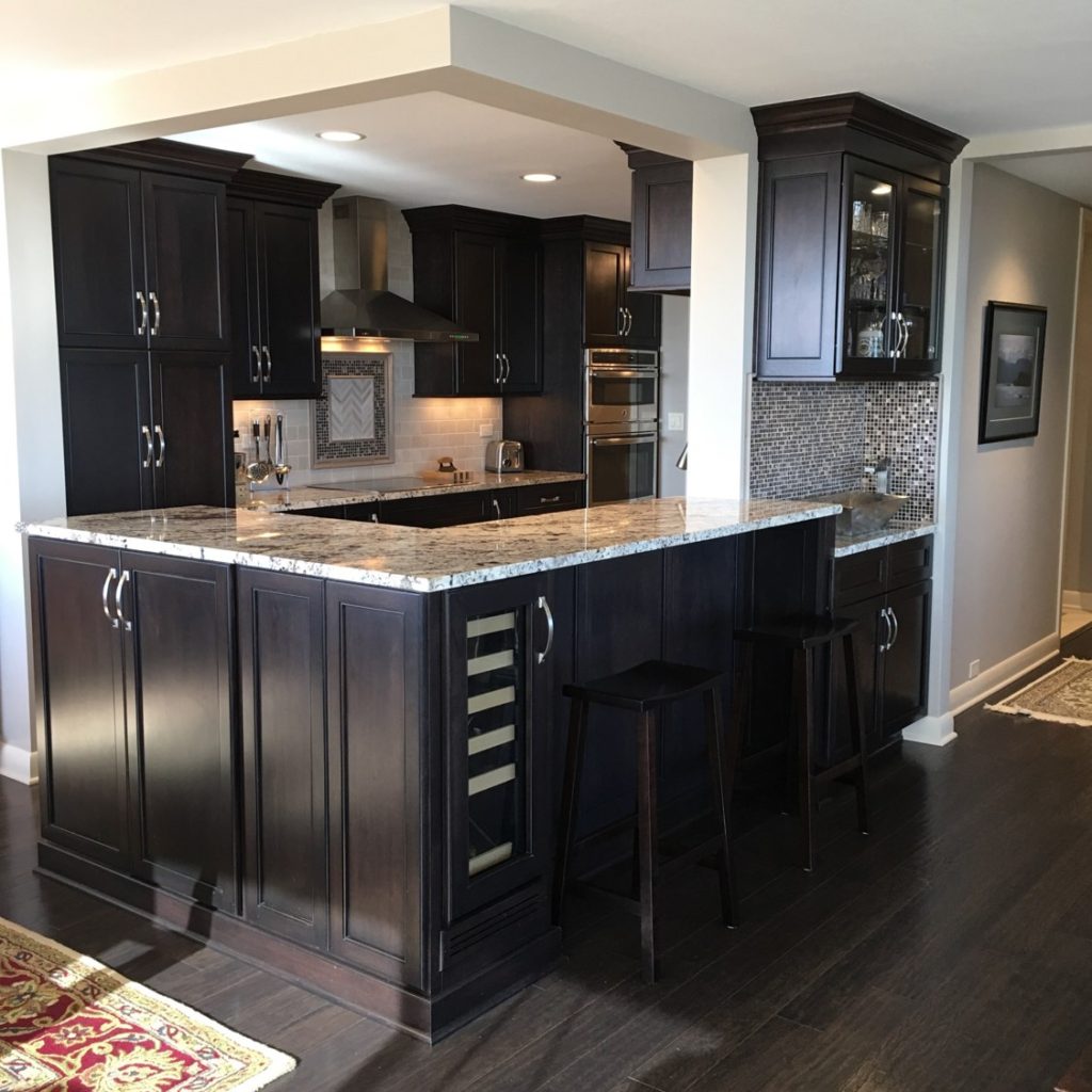
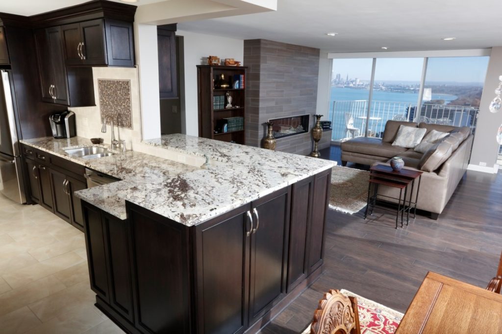
Our design solution removed half of the wall and expanded the counter, which satisfied building requirements, provided more seating area and afforded the fabulous open view the homeowners wanted.
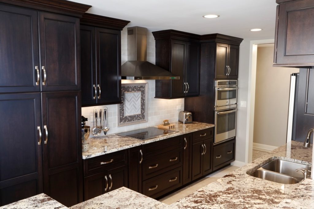
THE KITCHEN: BEFORE & AFTER:
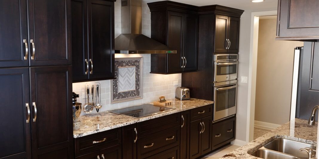
The kitchen was completely transformed from a cramped, outdated, narrow space to a fresh, contemporary room that flowed seamlessly with the living and dining rooms, creating an engaging, open-concept living area.
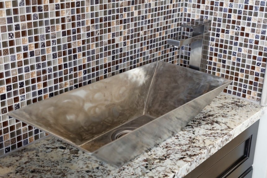
We used custom cabinetry to frame the wet bar with a custom stainless trough bar sink and wine refrigerator. The bar was built around the existing walls, which expanded the kitchen area into the living and dining rooms.
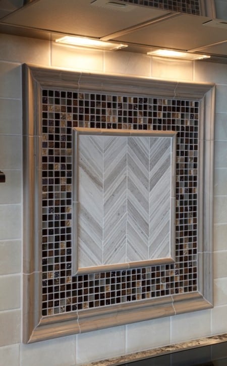
During our first design meeting, the homeowner shared that while at a home show in Texas, she found a tile mosaic that she really loved—but didn’t have the name or style information. Amazingly, our installer found the exact tile and we used that mosaic as the inspiration for the color palette for the main living areas. The tile mosaic was installed in the kitchen in several locations including over the range, sink and wet bar.
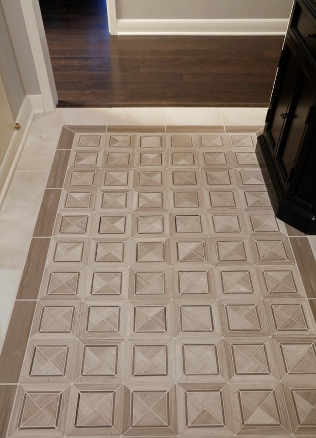
Always, the difference is in the details: A custom, upscale look was achieved by combining textures and finishes. The natural stone entry floor creates the perfect transition to the natural stone, metal and glass backsplash in the kitchen and bar area.
To complement the sleek tile, the homeowners chose rich finishes in warm colors. The flooring throughout is Shaw 5” wide plank hardwood in Danforth and granite surfaces in the kitchen are Alaska White against beautiful custom 48” cabinets.
Next week, I’ll wrap up the project with lots of photos and design notes about the living area, master bathroom renovation, a new laundry space and more.
Shelley Bujdos
