BLOG #1 of 3 IN A SERIES
This blog series walks through a recent project managed by Dover Home Remodelers; it details the challenges, solutions, and the customer selections and design style that shaped this luxe, designer-inspired bathroom remodel.
Some remodeling projects are enjoyable because they pose unique design challenges, while others are fun to manage due to the energy and enthusiasm of the homeowners. This master bathroom renovation checked both boxes.
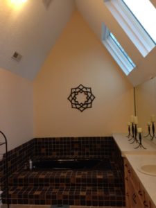
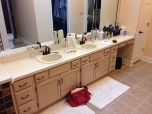
The spacious bathroom was original to the home, which was built in Westlake in the 1970s. The homeowners described the room as “dated, nonfunctional and cave-like.” Initially, their remodel request was simple: They wanted an updated, functional bathroom.
But as we met to review initial design ideas, the wife’s vision changed from simply updating the bathroom to creating a spectacular living space. This blog details how we did it…
Clearly, this bathroom had good bones—a dramatic high-pitched ceiling and fabulous skylights—but it also had an awkward layout, with a tiny shower and lots of wasted space surrounding the tub. The dated fixtures and dark brown tile made the room feel heavy and cramped.
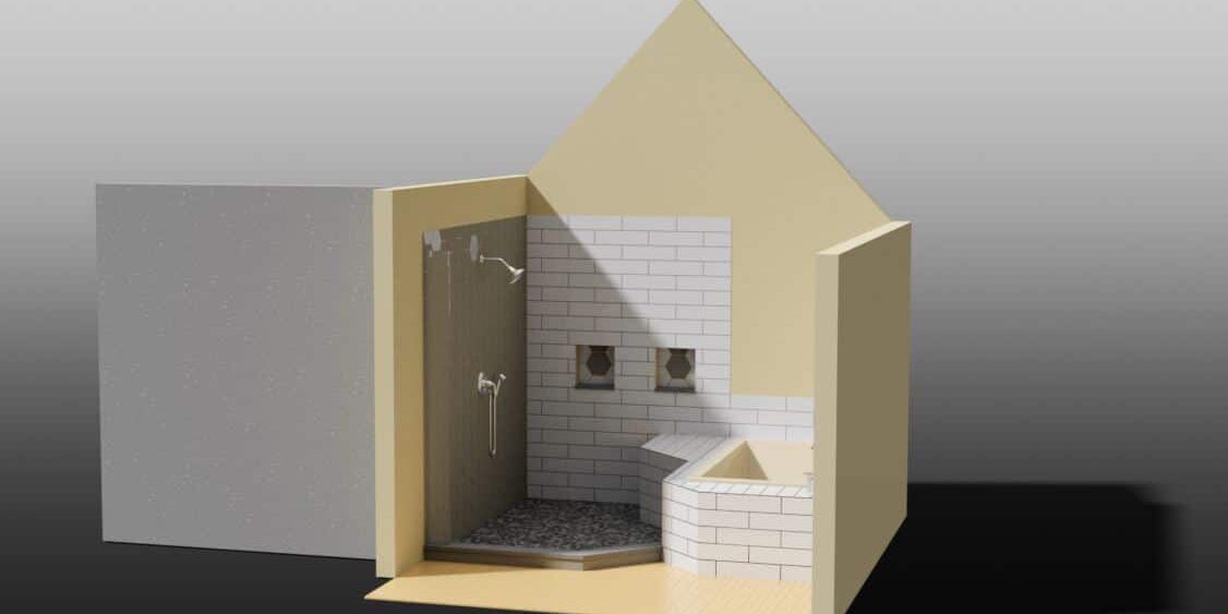
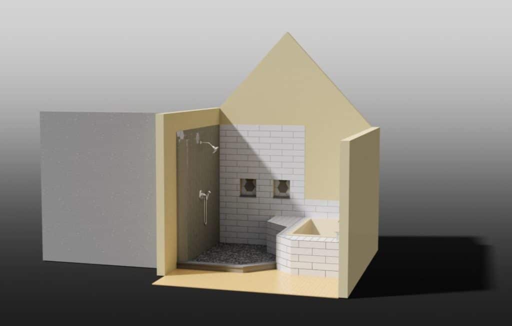
I started to reconfigure the space by eliminating the small shower in the back of the room and framing the new shower as the focal point of the room: Oversized with dual rain showerheads and an extended tub deck that created seamless flow. This 3D rendering helped the homeowners visualize the concept—and it started us on our path for the renovation.
My next blog will walk through the new layout and design selections.
The Best Is Yet To Come,
Beth Orr Schroeder


