Meet GUEST BLOGGER Dave Frye: Certified remodeler. Meticulous craftsman. Award-winning designer. Known for his carefree, person al approach balanced by an expert eye for detail, Dave has been with Dover Home Remodelers for 29 years. He’s spent that time putting his industry knowledge and experience to work designing and managing projects of all scopes and sizes, with celebrated success.
This kitchen project was a lot of fun to design: The homeowners are two avid cooks who also love to entertain, so they brought a lot of great ideas to the table about how they wanted their new kitchen to look and function.
We started with a cramped, outdated galley-style kitchen, which is typical of many 1920s era Cleveland homes. The room had five entrances, so defined work spaces were non-existent. Beyond the kitchen was a sunroom, which was barely visible though a single door. The rooms not only felt disjointed but the kitchen lacked natural light making it feel even more confined. Our charge was to create open, flowing space between the two rooms with a lighter, brighter kitchen well suited for cooking and entertaining.
First, the wall between the kitchen and sunroom was removed. When our carpenters saw the second story floor sagging about two inches, we brought in an engineer. Based on those findings, we installed new floor joists, a new post and a larger structural beam, with support anchored in the basement. It was an unexpected challenge, but one that was quickly remedied.
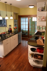
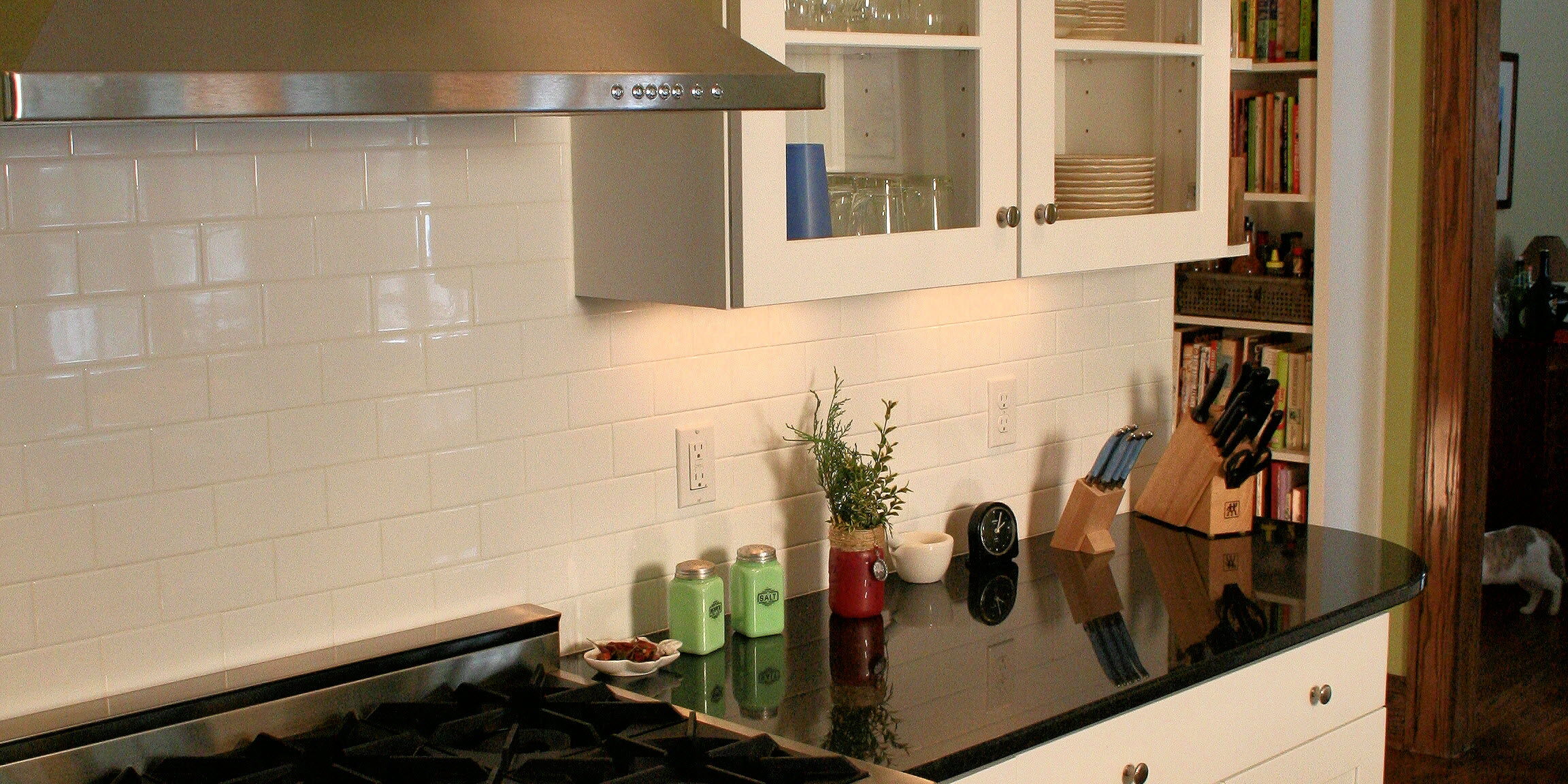
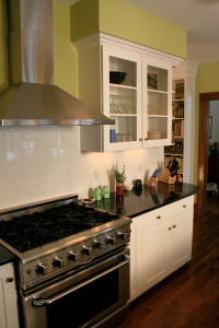
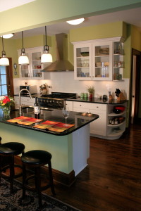
Without the wall, space and traffic flow problems were solved—and it completely opened up and brightened the kitchen. The sink and stove placement were flipped-flopped so the sink could face the bright sunroom. Now, both cooks would enjoy full view of the sunroom while preparing meals and entertaining guests. Top-of-the-line appliances included a six-burner stove, which made a handsome and commanding addition to the room.
New granite countertops were designed with added depth to create a comfortable bar/entertaining area. The homeowners selected high-end glass wall cabinets that matched the home’s craftsman style. The white cabinetry was a striking contrast to the rich hardwood floors (which the homeowners opted to refinish themselves to maximize budget).
One of the two hall doorways was framed in, creating a corner space with full-height open shelving to house their extensive cookbook collection. An enhanced lighting system provided perfect balance with ceiling lights, pendant lighting and under-cabinet fixtures. Finally, an old rear door was replaced with a Frenchwood gliding door for an attractive and inviting entry to the new kitchen.
We’re fortunate in this business to work with a lot of great people. These homeowners made the end product all the more satisfying: We were pleased, and proud, to see them so happy with their new kitchen.
All the best,
Dave Frye


