Our team at Dover was honored by NARI with a 2018 Contractor of the Year (CotY) Award: First Place, Kitchen Remodel ($45,001-$60,000), for this townhome kitchen renovation. For the next few weeks, designer and guest blogger Amy Tilow will take you on a behind-the-scenes tour of this award-winning project. Enjoy the clean, contemporary design and ingenious space-saving amenities.
BLOG #1 of 3 IN A SERIES:
COtY Award Entry: Kitchen Remodel: $45,001 – $60,000
A Kitchen Transformation with European Flair
Do you remember the Sesame Street song “One of these things is not like the other”? In the accompanying sketch, Ernie asks kids to identify the item that doesn’t belong with the rest of the group.
That real-life lesson in continuity was vividly demonstrated in this kitchen renovation project. Picture this in your mind: As you enter this beautiful Bay Village townhome, you’re greeted by a bright and airy first floor. The open-concept space flows seamlessly from the foyer entryway, leading to the light-filled dining area and living room, with a fabulous view of the lake beyond. The sleek living space features a palette of crisp white walls, ceiling and trim with pops of saturated color in oranges and reds displayed throughout in the furnishings and artwork. Completing the soothing, contemporary vibe in the space is rich, dark Brazilian hardwood flooring.
The existing kitchen was a complete disconnect from the adjoining rooms: Cherry cabinets, granite tile counters and mottled ceramic floor tile with dark grout. This kitchen did not belong to the people living in this home! The wife (from Italy) and the husband (from France) agreed. They turned to our team at Dover to help them create a kitchen that reflected their personal design aesthetic. She wanted a clean, functional space, frequently referencing her kitchen in Italy. He wanted the same, but with elegance.
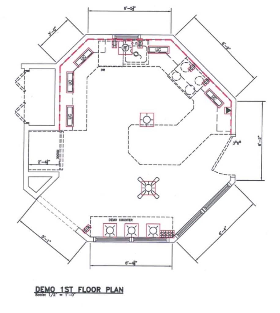
Here is the layout we started with:
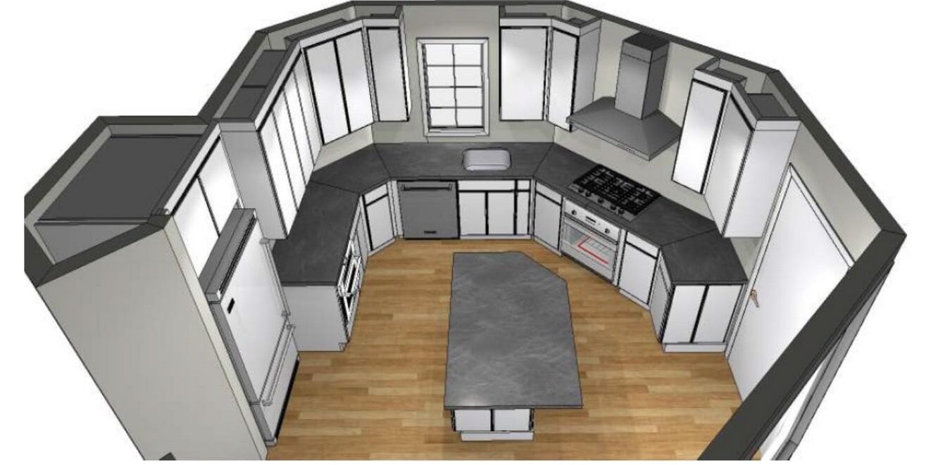
The first obstacle was the octagonal shape of the room. The sink could not be centered under the window and still allow for the dishwasher beside it. After giving the homeowner options for redesign, they opted to keep the sink in its original position.
The original kitchen had a peninsula, which the wife liked—and wanted to keep. Because we were working within the existing footprint of the room (approximately 12’ x 12’ square), that counter cut the small space in half and closed off the one side of the room making it feel cramped.
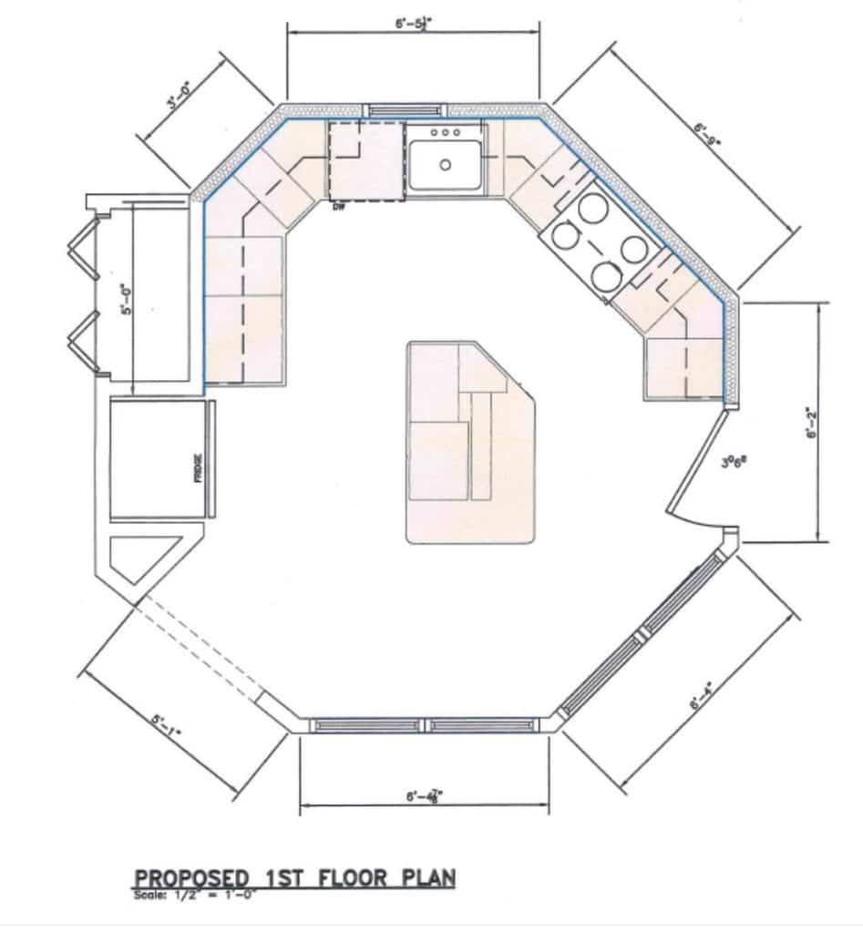
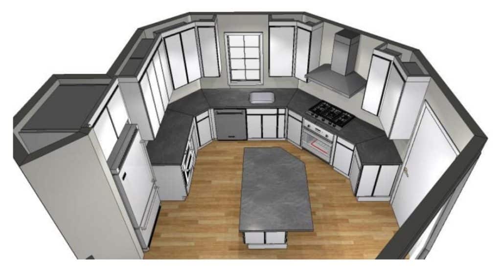
The proposed new design eliminated the peninsula and added a more functional island, which would offer better flow in the kitchen space:
In the next blog, I’ll walk you through the next step of the design process with lots of before and after photos.
Amy Tilow


