Meet GUEST BLOGGER Eileen Orr: An accomplished designer, Eileen and her husband, Jim, founded Dover Home Remodelers in 1984. She has held various positions in the family-owned company over the years—but Eileen’s passion, and her incredible talent, remains designing spaces and delighting customers by helping them bring their renovation ideas and design vision to life.
This kitchen renovation was a dream project: The job was managed for repeat customers who are an absolute pleasure to work with—and the finished space not only exceeded expectations, it earned our team a NARI CotY Award. Here’s how it all fell into place:
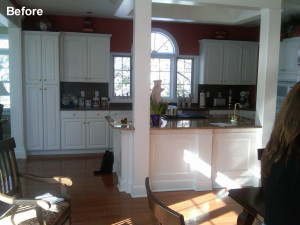
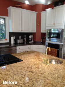
This lovely home is in a great neighborhood in Avon Lake. At about 15 years old, it is showing some signs of wear, but rather than move, the homeowners chose to update their home to better meet their needs and suit their style. The kitchen was at the top of their list: It had a good layout, but with cabinets and surfaces looking a bit dated, it needed a makeover.
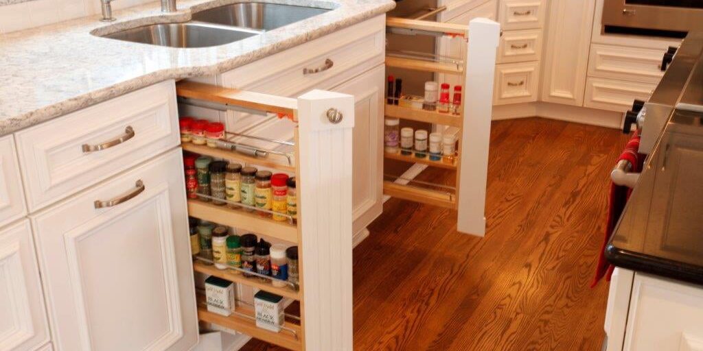
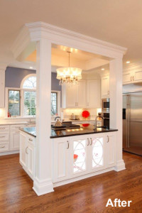
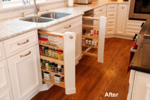
The existing kitchen featured white cabinets and dark wood floors, which is the exact scheme the homeowners wanted to repeat—but now with a fresh, new profile. To give the space the facelift it needed, we swapped out the builder-grade cabinets for custom-built cabinetry with a host of pull-outs and unique design features. The space includes my new standard upgrade: A hidden step stool under the toe kick beneath the double oven. The stool slides out and pops up; and it’s on wheels, so it easily glides wherever you need it. We added two fluted columns on both sides of the sink that hide spice shelves; installed smart vertical pantry space behind full-height doors; and designed a storage solution for grill tools on the endcap of the cabinets that face the French doors leading out to the deck—very convenient and incredibly functional.
The homeowners selected beautiful kitchen lighting fixtures with a gentle oval shape—and we used that shape as our inspiration for the display cabinetry: Our cabinet makers hand-crafted glass-front cabinets with interior glass shelves and LED lighting. The cabinets feature curved wood insets that add a high-end design element without being fussy or competing with display items inside. These striking glass display cabinets are featured near the dinette and then repeated again on the island.
The kitchen itself is a square room with distinct lines formed by cabinetry and a center island. So to continue that softer, more feminine edge achieved by the curved lines of the lighting and cabinet insets, we used an arching Hansgrohe faucet and brought movement into the backsplash with a mosaic tile border. This piece actually proposed a challenge when we had to navigate the tile around a chimney stack. To keep the lines perfect, our installer hand-pieced each tile in the mosaic to achieve symmetry.
We were able to re-use the granite from the existing island, cutting it to-size for the butler’s pantry and an adjoining wet bar. The new kitchen surfaces include a mix of granite in San Benedicto (island) and quartz in Everest (perimeter) to give the space more character.
Finally, because the wood floor had previously been refinished, we laid new 3 ½” plank red oak with a gorgeous ash stain that really offsets the white cabinetry. The homeowners liked it so much that they had us come back to carry out the same flooring throughout the entire home.
I hope you’ve enjoyed the project photos. This is a project I’m proud of—not only because it’s beautiful, but because these homeowners got the kitchen of their dreams without abandoning their home or leaving their neighborhood.
All the best,
Eileen Orr
