Imagine a classic colonial built in 1950, with great bones and original hardwood flooring, in a desirable Westside Cleveland community near Lake Erie. While there was a lot the homeowners loved about this beautiful home, its choppy, compartmentalized first-floor layout made the space feel small and cramped.
They met with our team at Dover to help them reimagine their home to suit their young, growing family better. Their vision translated into an open-concept living space that would increase the kitchen footprint, add a spacious island with seating, eliminate the formal dining room that was rarely used and create a lighter, brighter, more free-flowing space throughout the home’s first floor.
This blog is an end-to-end project walkthrough, beginning with the kitchen before, the structural challenges we met during the remodel and ending with the final product: a happy, stylish, open-concept kitchen and living area.
The Kitchen: Before & After
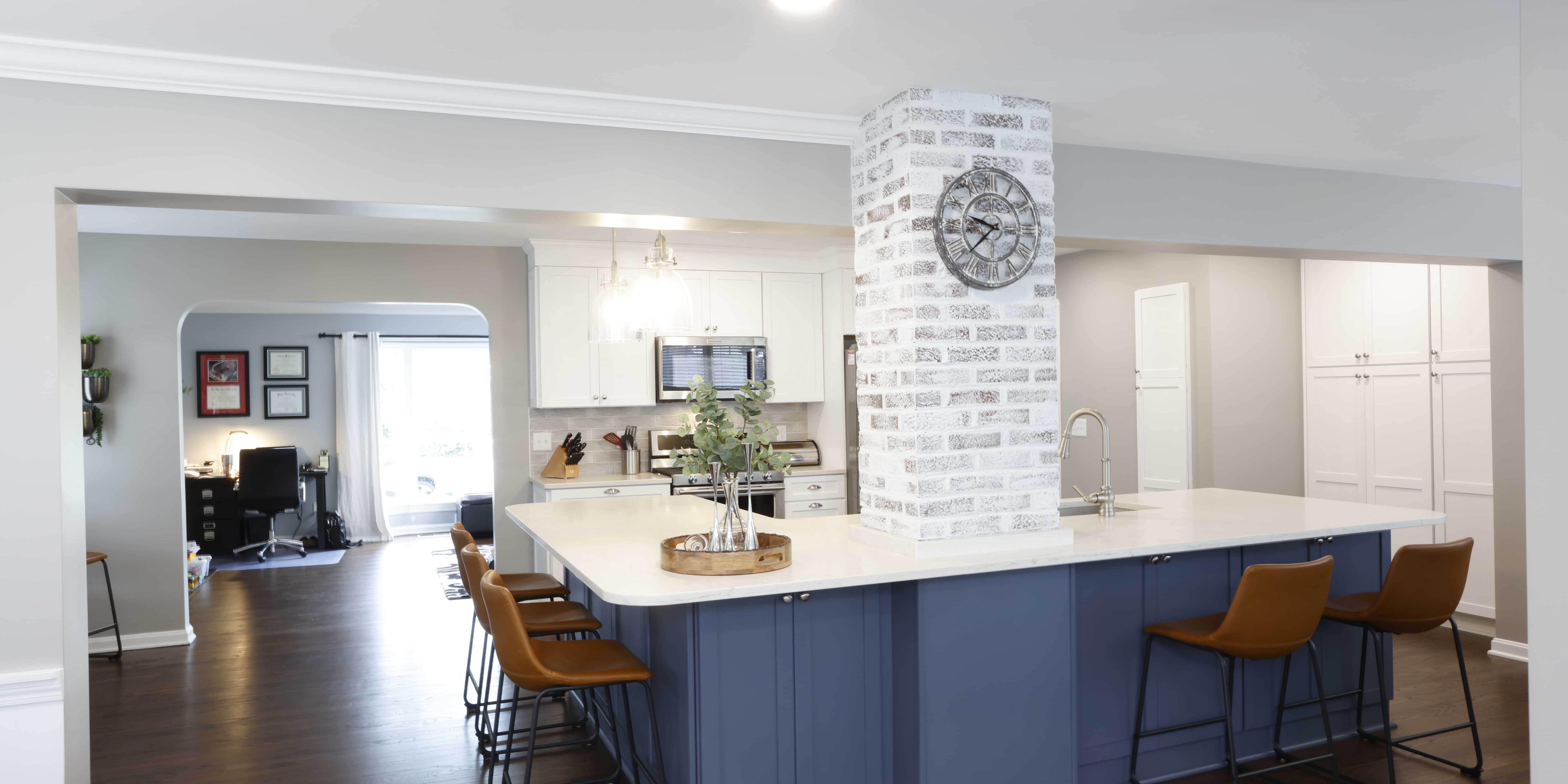
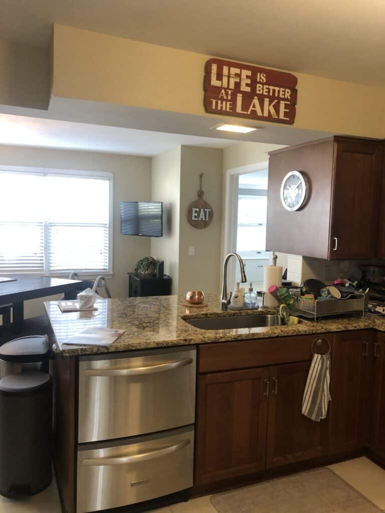
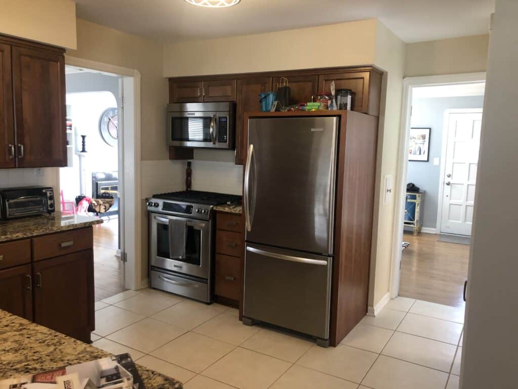
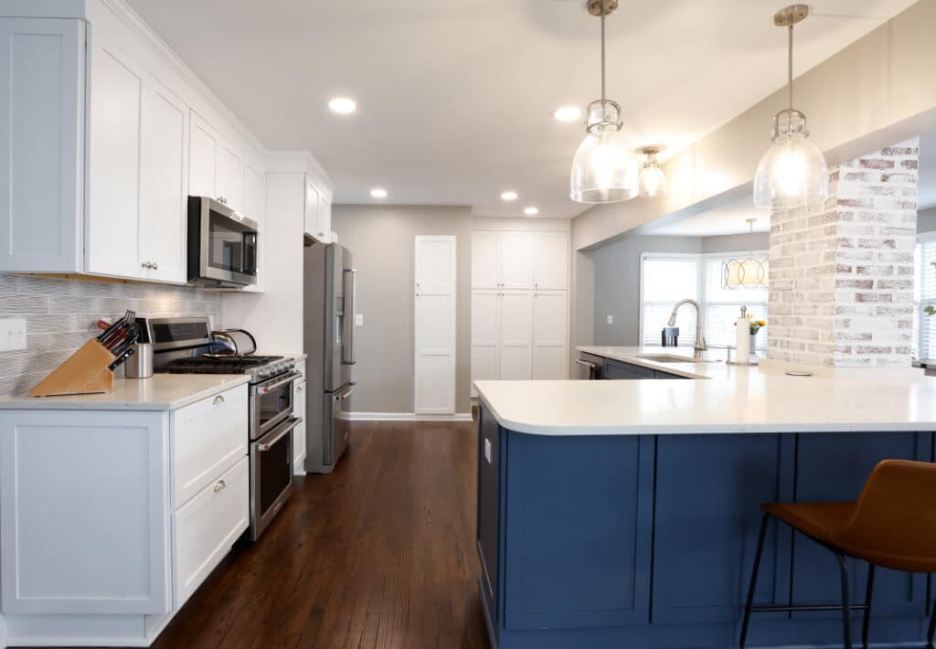
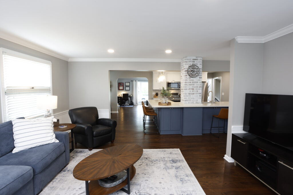
The original kitchen was dated, isolated and needed to make better use of space. The new kitchen design embraces modern living and contemporary aesthetics. As an open-concept floor plan, the kitchen now has harmonious connectivity with the surrounding living areas, and with abundant natural light, the space feels and lives much larger.
The Kitchen: Planning Phase
The homeowners’ vision for their new kitchen was an updated, more functional family gathering space with lots of light for an airy feel and much-needed organization and storage. Because they seldom used their formal dining room, we borrowed square footage from that space and removed the dividing walls between the dining room and family room and the family room and kitchen to create one open, cohesive space.
The Kitchen: Before
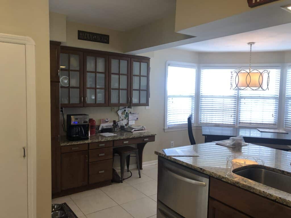
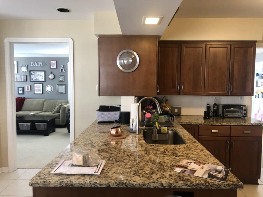
Drab and dated, the kitchen lacked functional prep and storage space—a must-have for this young family. Despite windows along the rear wall, the room felt dark and cramped because it was separated from the rest of the first floor living area. Plus, the wood cabinets and dark granite added to the visual weight of the space.
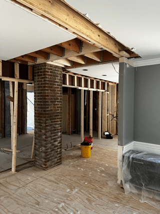
The Kitchen: During
Because creating an open-concept kitchen and living space required the removal of load-bearing walls, structural engineering was an essential first step. The original beam between the dining and family room was removed and replaced with a larger beam that extended through to the living room in the front of the house to carry the heavier load. This larger beam required digging footers in the basement and installing steel-bearing plates bolted into new walls poured to replace the home’s original—and fragile—terracotta foundation. In addition, we added columns flanked by wing walls on both ends of the new beam to distribute the load for structural integrity.
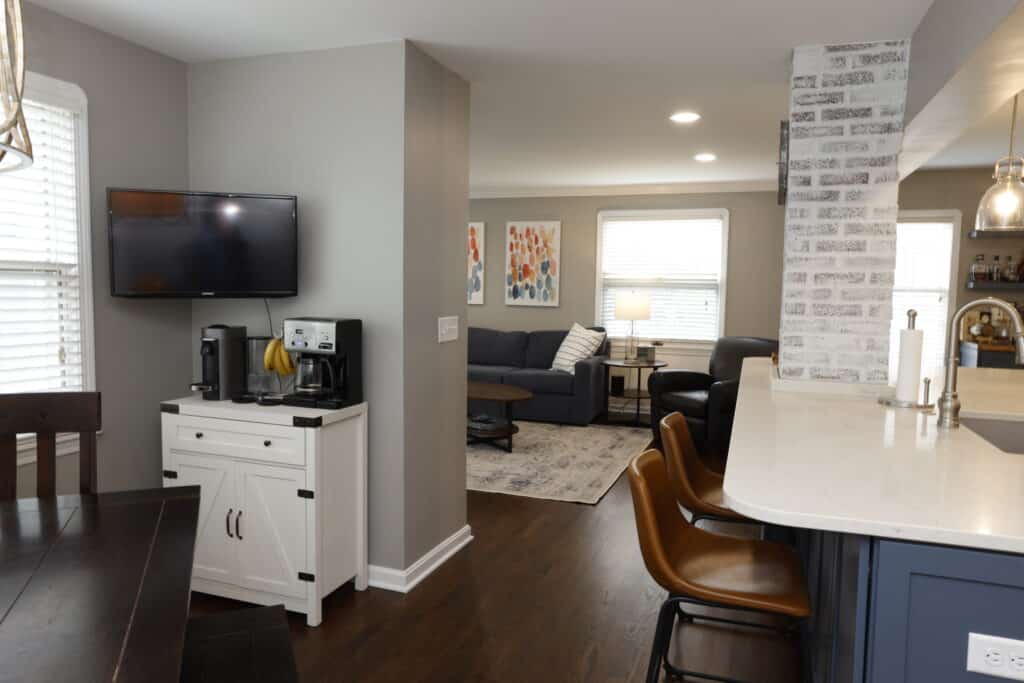
Removing the walls between the dining room and family room and dining room and kitchen made room for the new kitchen/living area. Finally, expanding the entryway from the front living room into the kitchen made the new kitchen and family room area more inviting.
The Kitchen: After
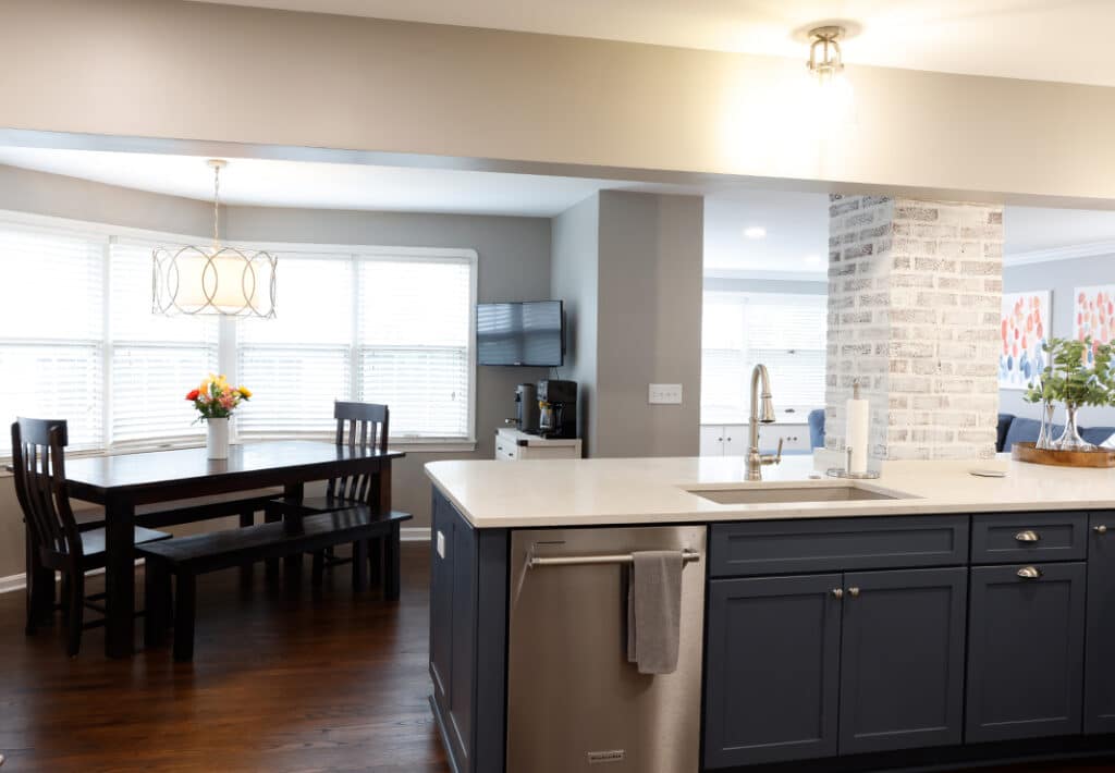
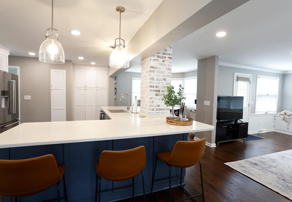
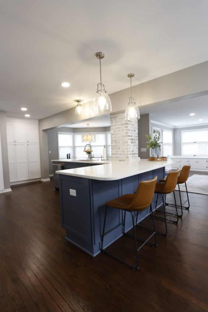
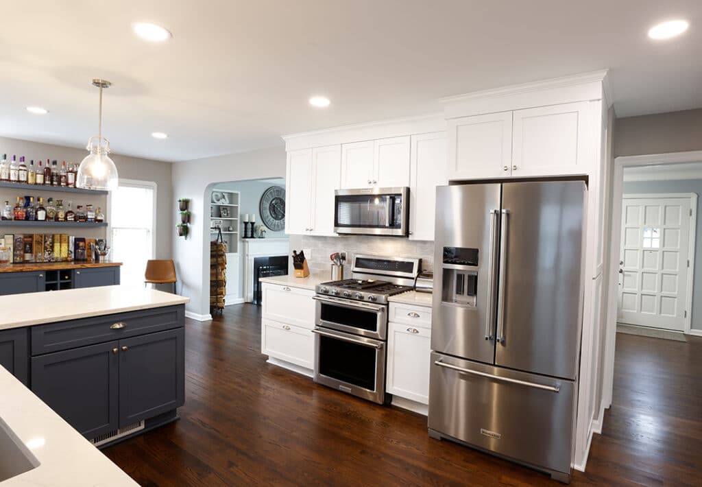
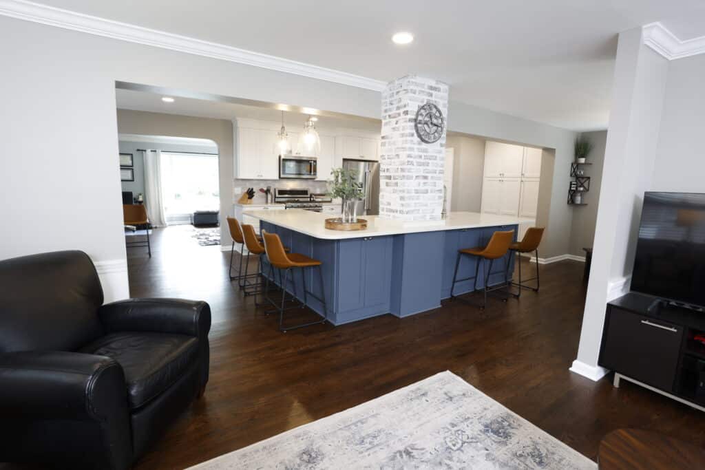
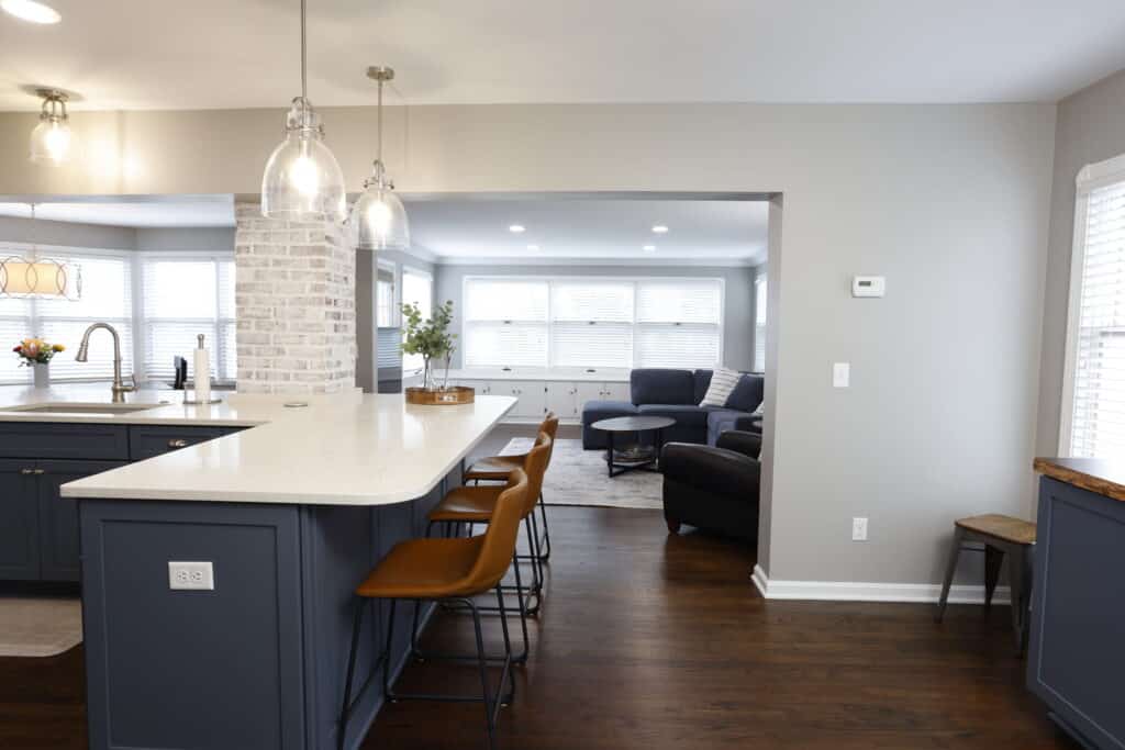
With the chimney in the center of the new kitchen space, we hoped to incorporate it into the design as a focal point. But we weren’t sure what we’d find underneath because it was covered. Fortunately, the chimney brick was in excellent condition, so we used it to add texture and charm by exposing the existing chimney and then tuckpointing and whitewashing the brick. The new central island flanks the chimney on both sides to anchor the room.
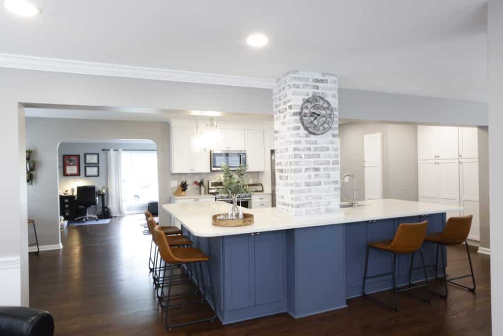
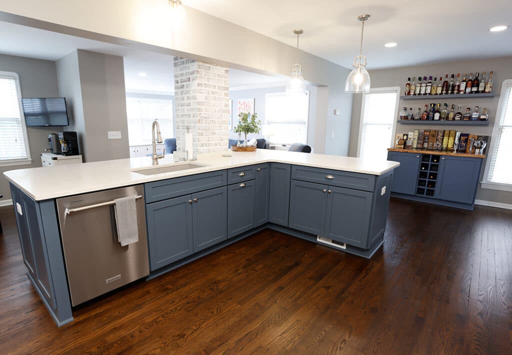
A nod to the nearby Lake Erie, the homeowners selected blue cabinetry for the island. (Medallion Lancaster, Gale Classic). Medallion Lancaster cabinets in Sea Salt were used on the perimeter with Corian Quartz surfaces in London Sky for seamless flow. The sizeable island accommodates the sink (BLANCO Undermount Composite Super Single Sink in Concrete Gray) – with Moen faucet and soap dispenser (Paterson) in stainless, and dishwasher. Plus, it provides a comfortable seating space for five, plenty of workspace and loads of built-in storage—a lazy Susan, cabinets, drawers with dividers and pull-outs, plus pop-up USB ports for convenient charging.
Behind the island, the original kitchen dividing wall area is reconfigured to include the major appliances with functional storage. For the backsplash, 3”x 12” subway tile creates a classic, cohesive look.
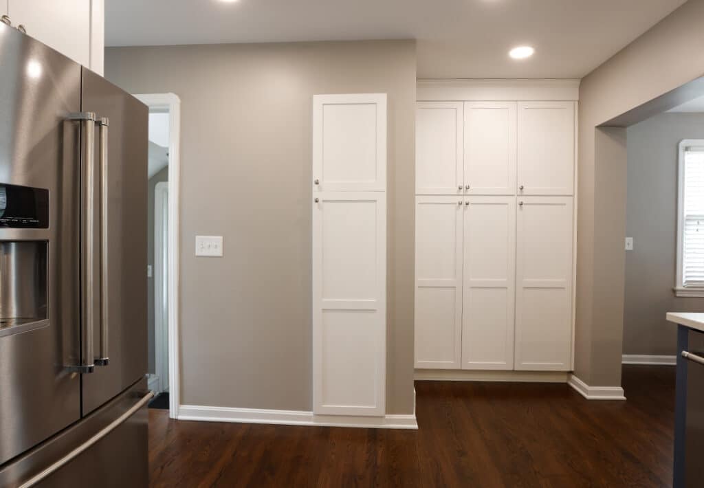
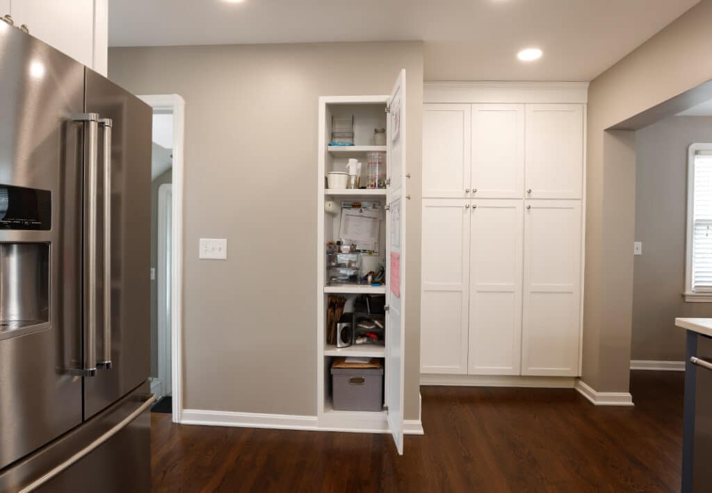
Where the planning desk once stood, the new space features floor-to-ceiling pantry cabinets with adjustable shelves and roll-out trays for easy access to smaller appliances and serving ware. Plus, the old pantry cabinet is redesigned to become the family command center, complete with storage with rollouts, a charging station, space to hang a calendar, a dry-erase board and more. The homeowners chose a mixture of can lights with Newton Bell One-light 10-inch Mini Pendants over the island.
Open-concept Living Space
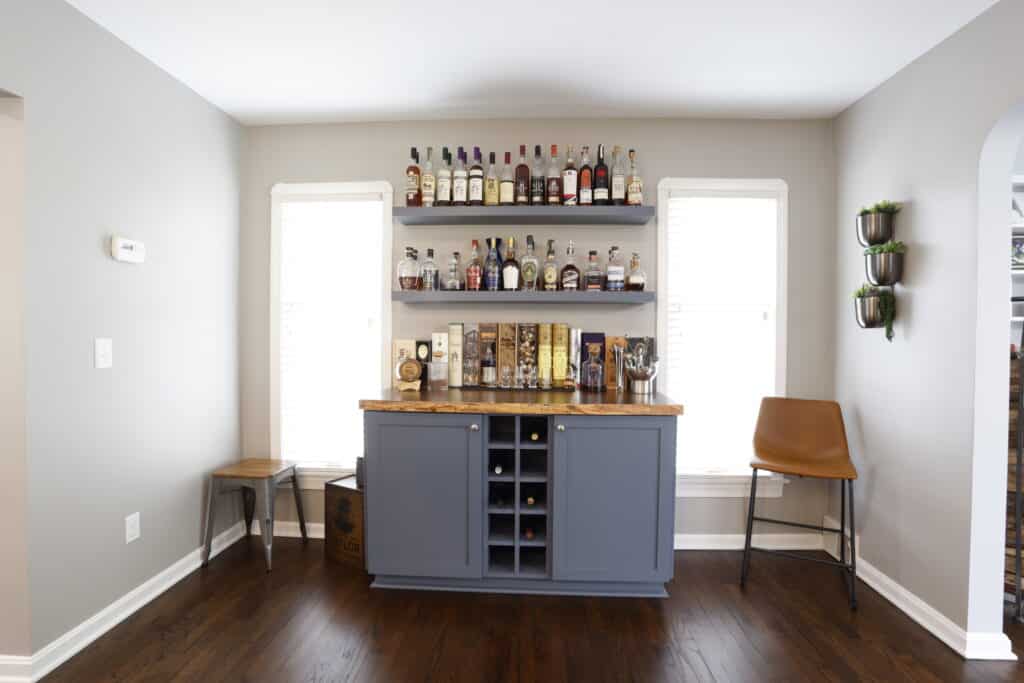
To tie the open living areas together, in the former dining room nook, we used the same Medallion cabinetry from the island with a custom maple surface and floating shelves to create the showpiece bar that showcases the owner’s expansive whiskey collection.
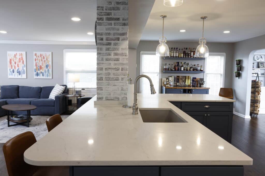
For visual harmony throughout the first floor, we removed the tile floor in the kitchen, toothed in new hardwood to match the rest of the original floors in the home and sanded and refinished all hardwood throughout. All trim profiles stayed consistent with the rest of the home for continuity.
Looking for a NE Ohio Remodeler?
This open-concept kitchen project in Rocky River was a delight from beginning to end—and went smoothly, coming in on budget and deadline. If you’re looking for a home remodeling partner for your next project, contact our team at Dover Home Remodeling. We’re here to help.
Patti Saracusa
