The homeowners were prepared to add on to their home to get the updated kitchen they desired—but after looking at their space, Dover Home Remodelers proposed a layout that created a thoughtfully-designed kitchen in its existing location, without the cost of an addition. This sleek, contemporary kitchen checks all the boxes: Efficient. Functional. Stylish.
They partnered with Dover Home Remodelers to create this beautiful, ultra-organized family kitchen—a project that earned Honorable Mention in the NARI Contractor of the Year (CotY) Awards 2020 for Residential Interior: Under $100,000.
This young family of four had a vision for their new kitchen: A crisp, mid-century modern open-concept space with clean lines and smart functionality. But how would they get there? The homeowners had architectural drawings created for an addition, thinking that’s what they needed to achieve a larger, more functional kitchen.
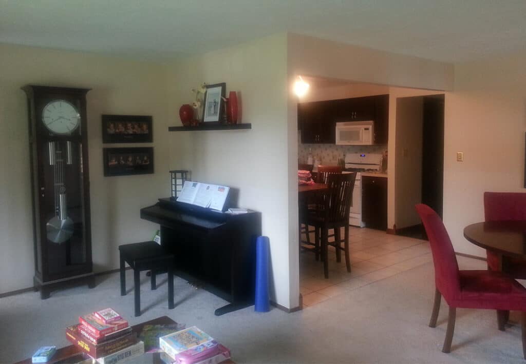
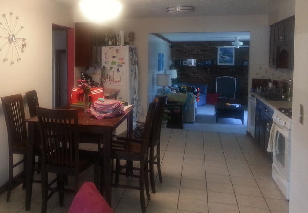
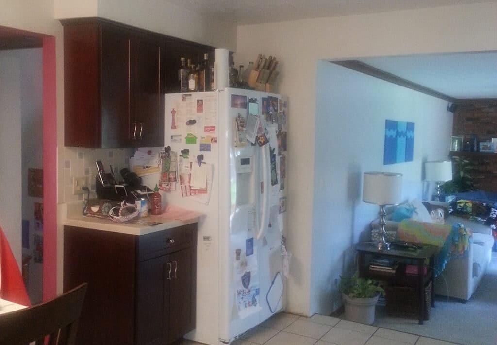
But we looked at the project differently. The problem with the existing kitchen was the location: It was in the middle of the house, essentially serving as a hallway between the family room on one end and the dining room on the other. The room was a 12′ run that included the sink, dishwasher, range and a few cabinets. The refrigerator was located on the opposite end of the space. And because of its position in the middle of the house, there was no natural light, which made the kitchen dark and dreary.
The Kitchen: Before

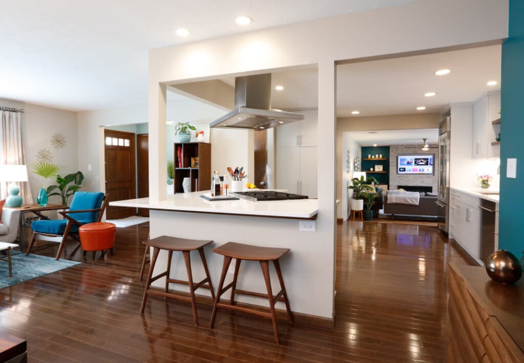
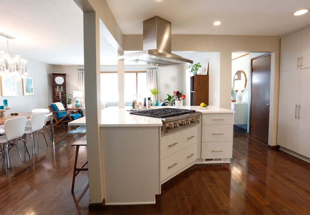
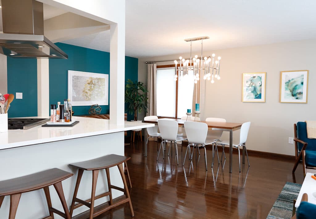
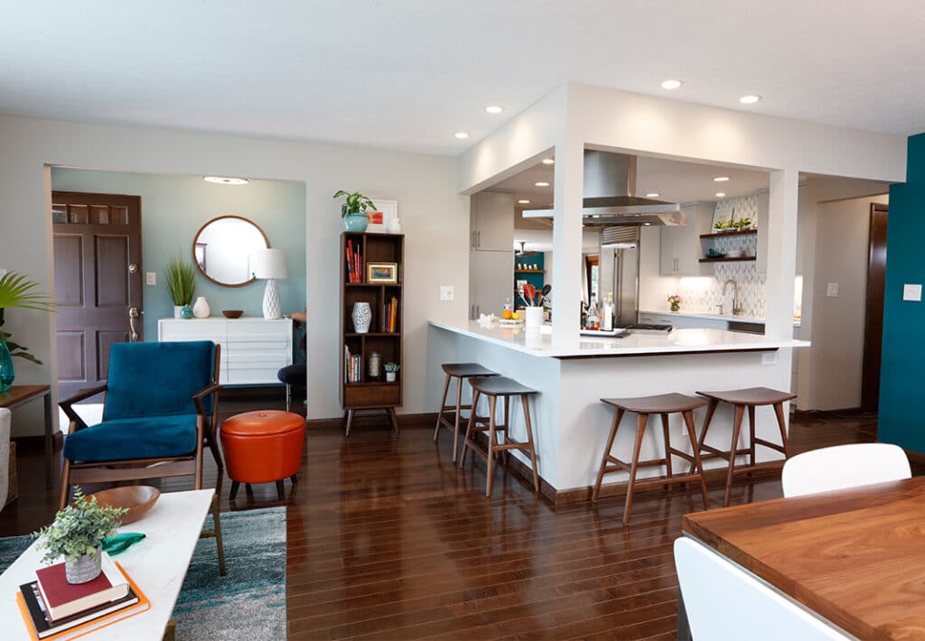
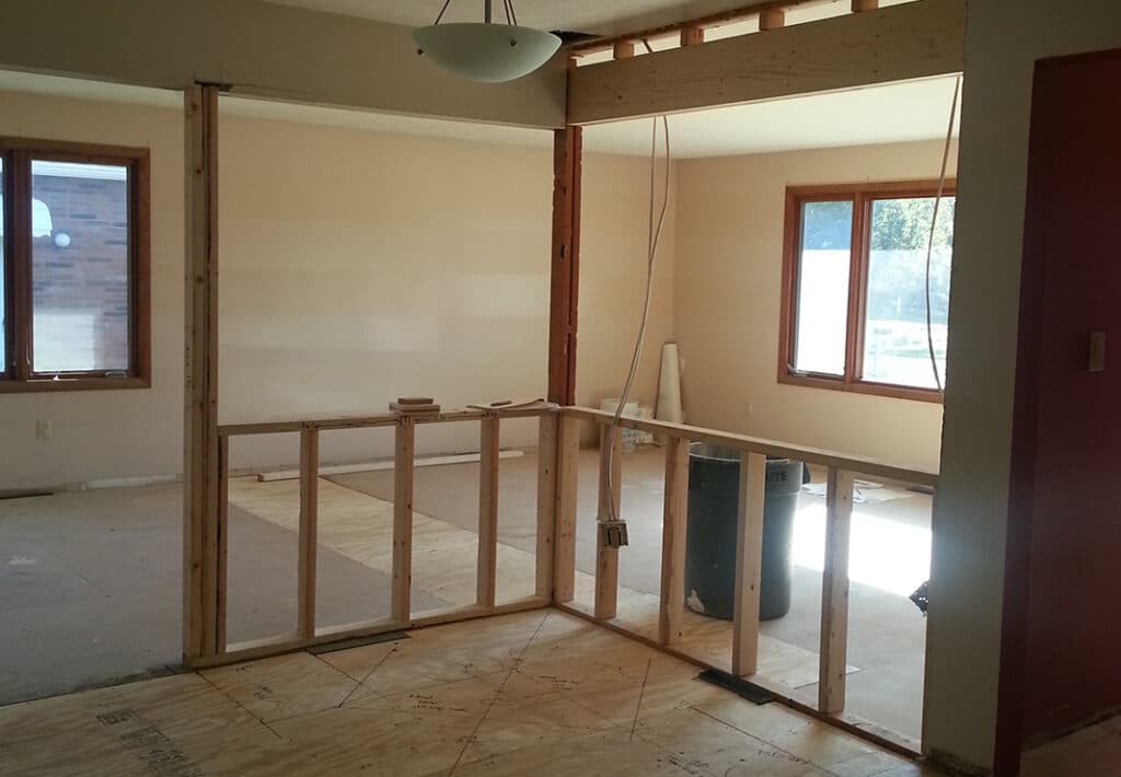
Instead of an expensive home addition project, we suggested working within the existing space. Our new design plan removed the wall between the kitchen and living room, opening the space to allow for an abundance of light to pour in from the large picture window, while creating an open-concept kitchen-family room-dining room space.
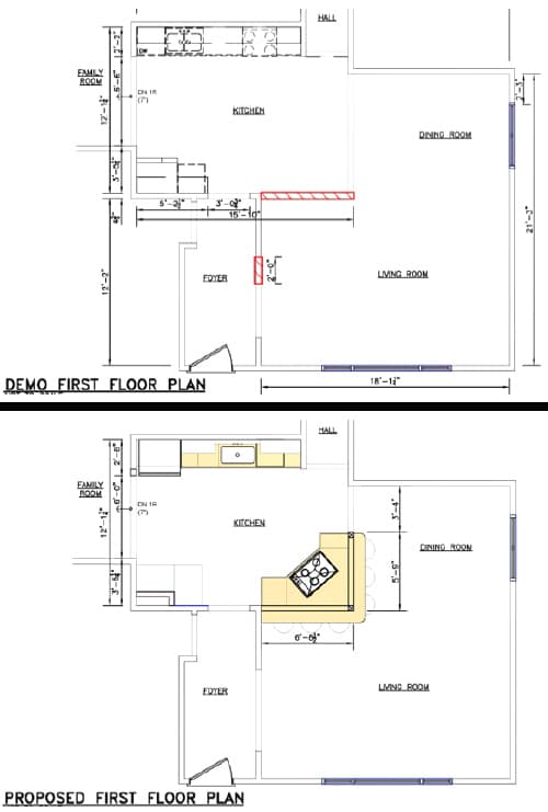
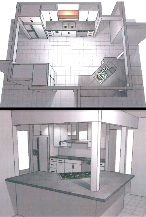
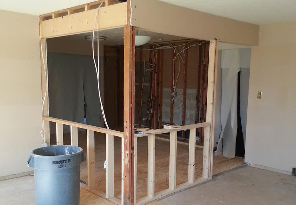
Since the wall to be removed was load bearing, we installed a dropped header that tied into an existing header on the dining room side and supported these with a column at the corner. To establish balance, a second column was also installed on the other end. To ensure structural integrity, we removed floor sheeting and installed a 16′ LVL beam underneath the corner post, tying it into the block foundation walls below. We also widened the doorway from the foyer, making the entry both inviting and inclusive.
The Kitchen: During
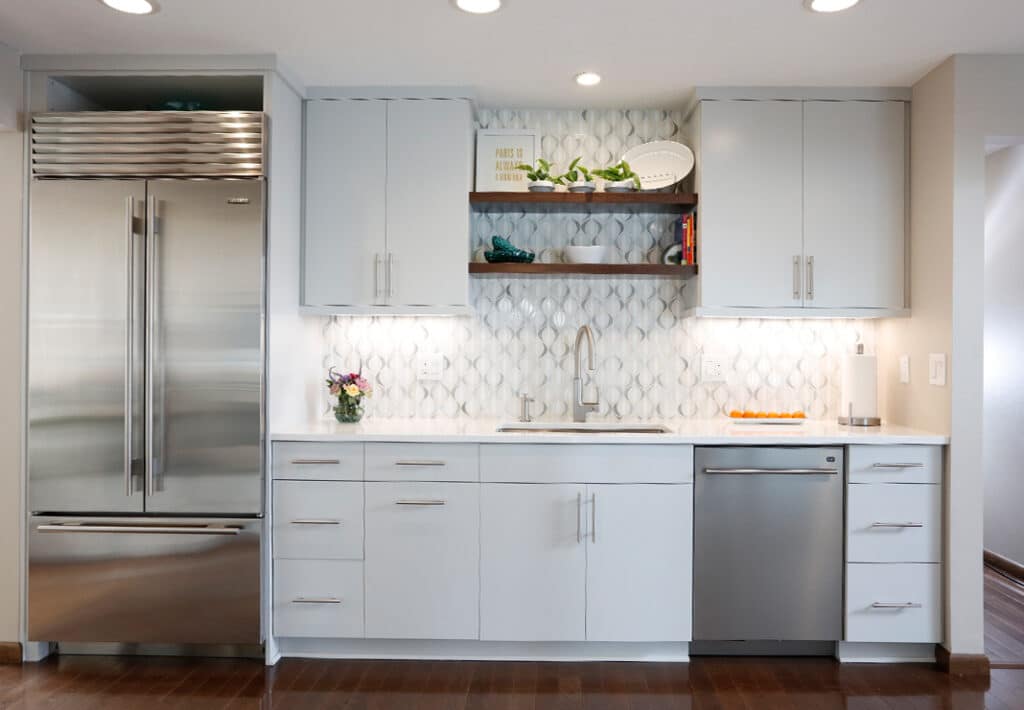
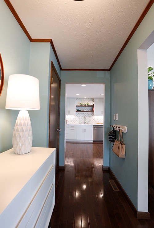
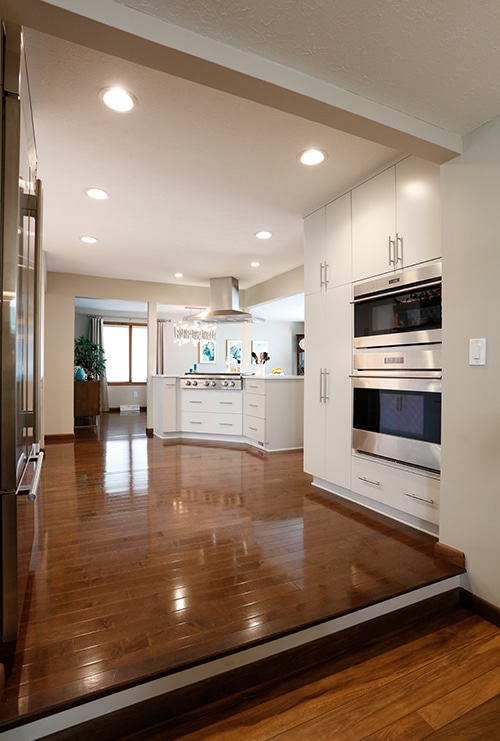
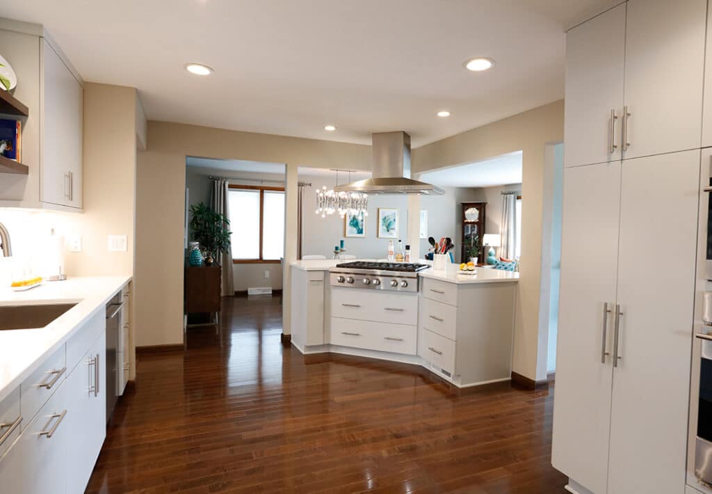
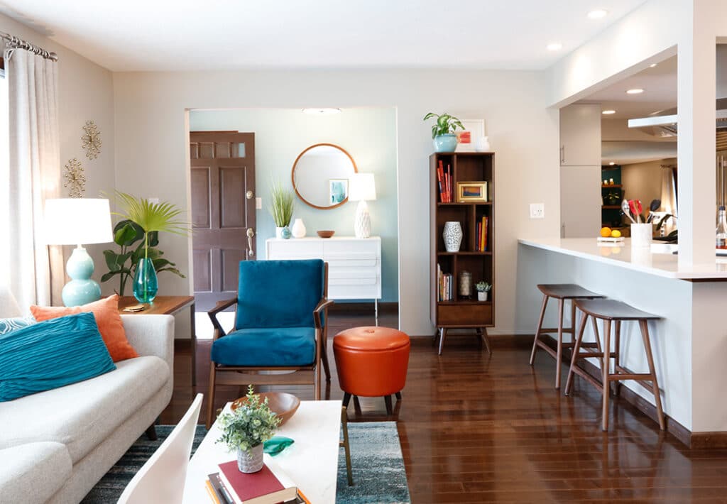
The Kitchen: After
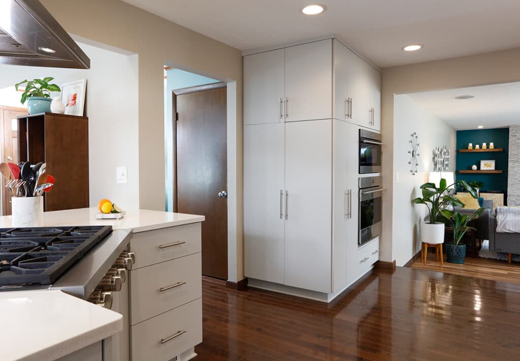
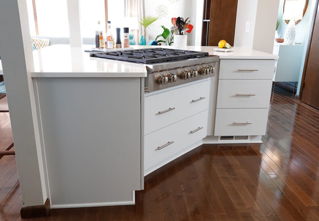
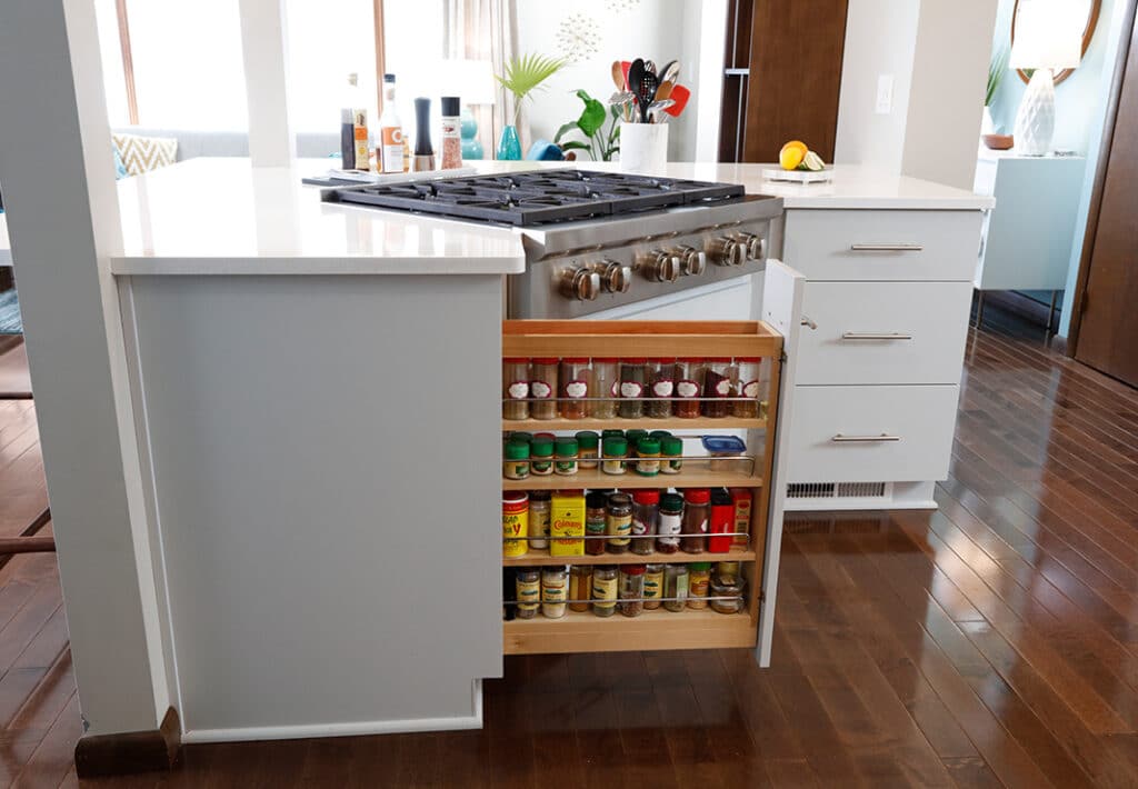
With the new location for cooking now in the center of the house, we were able to establish island/peninsula type seating, giving the family an interactive space. This area has plenty of storage for the chef in the family, with drawers below the cooktop and a spice pull-out cabinet. Add to that a large pantry cabinet with roll-out trays and a reduced depth cabinet on the side for hidden storage, complete with dry erase material inside the doors for family “to-do” lists or kid’s artwork.
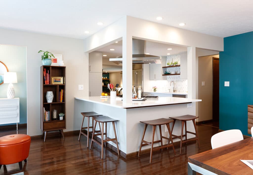
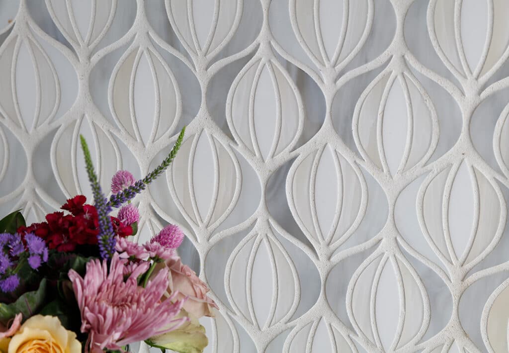
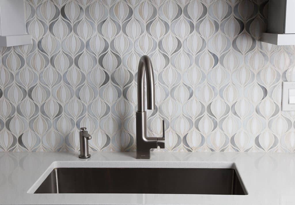
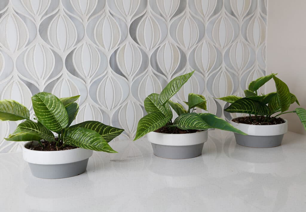
Rather than a cabinet above the sink, custom wood shelves were stained to match the engineered hardwood flooring (Armstrong-Bruce Engineered Maple, Cappuccino) and installed between wall cabinets. This allows for the tile backsplash (Oceanside – Devotion Lotus Blend/Serenity Glass Mosaic) to go to the ceiling and a place to display items. Additional storage is found above and below the tall microwave/oven cabinet. Rounding out this customized space are LED undercabinet lights, Decora switches and a fabulous chandelier.
