It’s true that many older homes have good bones—and this bungalow on Cleveland’s west side was no exception.
But what it exhibited in sound structure, it lacked in function and aesthetic. The homeowner turned to Dover to remodel the kitchen, master bath and sunroom to make better use of existing space, while creating a more livable and functional layout with a fresh, updated vibe.
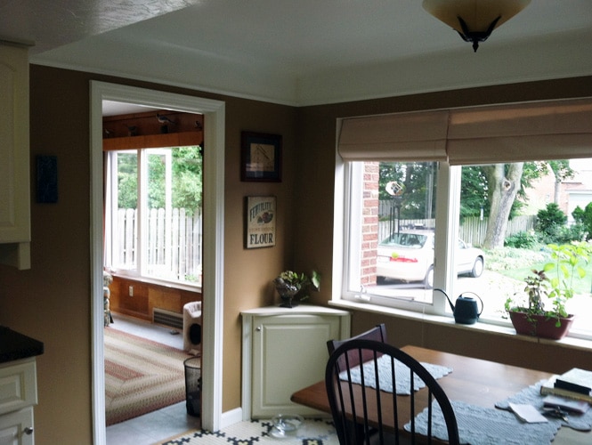
The Kitchen: Before
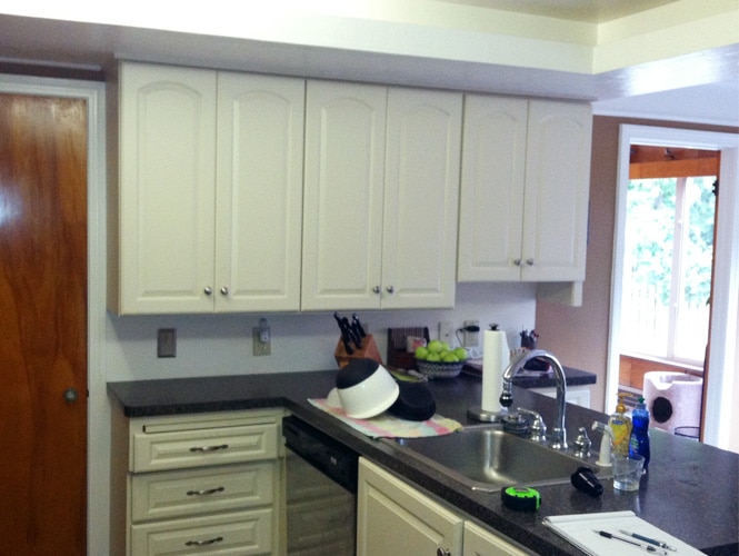
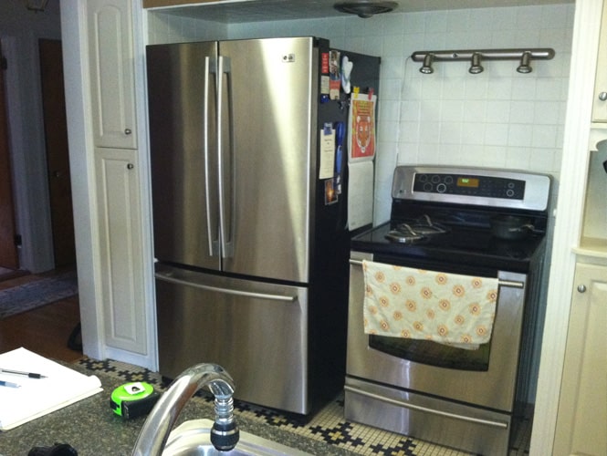
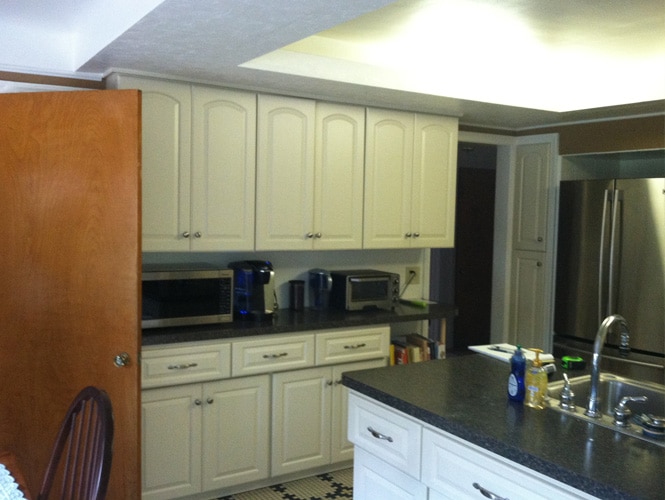
The kitchen had been remodeled by the previous owner, yet functional cabinets, work/prep space and countertops were non-existent. Soffits with lighting elements brought the ceiling lower and made the space feel smaller and boxed-in.
The Kitchen: During
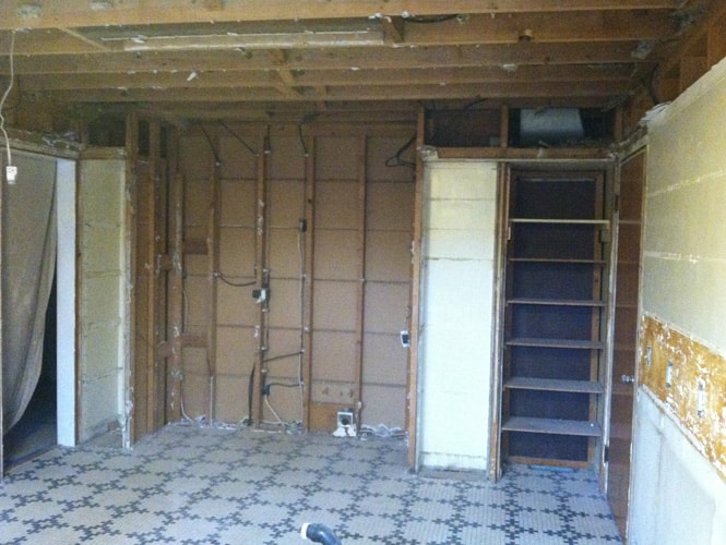
The project required a complete gut, down to the studs.
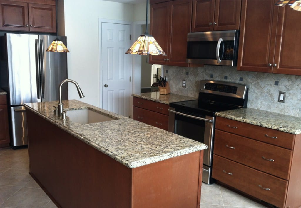
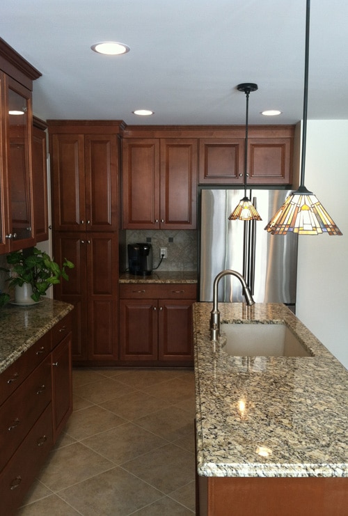
The Kitchen: After
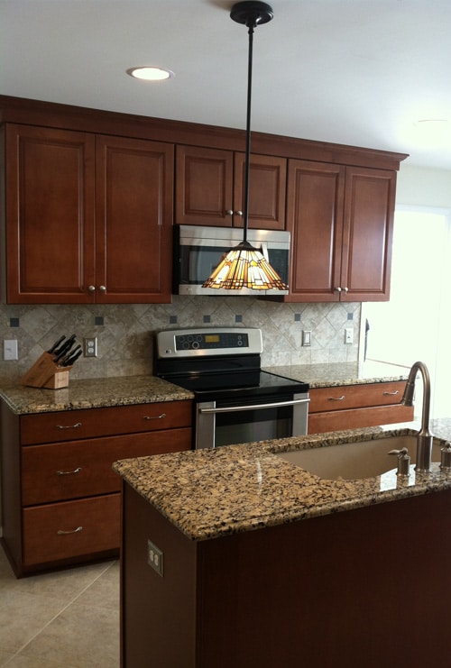
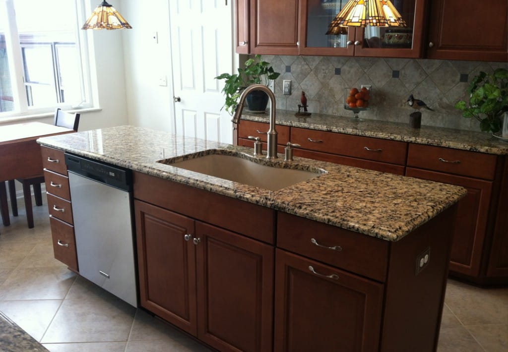
The new layout separated the range and refrigerator, eliminated the peninsula and added a central island with a sink.
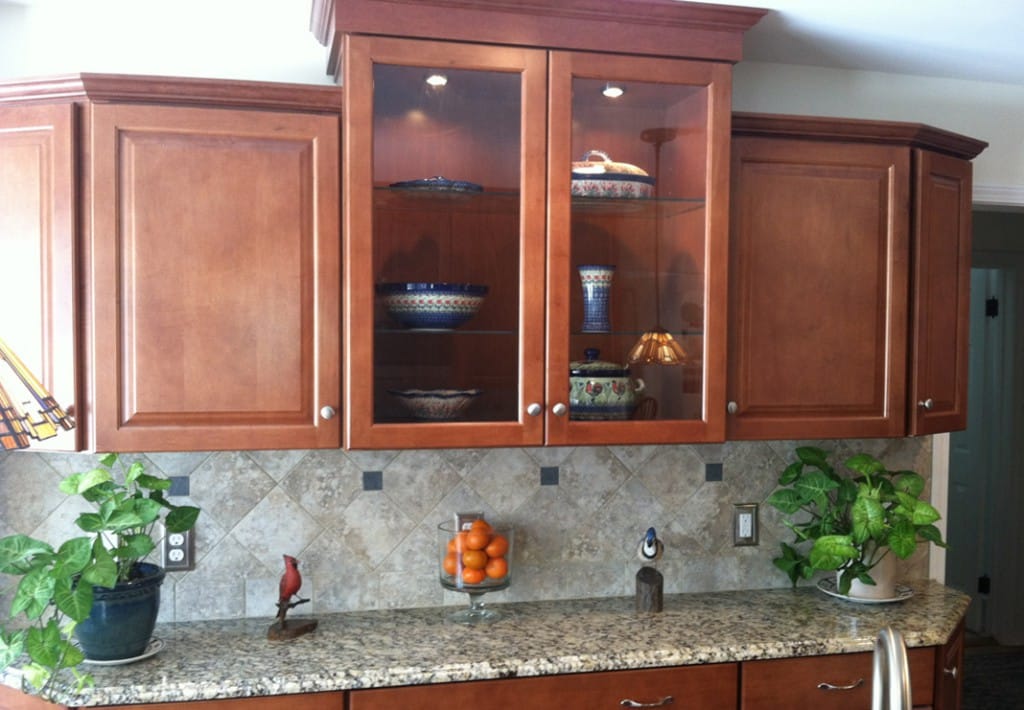
The renovation included removing a cramped pantry closet and creating a larger pantry for more storage; as well as the addition of a display wall with glass-front cabinets with lighting for collectibles.
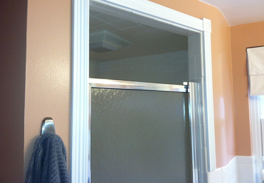
The Bathroom: Before
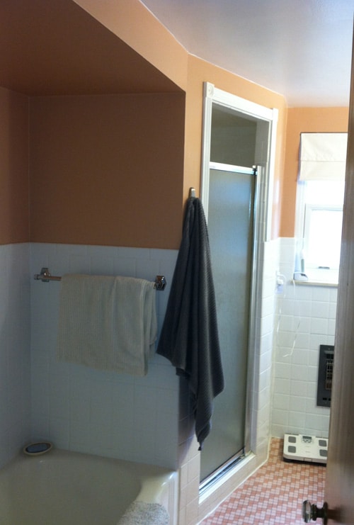
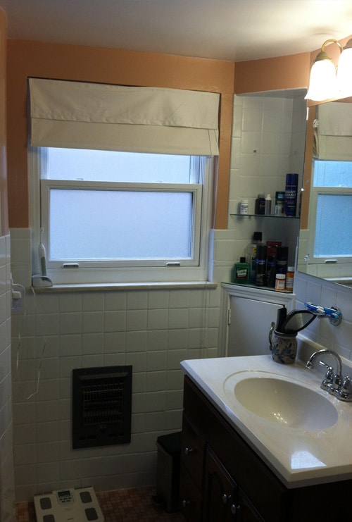
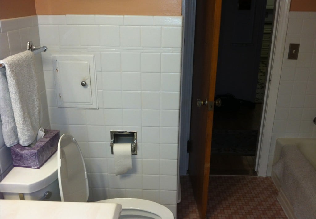
The space was cramped with one sink, a tub and toilet. The homeowners’ vision: Eliminate the bathtub, install a walk-in shower and two sinks.
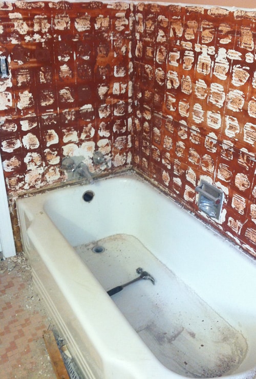
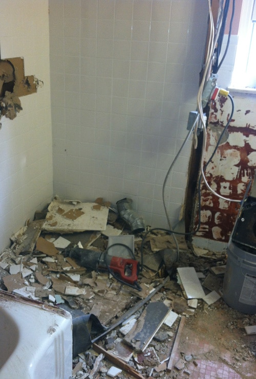
The Bathroom: During
The bathroom had never been remodeled: It still had the original mud-based tile on the floor.
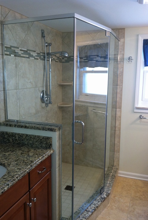
The Bathroom: After
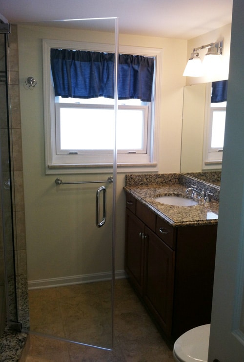
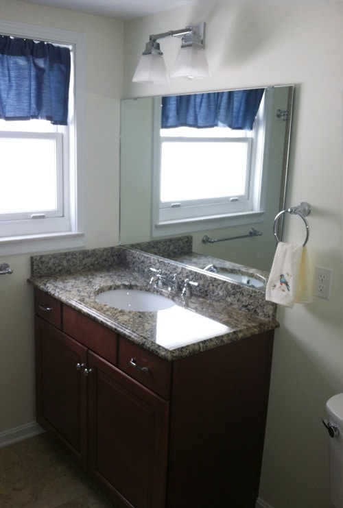
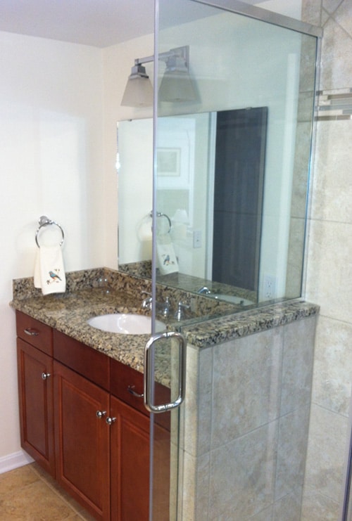
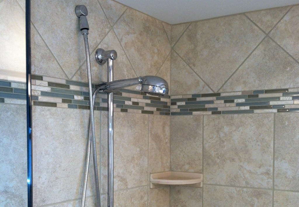
The new layout opened up the room for a lighter, brighter and more spacious feel; and the smart design maximized that space, including more counter area and linen storage.
The Sunroom: Before & During
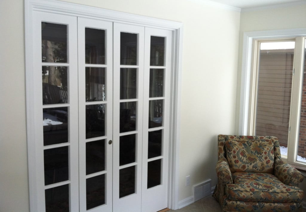
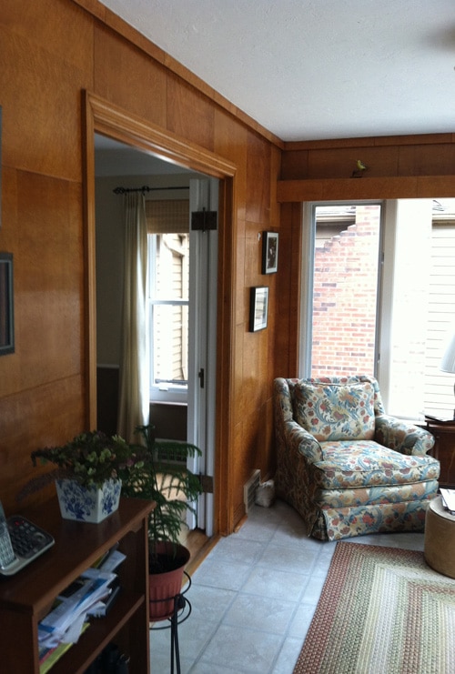
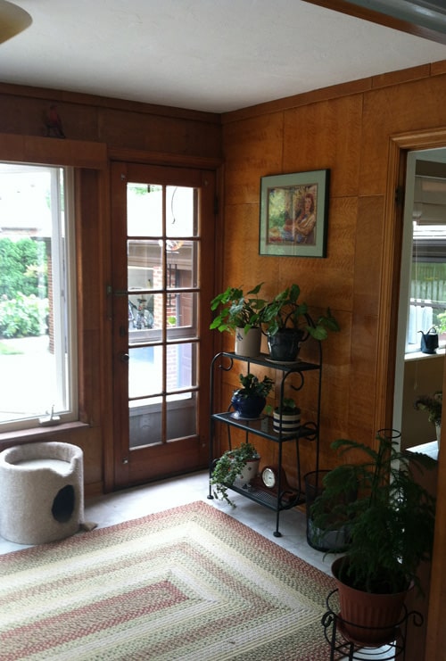
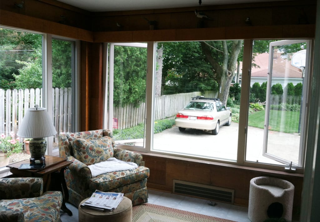
The sunroom had dark paneling on the walls making the room outdated and anything but sunny. Located just off of the kitchen, the goal was to create a continuous and inviting space that flowed from room to room.
The Sunroom: After
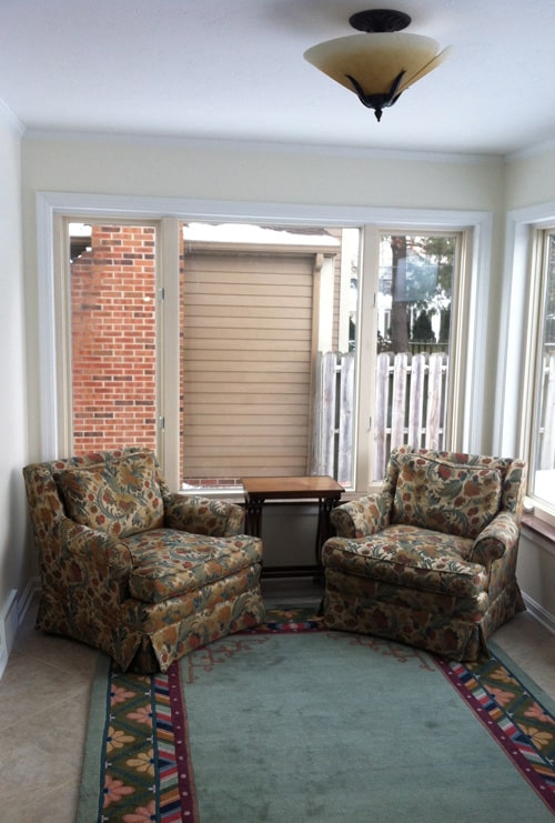
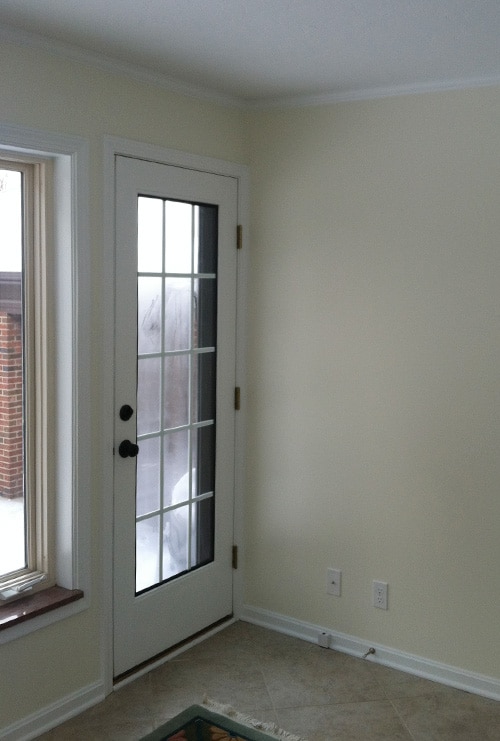
The simple facelift gave the room an entirely new look and feel. Keeping only the original windows, the paneling and flooring was stripped; underfoot, 18″ x 18″ tile was installed on a diagonal to create clean, open lines.
