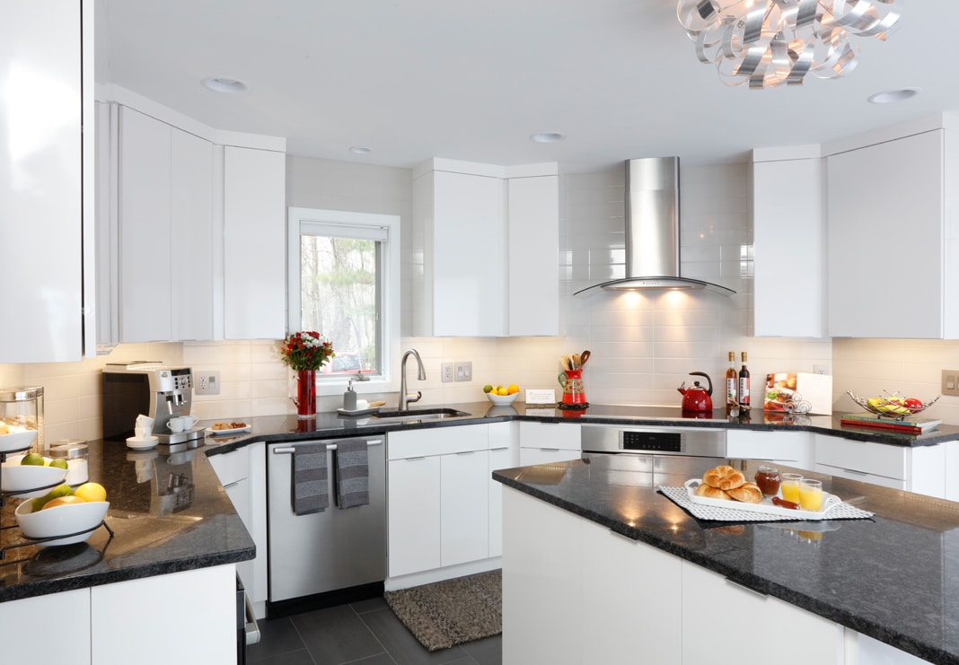
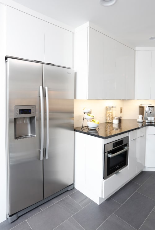
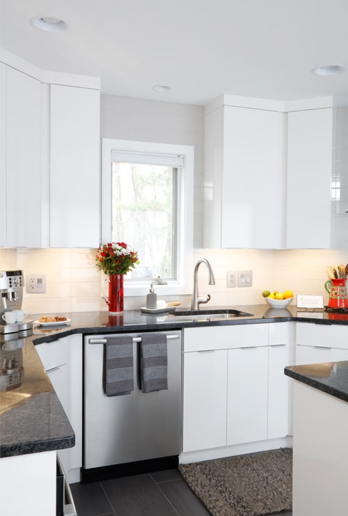
Out with the old. In with the new. This townhome kitchen gets a style overhaul with custom frameless cabinetry, granite surfaces, a sleek tile backsplash extended to ceiling and brushed aluminum accents.
The homeowners partnered with Dover Home Remodelers to reimagine the tired space—a project that earned Dover first place honors in the prestigious NARI Contractor of the Year (CotY) Awards 2018 for Kitchen Remodel ($45,001 – $60,000).
A modern new kitchen with European flair
The homeowners—originally from Italy and France—had created a sophisticated, artsy vibe in their bright, airy townhome: A palette of crisp white walls, ceiling and trim with pops of saturated color in oranges and reds displayed in furnishings and artwork.
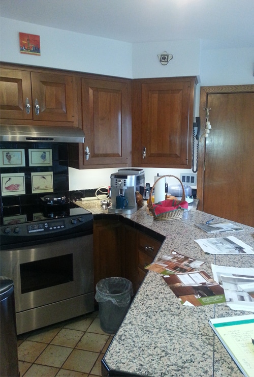
And then there is the kitchen. The original kitchen with its cherry cabinets, granite tile counters and mottled ceramic floor tile with dark grout did not fit with the rest of the home – it was a complete disconnect.
The homeowners’ vision: An updated, functional kitchen with modern elegance.
The Kitchen: Before & During
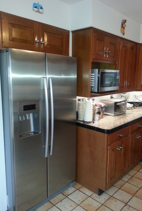
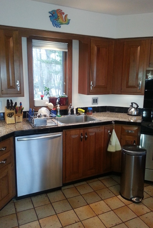
The first obstacle was the unique octagonal shape of the room. The sink could not be centered under the window and still allow for the dishwasher beside it. The odd angles in the room made for a challenging design.
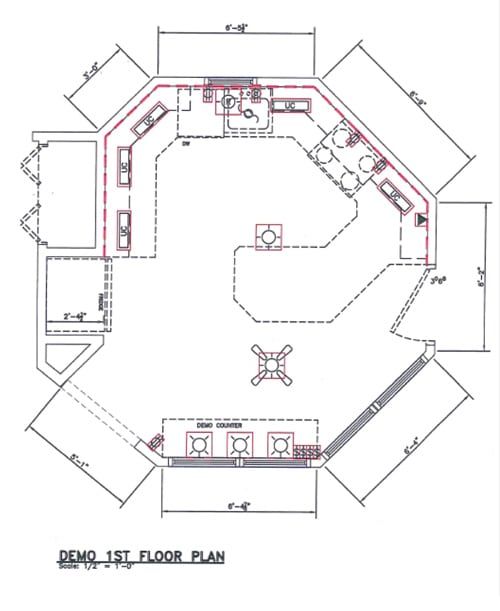
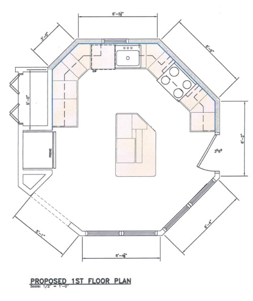
The solution: Keeping the sink in place per the homeowners’ request, we eliminated the peninsula and added an island, which creates better flow in the kitchen space:
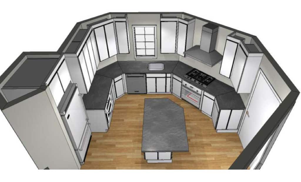
The soffits were removed to give the space the illusion of height. Tall cabinets extend to the ceiling and create a seamless sightline.
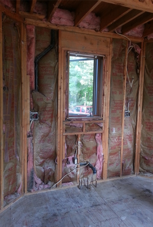
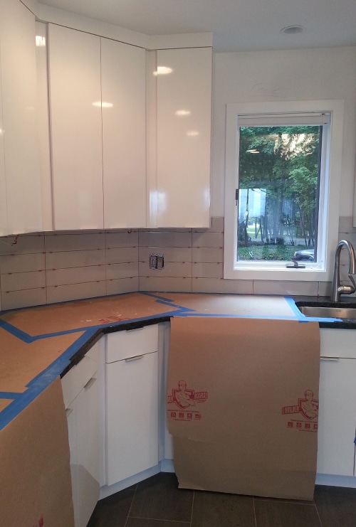
The Kitchen: Before & After
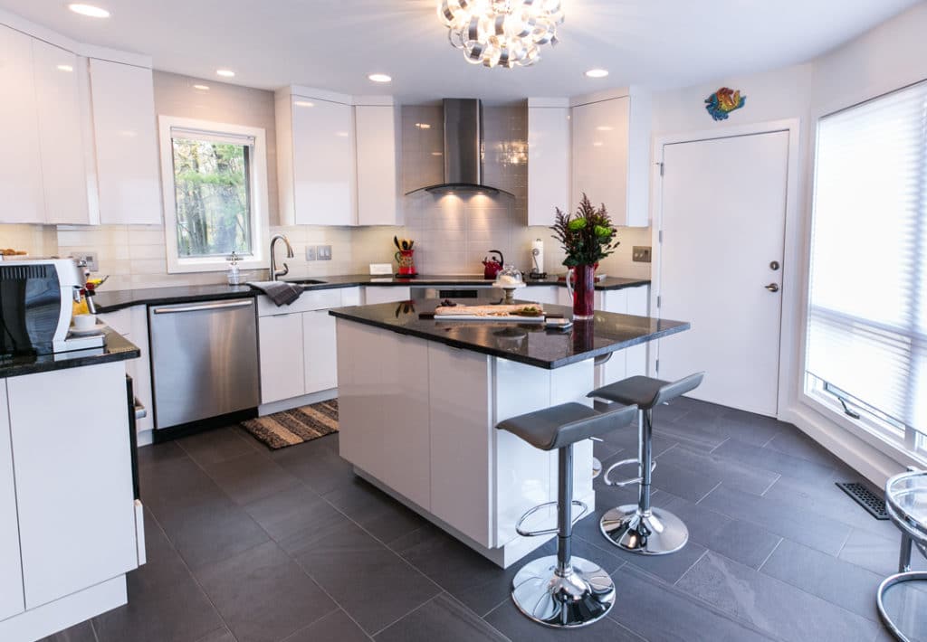
The new kitchen goes from dark and dated, to bright and stylish. The sleek, custom frameless cabinets are set flush with flat crown molding for a contemporary feel that coordinates with the rest of the home.
In the original layout, the peninsula divided the kitchen, hindering any flow in the space.
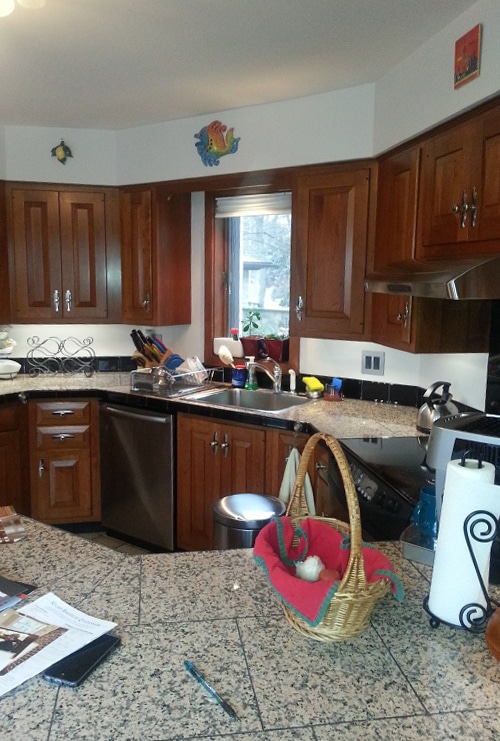
The new center island creates functional space and allows easy movement throughout the kitchen.
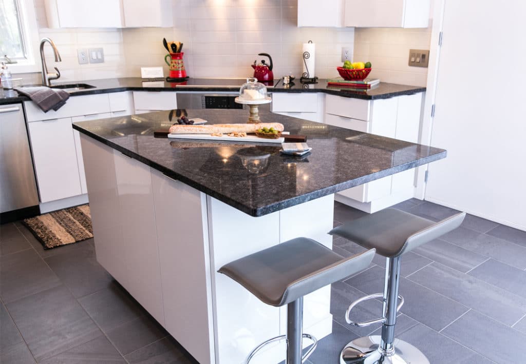
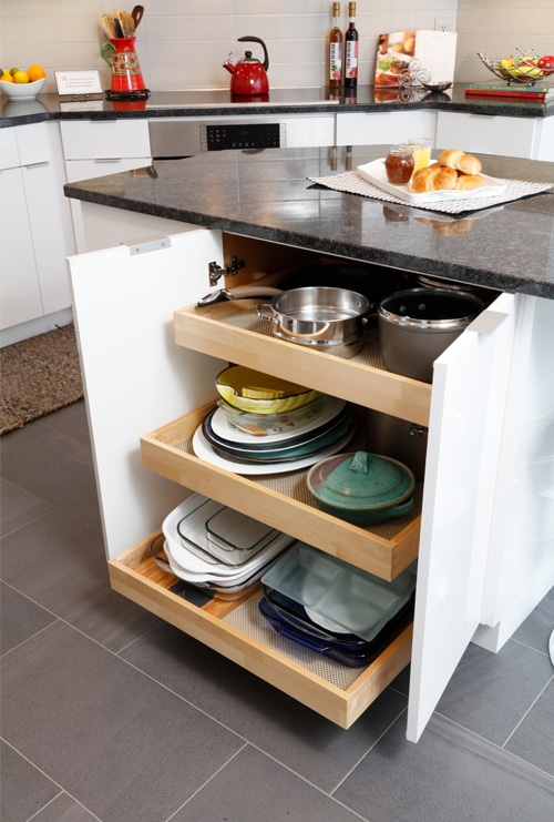
With the peninsula removed, the new island provides additional storage placed in unique ways to allow for bonus seating for four on two sides.
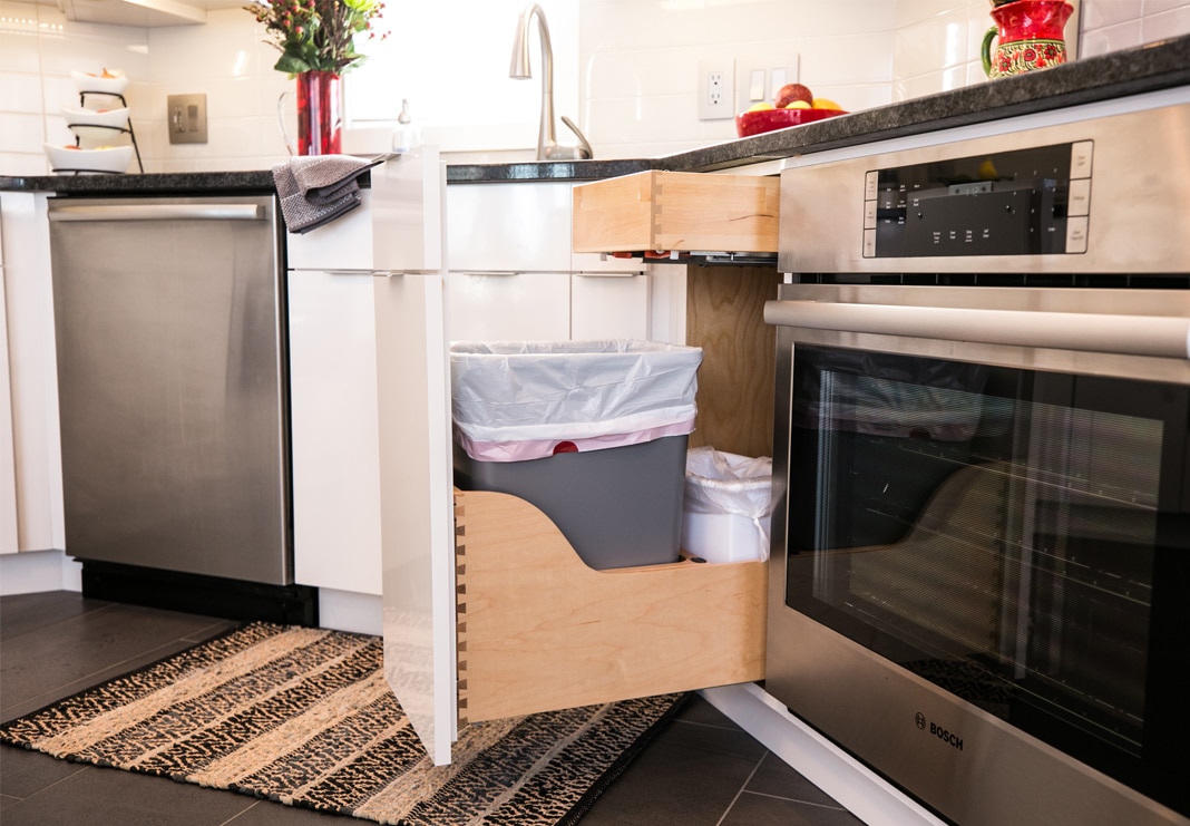
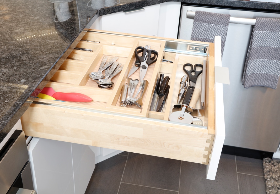
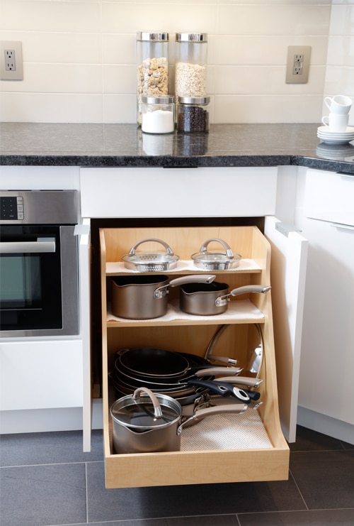
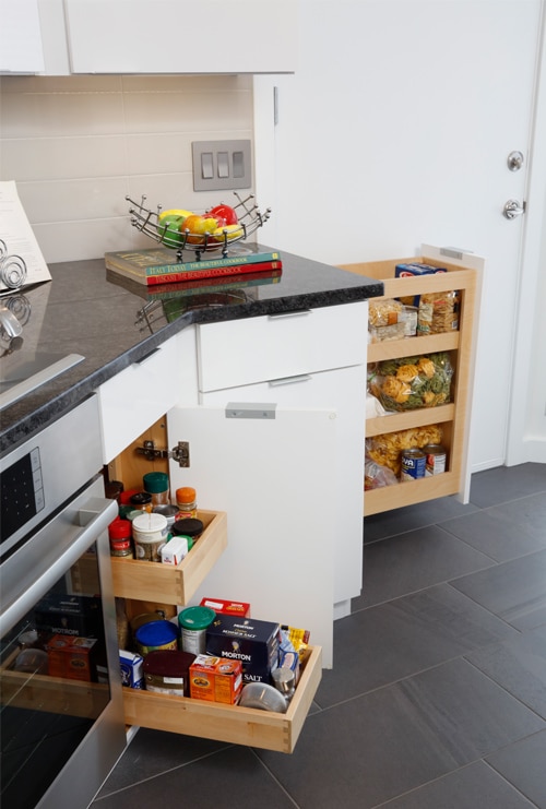
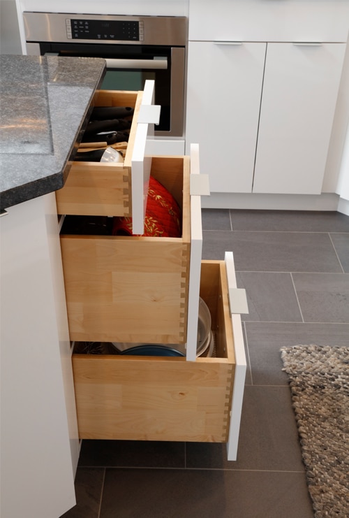
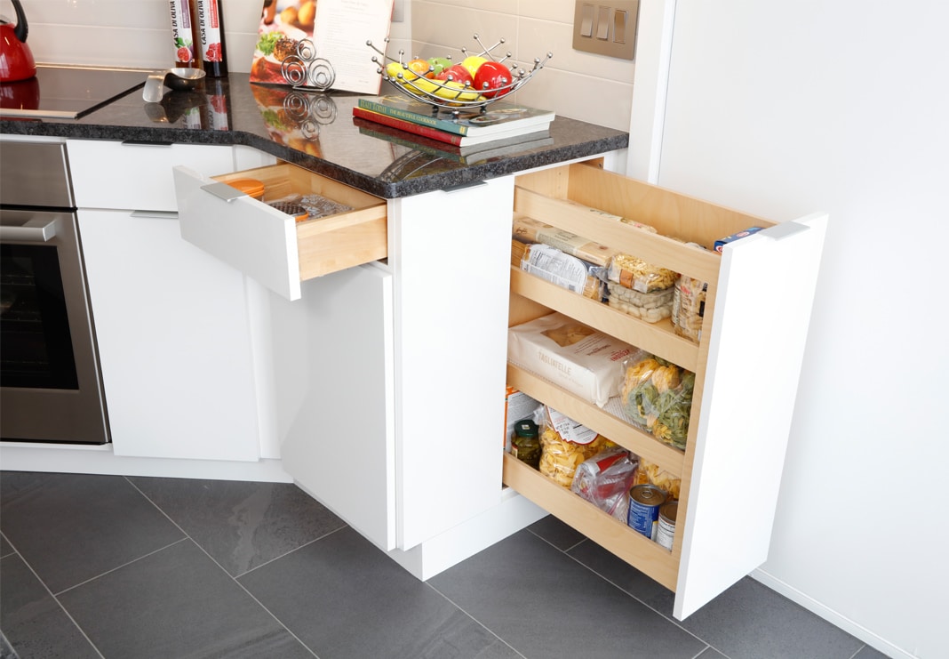
We used the angles of the room to our advantage by creating “hidden” storage in unexpected areas including a pasta drawer that opens from the side, pull-out drawers in cabinetry and horizontal doors.
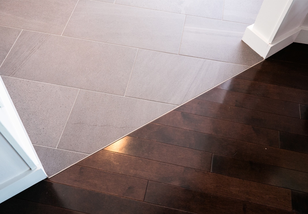
The Schluter®-System was used to bring the new porcelain floor to the same height as the existing hardwood:
To balance the white, a medium-hue gray granite (Rocksolid Stoneworks in Steel Grey) adds warmth to the space.
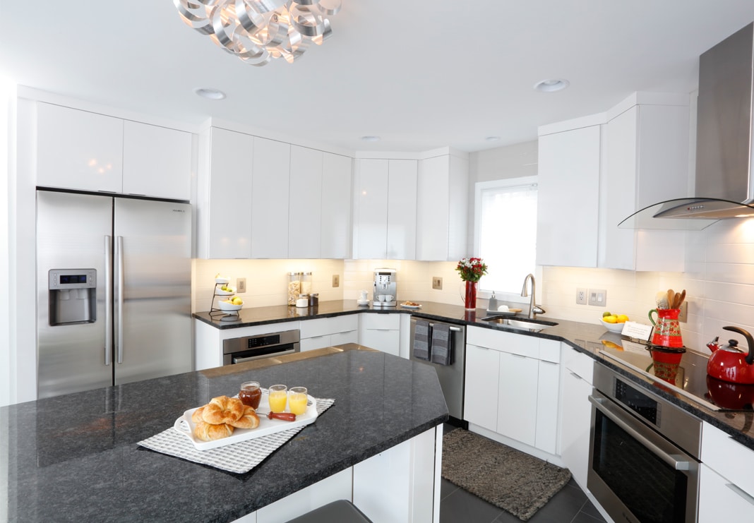
For the backsplash, 4″x 16″ ceramic tile (Crossville “Expressions” in Haze) was installed square-set up to the ceiling for a modern feel.
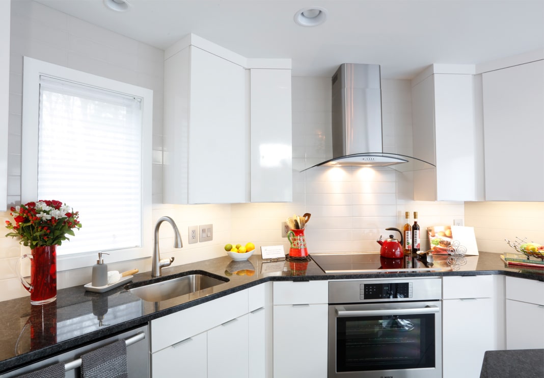
No longer a misfit, the elegant new kitchen now flows effortlessly with the rest of the well-appointed space in this beautiful townhome.
