Completely reimagined living spaces make this house a forever home with a spacious kitchen, light, bright sunroom, custom-appointed great room, updated primary suite and refreshed exterior.
Ready to downsize after their grown children moved out on their own, these homeowners found a sturdy 1957 brick home in the ideal neighborhood. The caveat: the property needed a complete overhaul. The extensive renovation delivered everything the homeowners wanted in their new home: open, free-flowing living spaces, updated appointments, with a classic design style to enjoy for years to come.
The Overview
After interviewing multiple contractors and architects for the job, the homeowners chose Dover based on the quality of work and the design-build approach to project management. Based on their initial interviews, they found that working with an architect, engineer and builder separately made the budgeting and design process confusing. One point of contact to manage all aspects of the job from beginning to end was appealing and provided peace of mind.
Feasibility & Permitting
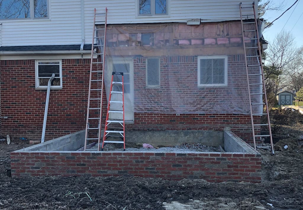
The homeowners wanted to build the new garage on an angle. This design required a special variance with the city based on code. At this stage, we also re-engineered the home’s structure to achieve the open-concept design: Incorporate the existing garage space into the main house, remove the load-bearing wall in between the kitchen and great room, add a steel beam to carry the load for the cathedral ceiling in the great room and tie it into the roof structure above, and install a support beam in the newly redesigned sunroom.
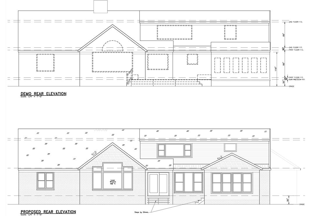
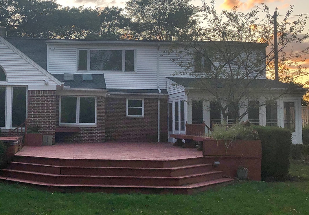
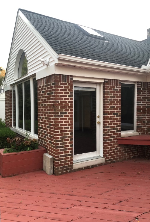
The Exterior: Before
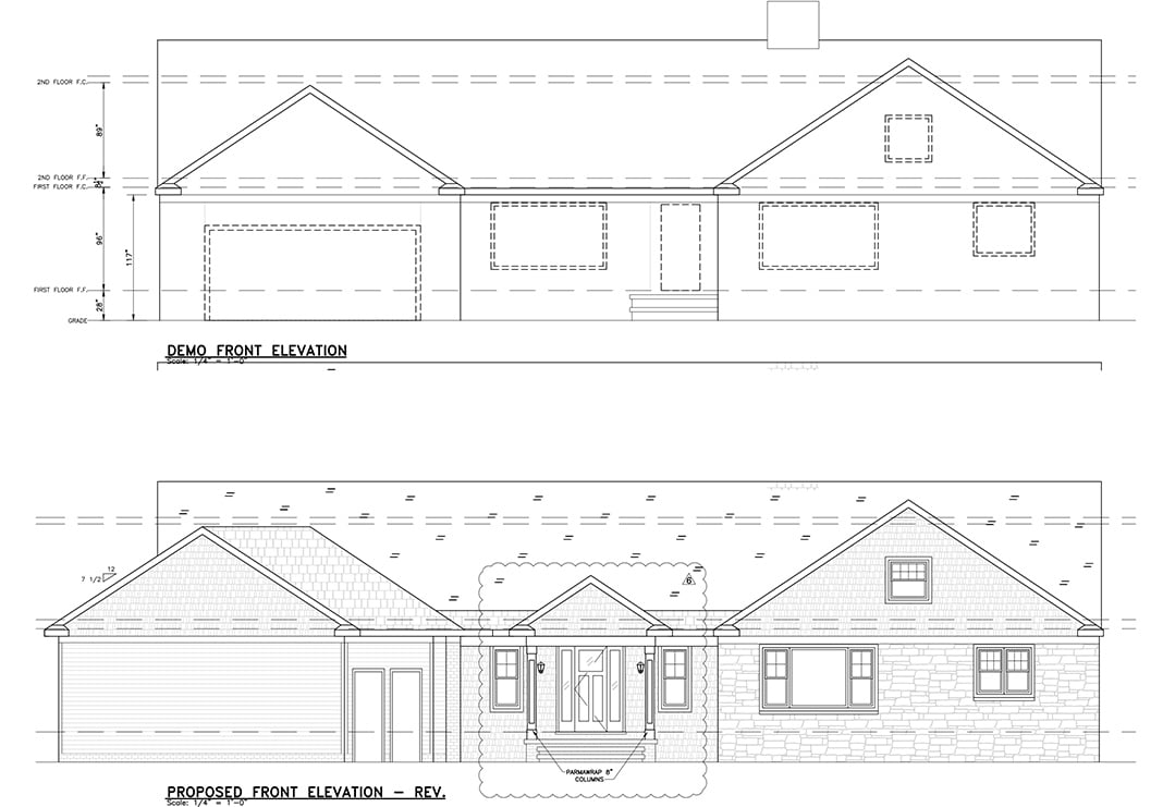
The existing elevation lacked curb appeal and needed a refresh.
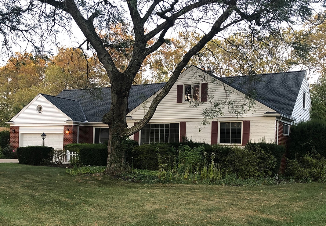
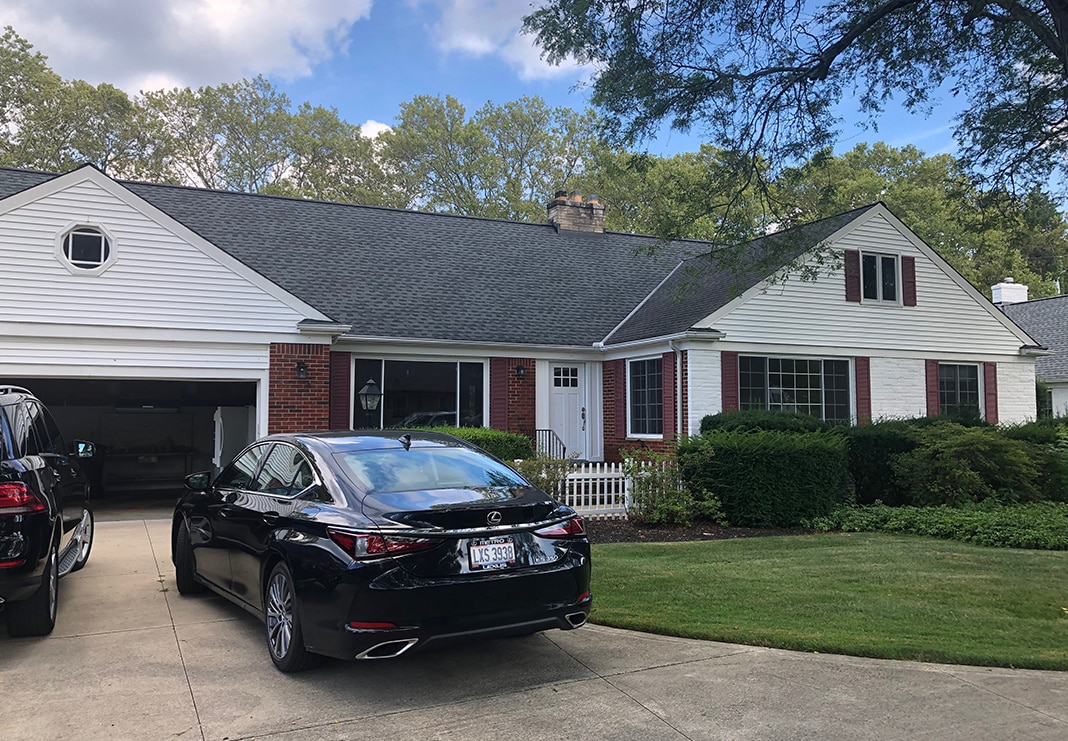
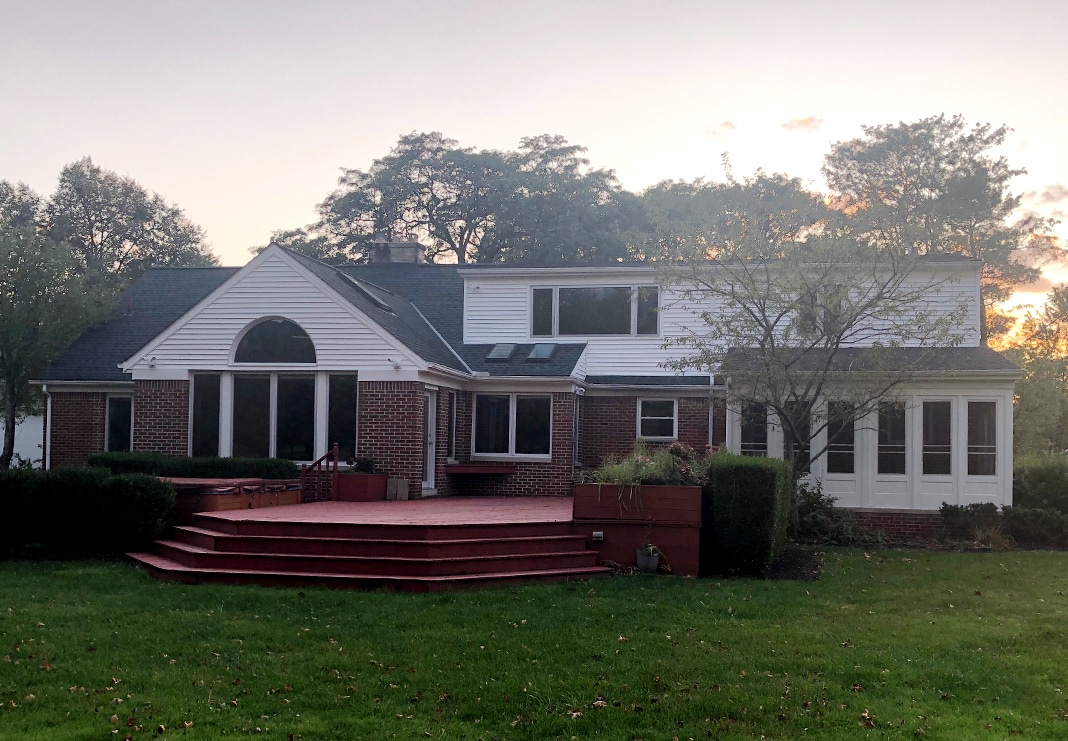
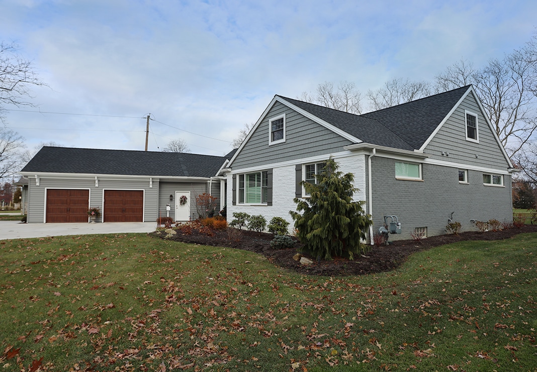
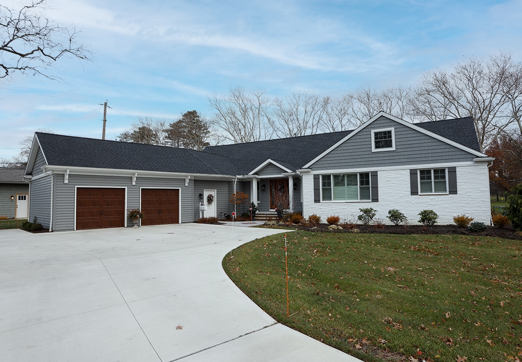
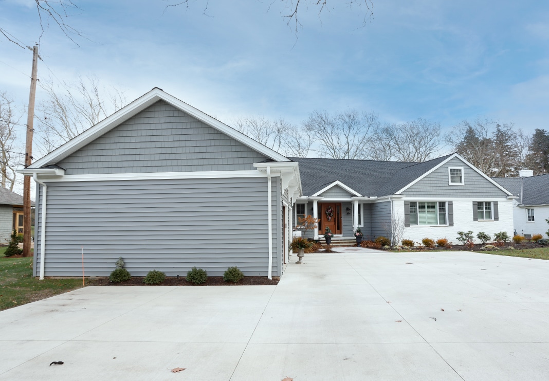
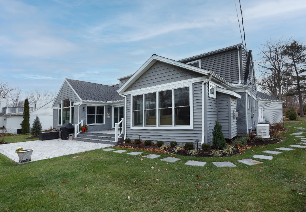
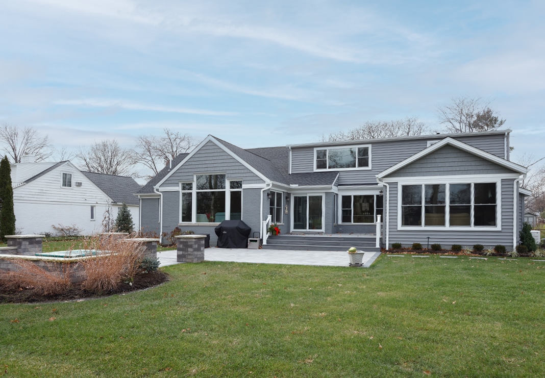
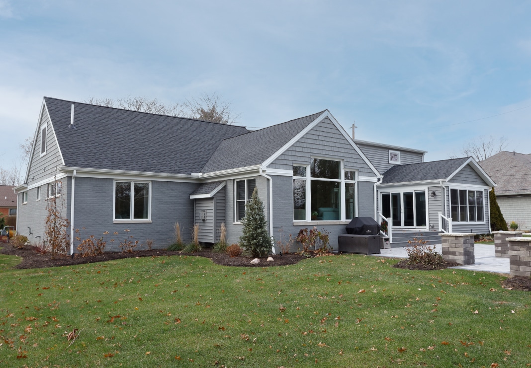
The Exterior: After
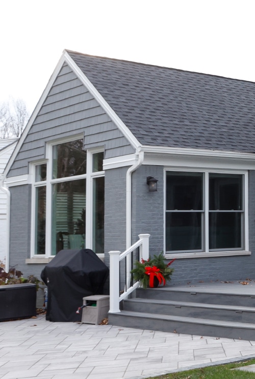
The remodel included all new brick (as required), new siding as an accent on dormers and front entry alcove; (Siding: Alside Pelican Bay in Sterling Gray traditional shake) and Odyssey Plus 5″ horizontal siding in Sterling Gray on the addition; and fresh paint. Wood garage doors provide warmth and contrast. On the rear of the home, a new deck ties into the new sunroom, great room and kitchen, bringing the whole-home renovation together beautifully.
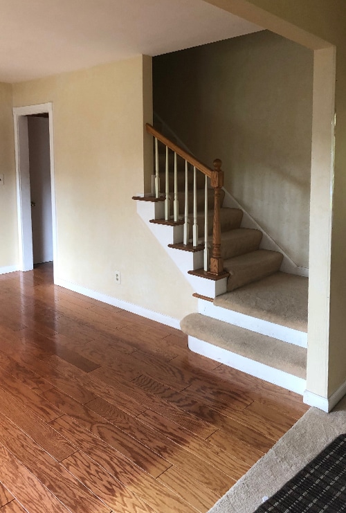
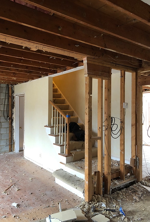
The Entryway & Staircase Before
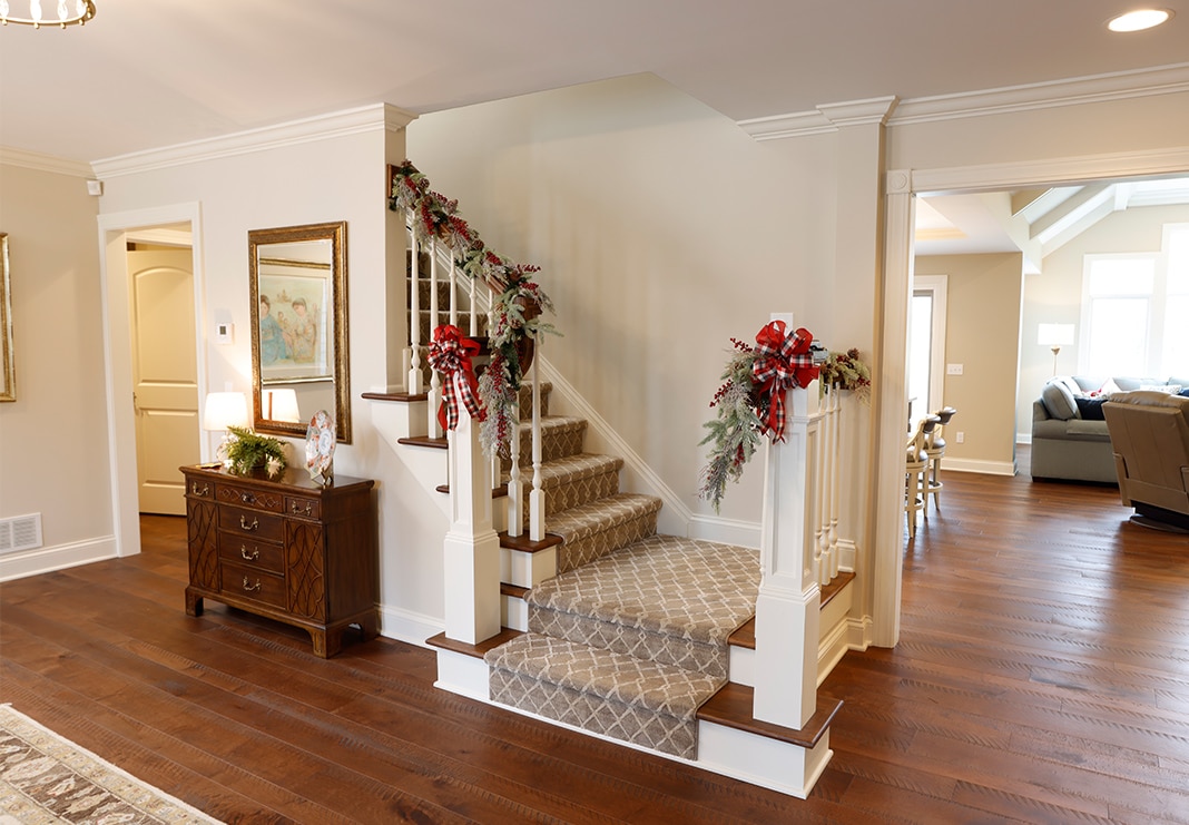
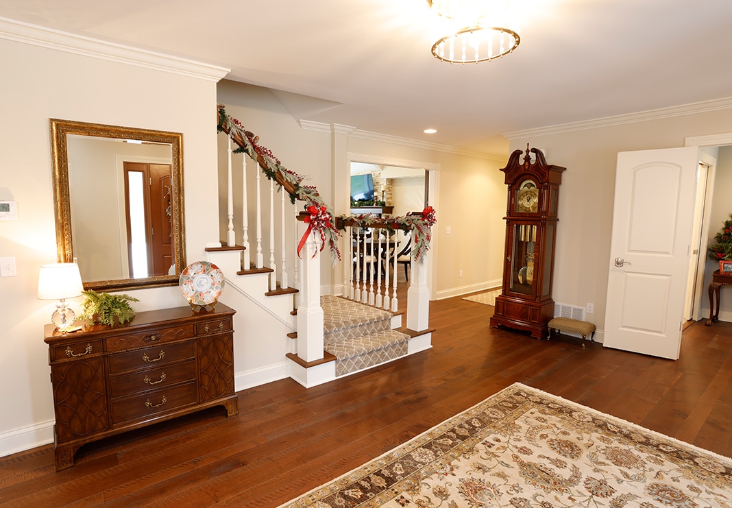
Part of the renovation of the downstairs living area included opening the staircase, creating a larger foyer and relocating the front door using part of the former dining room space to make a grander front entrance.
The Entryway & Staircase: After
The Great Room: Before
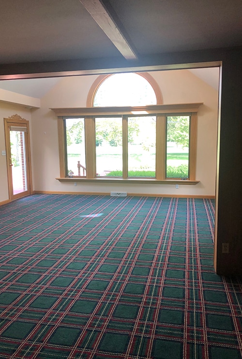
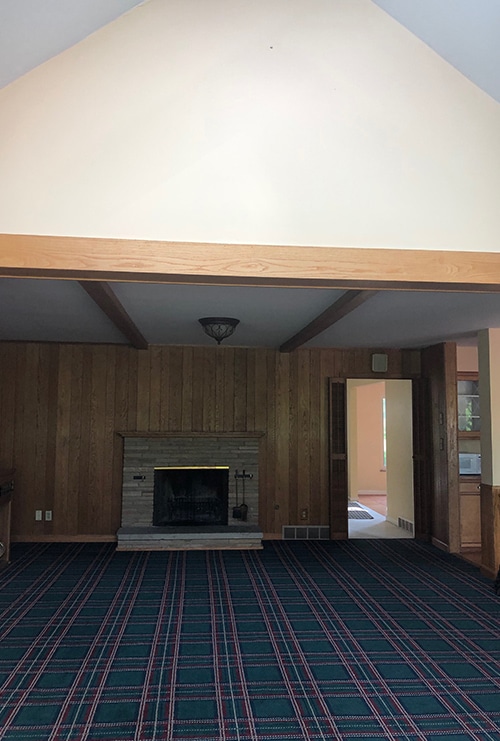
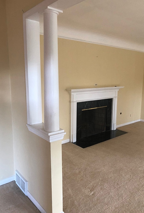
The existing great room, with wood paneling and dark carpeting, was drab and outdated. Separated by a half-wall abutting the kitchen on one side and a two-sided fireplace shared with the dining room on the other, the existing space made the house feel disjointed and smaller than its actual size. The homeowner had a vision: eliminate walls, vault the ceilings and create wider openings from room to room for living spaces that flowed easily from one area to the next.
The Great Room: After
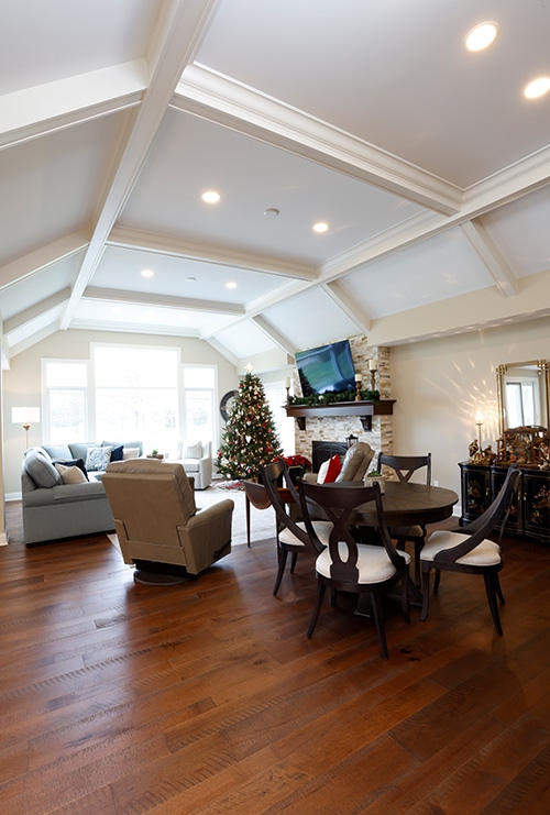
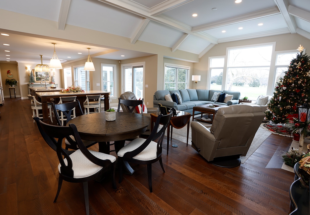
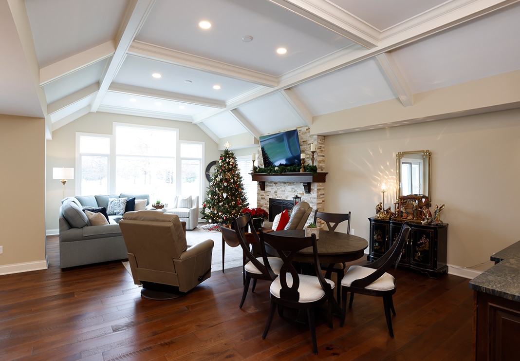
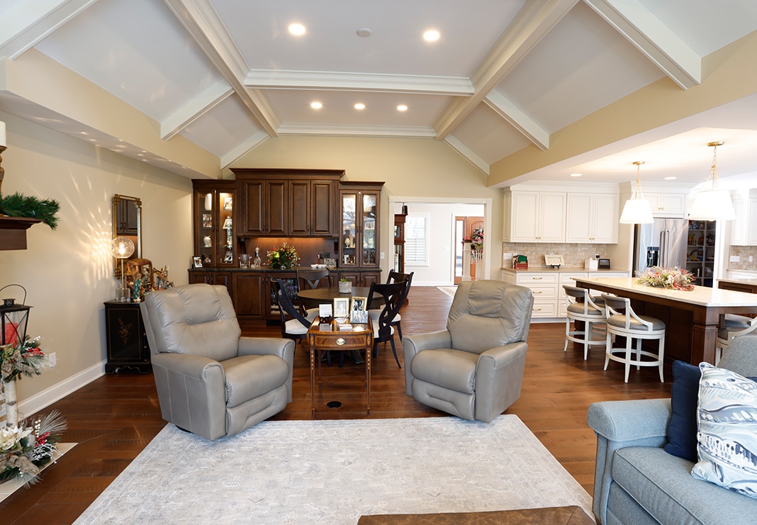
While the great room’s existing footprint was sizable, the room lived small. To create a loftier, more airy space, we eliminated the two-sided fireplace and redesigned the ceiling vault by encroaching an upstairs storage area. A new steel beam carries the load to develop the dramatic cathedral ceiling. We kept the existing soffits and integrated them with the steel beam to carry the weight from the removed load bearing wall. All beams tie into the tray ceiling design for a functional and beautiful design element.
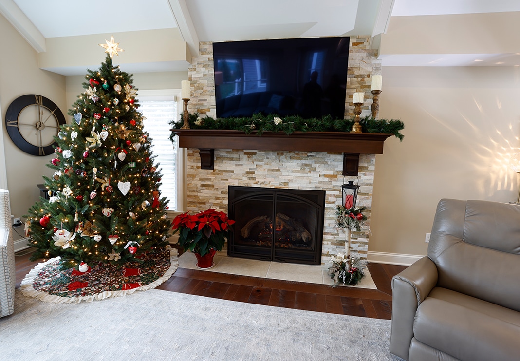
To create a game area and bar in the great room, we installed a beverage fridge and custom-lighted display cabinetry with space for a game table. The new gas fireplace and custom stone surround with a rich wood mantel create a cozy feel. Custom millwork and engineered hardwood floors (Armstrong Timbercuts in Maple Woodland Hills) are used throughout the first floor’s main living space to create a cohesive look for visual harmony.
The Kitchen: Before
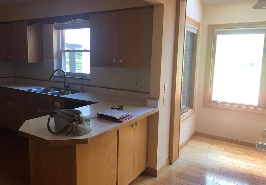
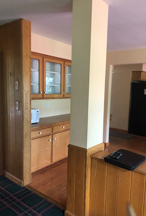
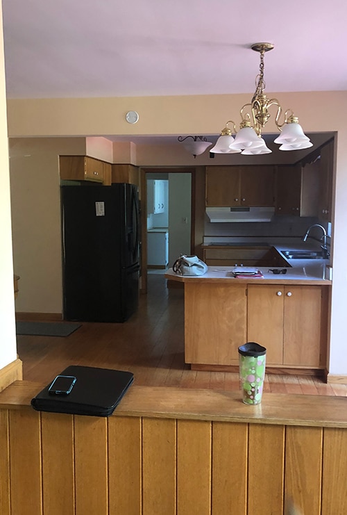
The original kitchen was old-school, from cabinets and hardware to appliances. Not only did the space need a refresh, but it needed a better flow. The wall separating the kitchen from the dining and family rooms made the kitchen feel closed off from the rest of the home. With no island, it had a small peninsula that lacked ample workspace and functionality. Plus, with little natural light, the room felt even more cramped.
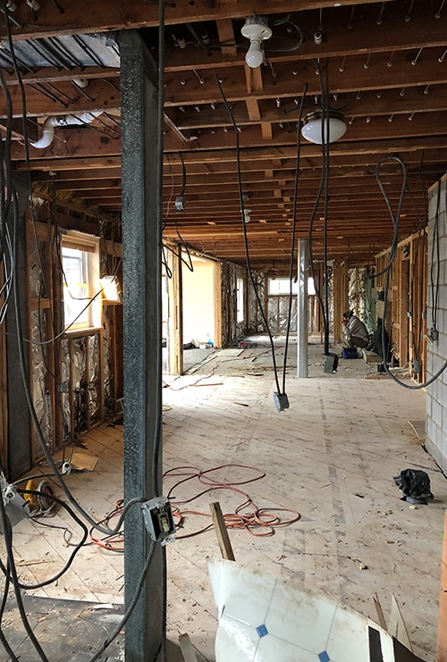
The Kitchen: During
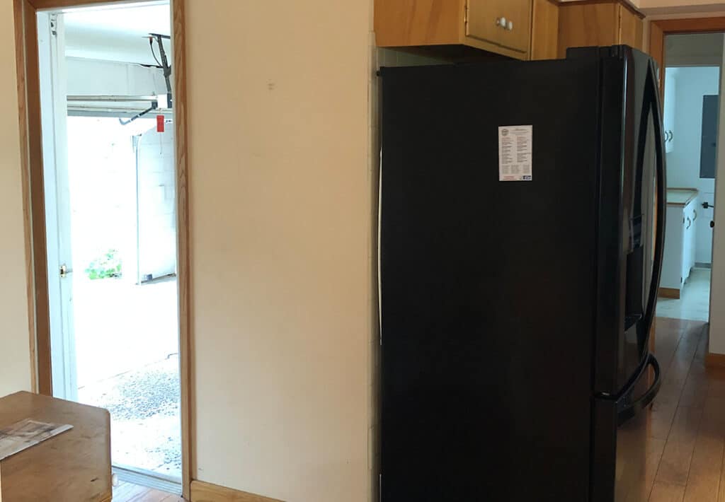
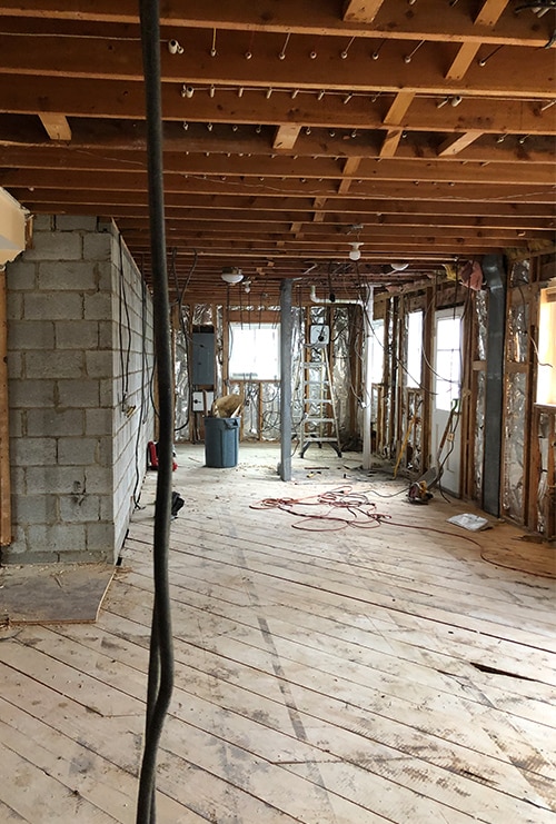
The remodel included removing the half wall between the kitchen and great room; enlarging the kitchen’s footprint by taking space from the former garage to create an oversized pantry, powder room and larger laundry room (which included re-engineering the load-bearing structure from the former garage and tying it into the interior trusses); adding new, more oversized windows; and reconfiguring the entire kitchen layout.
The Kitchen: After
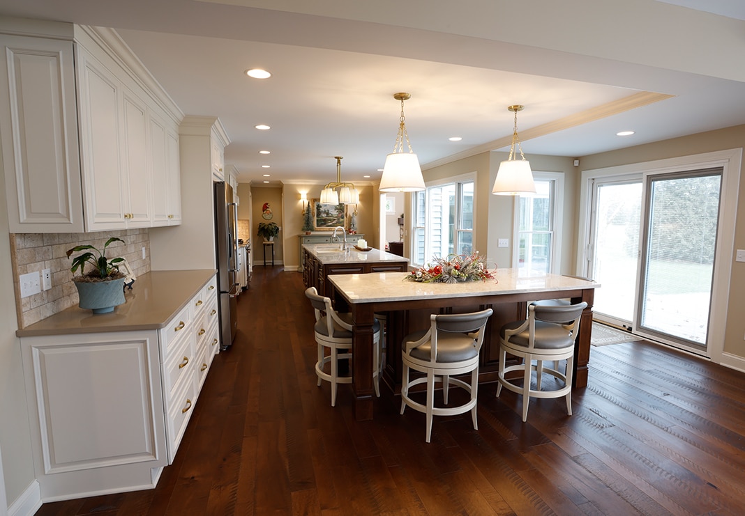
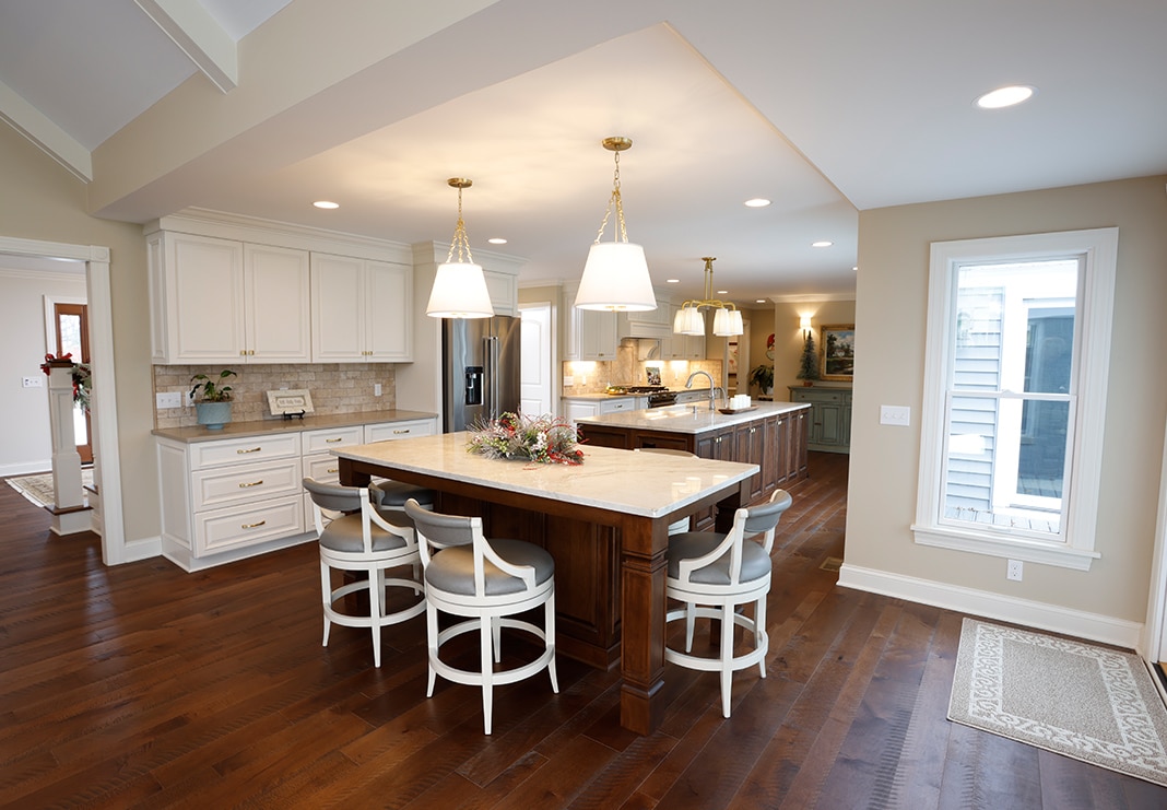
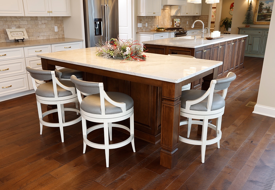
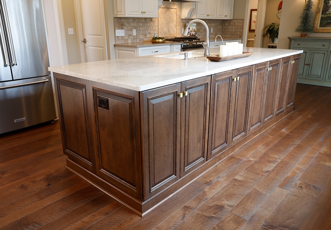
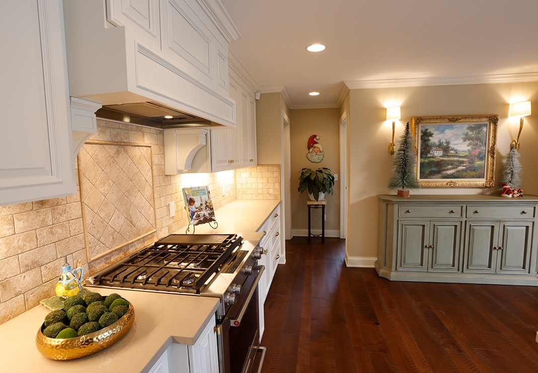
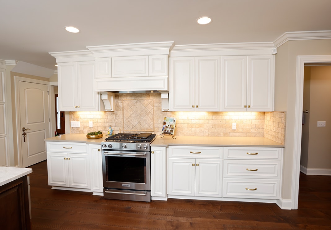
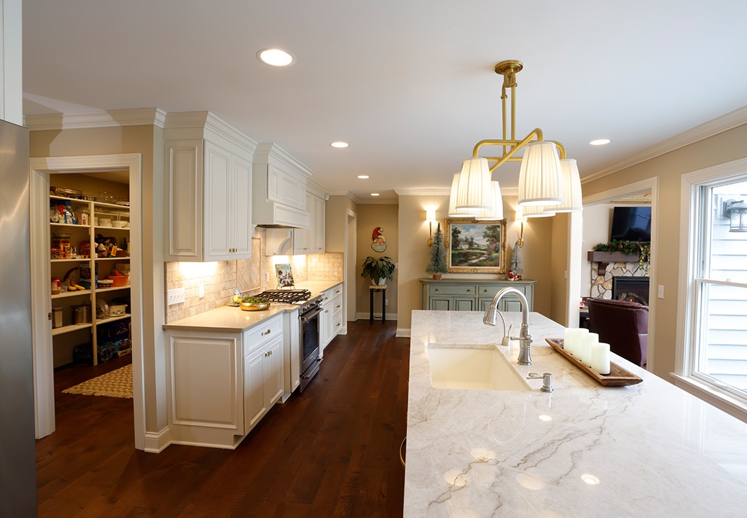
The wholly reimagined kitchen is a bright, open space with two large islands—a 6-seat island with storage and a working island—both using a different wood finish from the perimeter cabinetry for visual interest. Custom backsplash tile installations keep the look seamless. (Backsplash: Stone Tile International in Tumbled Travertine, Light Walnut) Silestone quartz in Lena for the perimeter surfaces creates a consistent look that lets the backsplash stand out. The updated kitchen also features plenty of counter space for prep and entertaining, all with neutral colors and elevated fixtures, creating an upscale, timeless look.
The Sunroom: Before
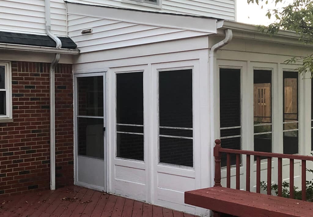
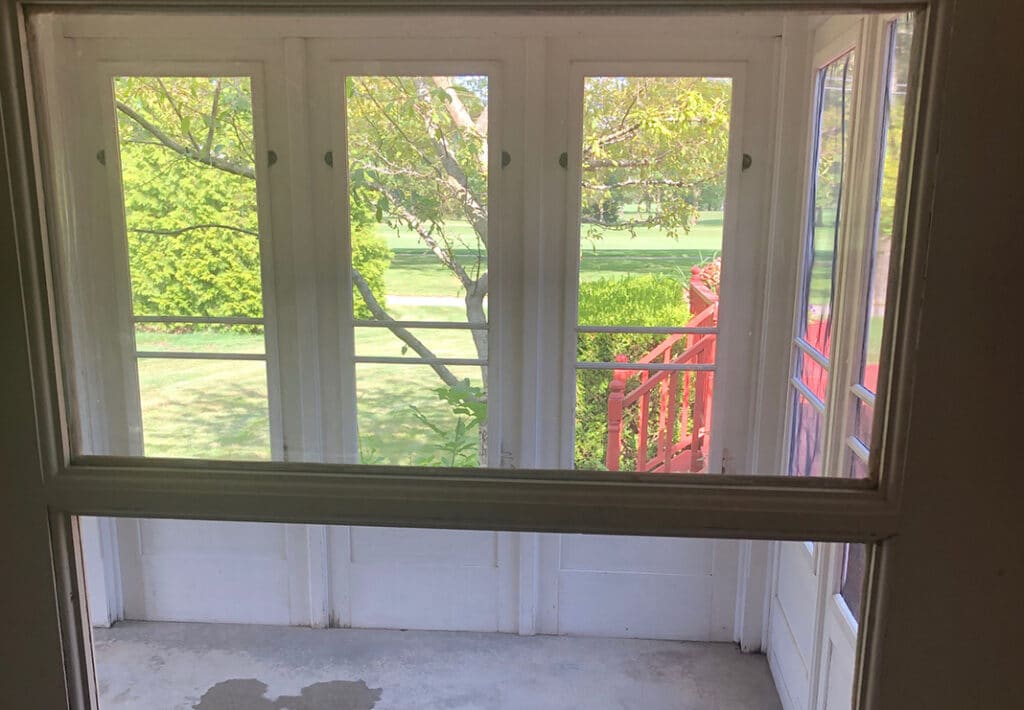
The old sunroom was an add-on living area accessed off the existing great room. While the room did offer a lot of natural light, it needed a major facelift to flow with the newly upgraded living spaces throughout the rest of the home.
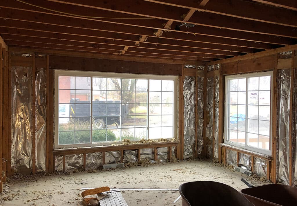
The Sunroom: During
We redesigned and reframed the sunroom space with four oversized windows for more natural light and to create a connection with the backyard. A larger opening from the kitchen allows a seamless flow between living areas.
The Sunroom: After
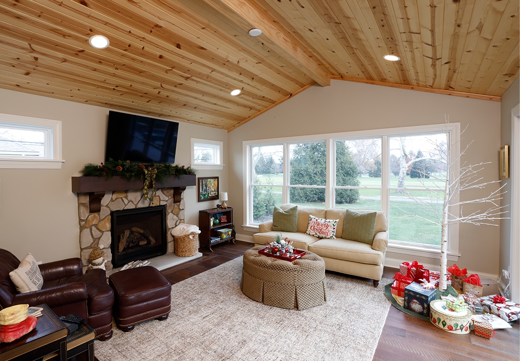
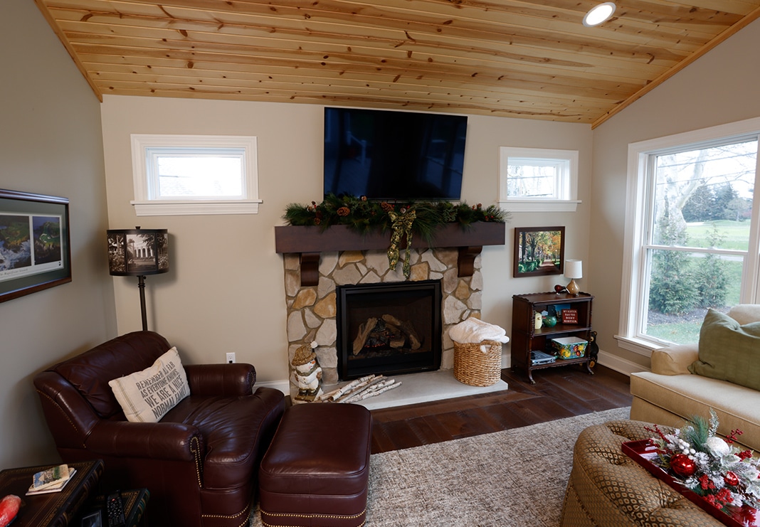
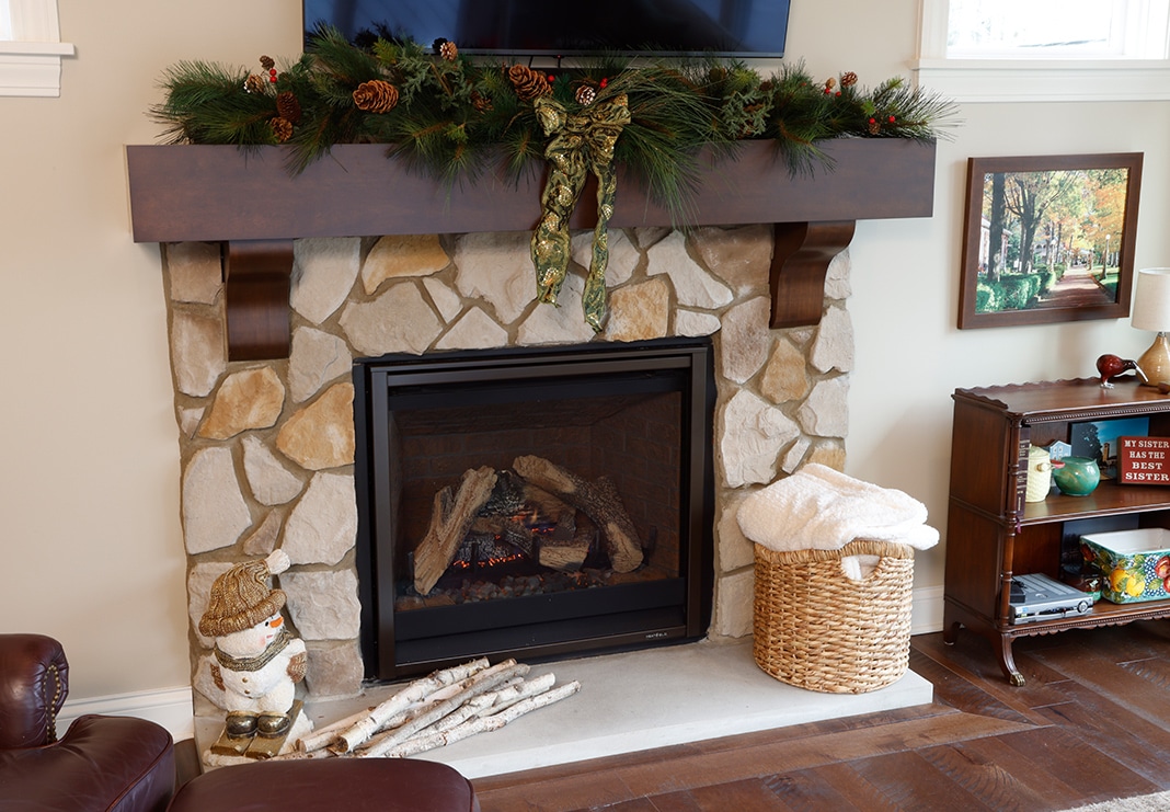
Vaulting the ceilings makes the room feel like part of the home, not an addition—plus, the center beam carries the load and is wrapped with wood to create a standout design element. The muted tones in the stone fireplace tie in with the custom stonework in the great room. Relocating the sliding glass doors provides easy access to the newly updated outdoor living space.
The Primary Suite: Before
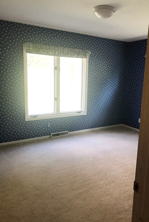
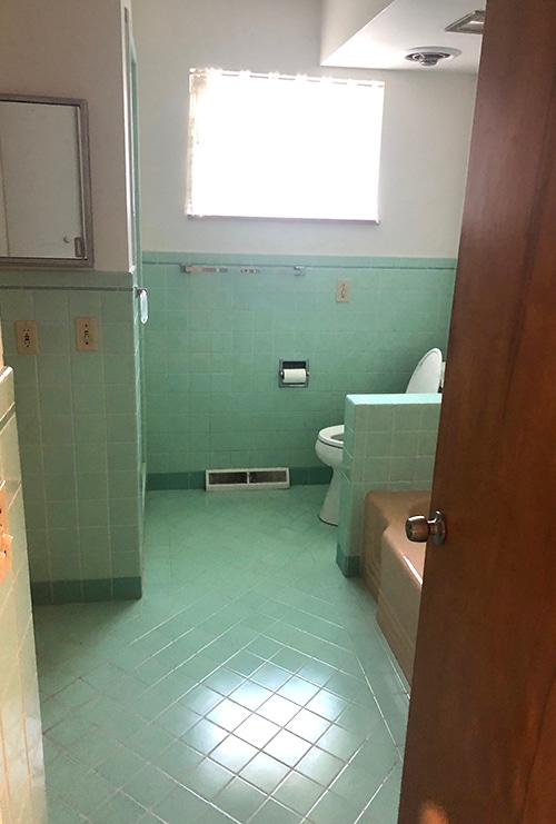
The existing primary suite was merely an average bedroom with an adjoining, cramped—and mint green—bathroom.
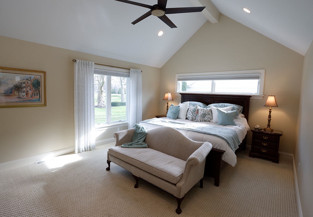
The Primary Suite After
To make the bedroom loftier, we added a support beam to create a dramatic cathedral ceiling and then used custom millwork to make it feel grander and more on-par with the rest of the newly renovated home living space.
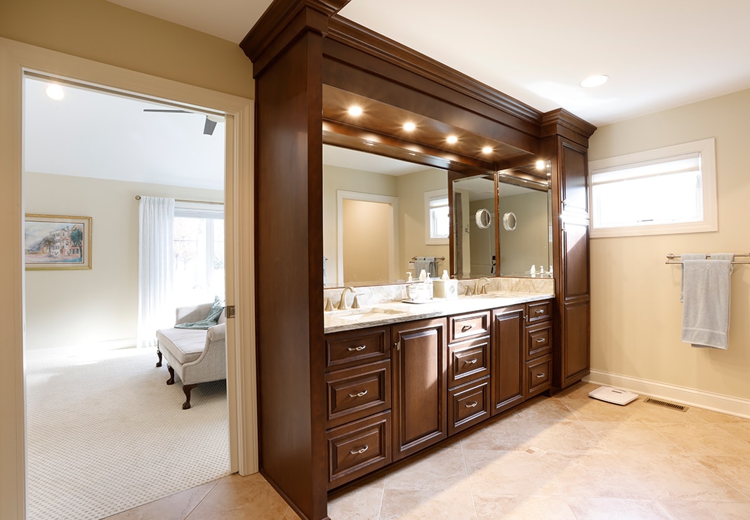
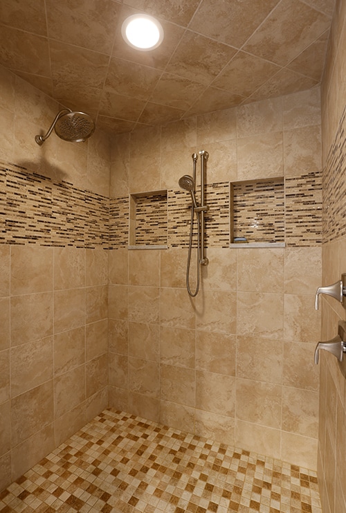
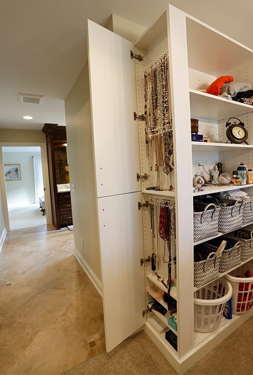
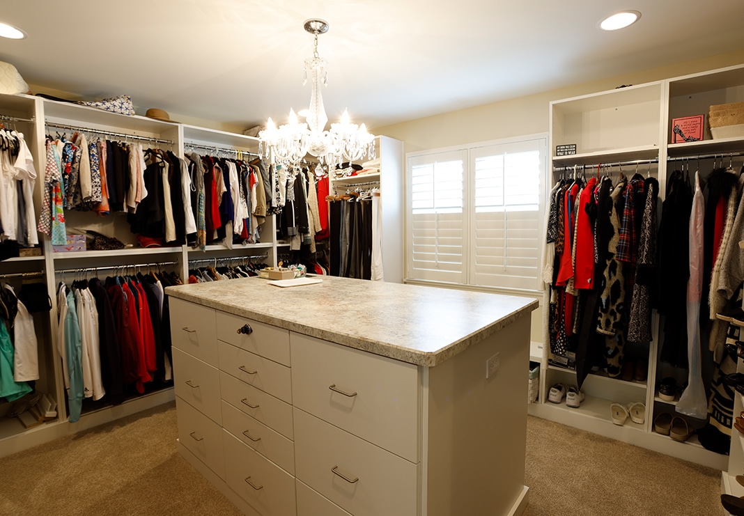
A pocket door leading from the bedroom into the bathroom maximizes space. The bathroom includes an oversized custom shower and custom cabinetry by 4B in Birch with a Nutmeg finish, creating his and her vanities with built-in recessed lighting. The vanity surround features many drawers and cabinets with built-in storage features. The bathroom’s tile floor is from Virginia Tile in Coastal Beige, size 18″x18″, installed on a diagonal for an elevated look. A larger walk-in closet complete with custom built-ins is the ultimate organization solution.
