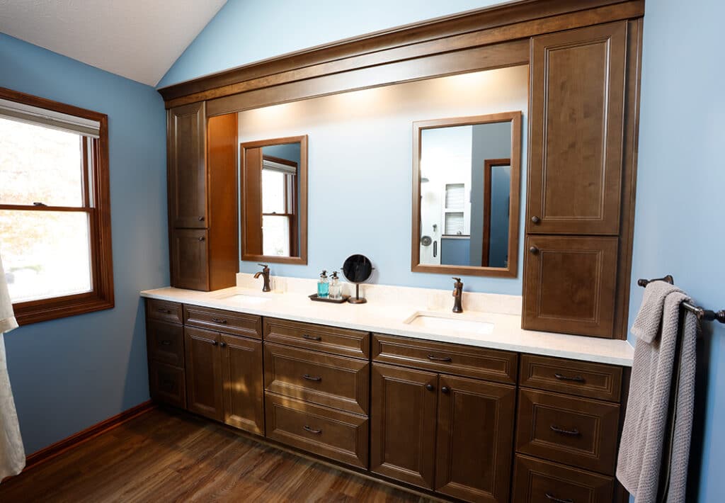
No to a tub. Yes, to a functional, stylish master bathroom. The bathroom remodel that elevates everyday essentials for happier living.
These homeowners knew what they wanted in their new master bathroom: Their vision combined with Dover’s craftsmanship and expertise wholly transformed the space, creating a beautiful new bathroom that suits their style just right.
The Master Bathroom: Before
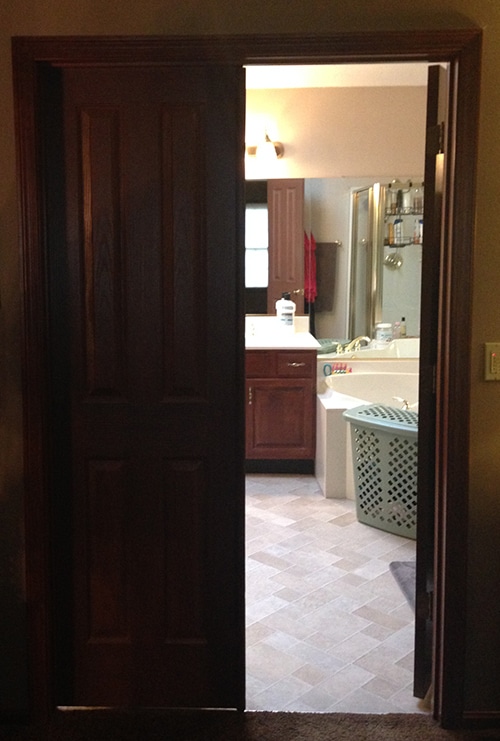
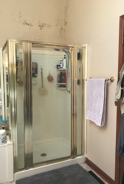
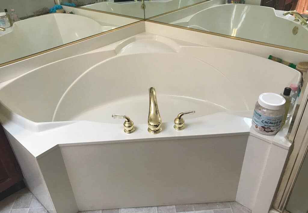
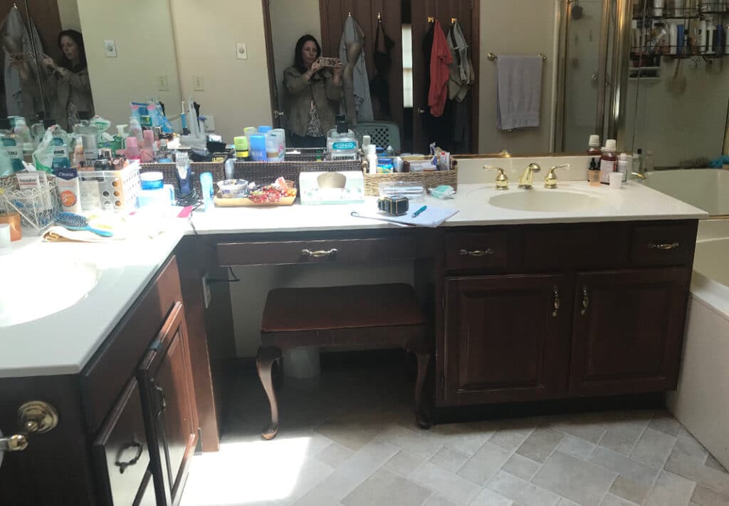
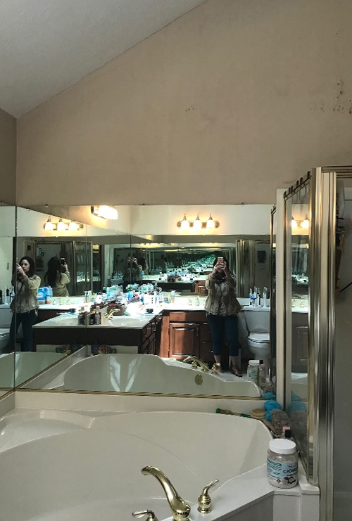
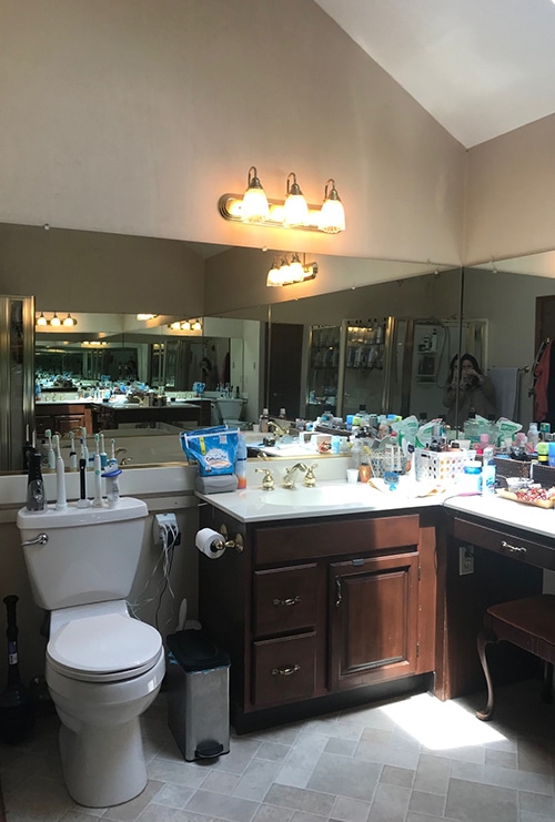
Tired, dated, and cramped: This builder-grade master bathroom was begging for an update. And these homeowners were all for it. While the room had an ample-sized footprint and a skylight that afforded an abundance of natural light, the layout was all wrong: A large soaking tub commanded most of the space. In addition, the L-shaped vanity was awkward. The toilet was stuck in between the vanity and a small linen closet. Plus, the small shower was cramped and offered no functional storage.
The New Master Bathroom: Wish List
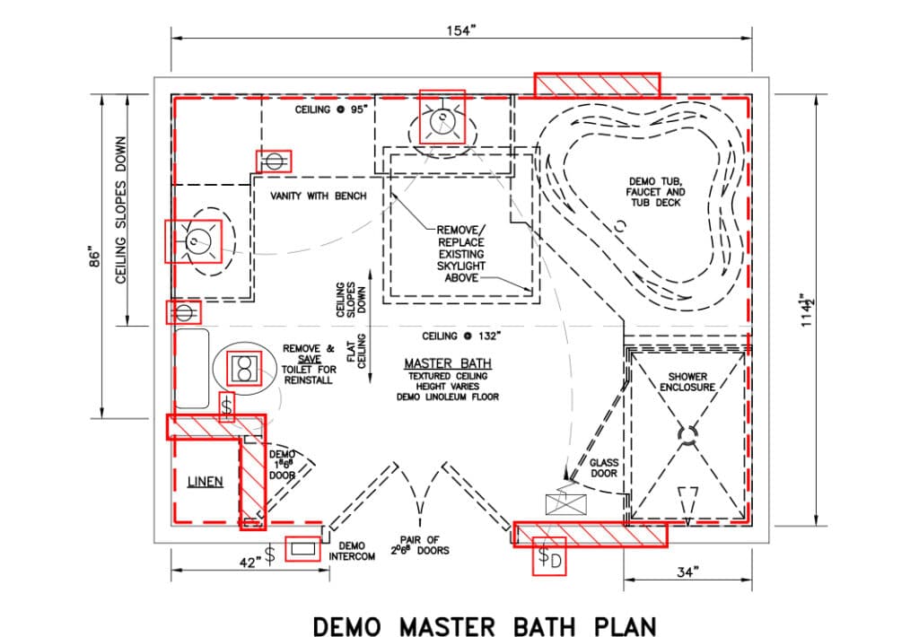
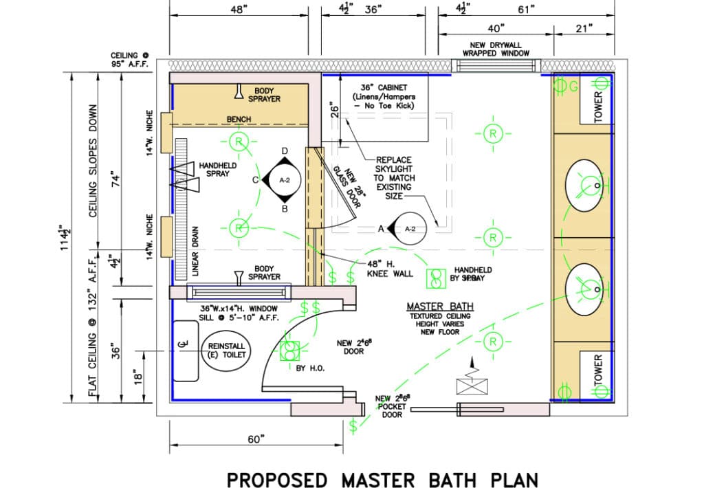
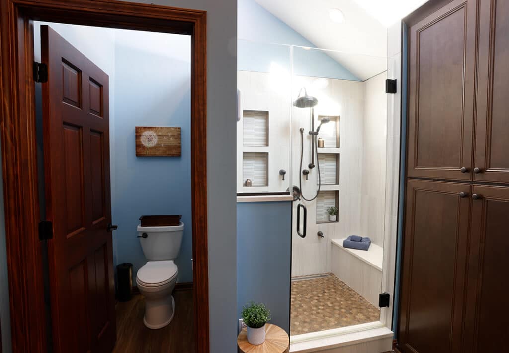
Since the homeowners have a bathtub in their guest bathroom, they decided on a large walk-in shower and no tub in their new master bathroom. In addition to the large walk-in shower, their must-have list included moving the toilet to a separate space with a door for privacy; and lots of bathroom storage with drawers, a space for laundry bins, and other functional features. Here’s how the master bathroom space was reimagined:
The Master Bathroom: After
We designed the new master bathroom layout to work within the room’s existing space—no added square footage required. Then, after gutting the bathroom down to the studs, we reconfigured it in a way that optimized every inch of space.
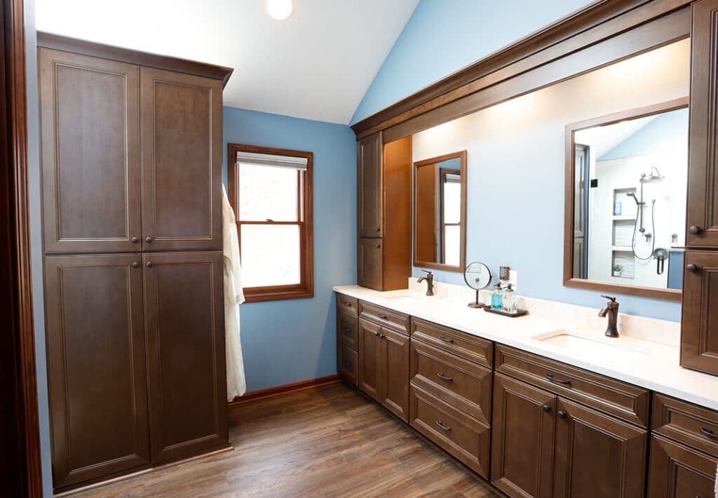
Based on the homeowners’ input, we designed the new master bathroom to reflect their home’s traditional style and flow seamlessly with the existing space. We installed the wood-look luxury vinyl plank flooring in the master bathroom and the guest bathroom down the hall to create that design continuity.
Next, we added light: Replacing the old, dingy skylights creates a more open, airy feel. By reconfiguring the room, we had enough space to add a new window along the back wall previously inaccessible. The result is more natural light and ventilation.
Creating the Shower:
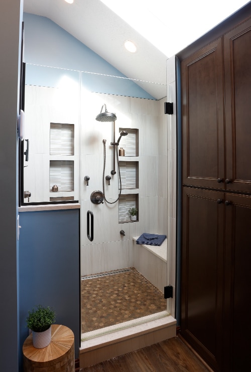
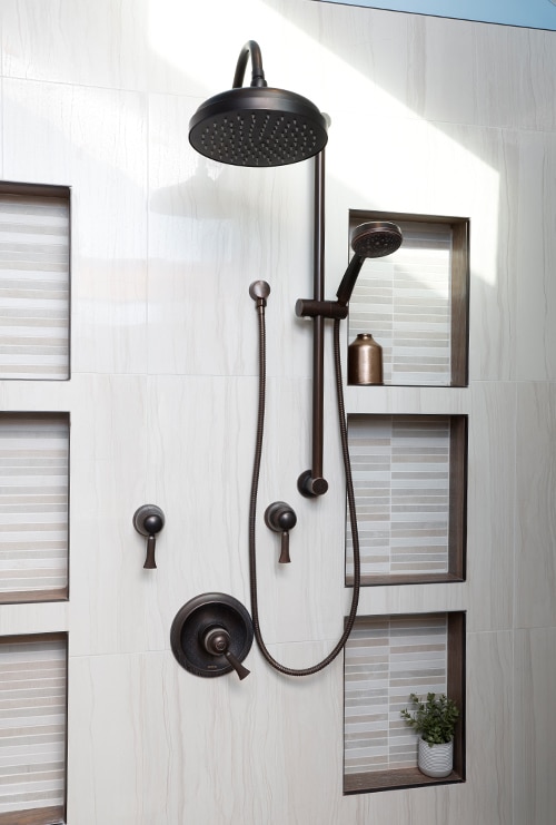
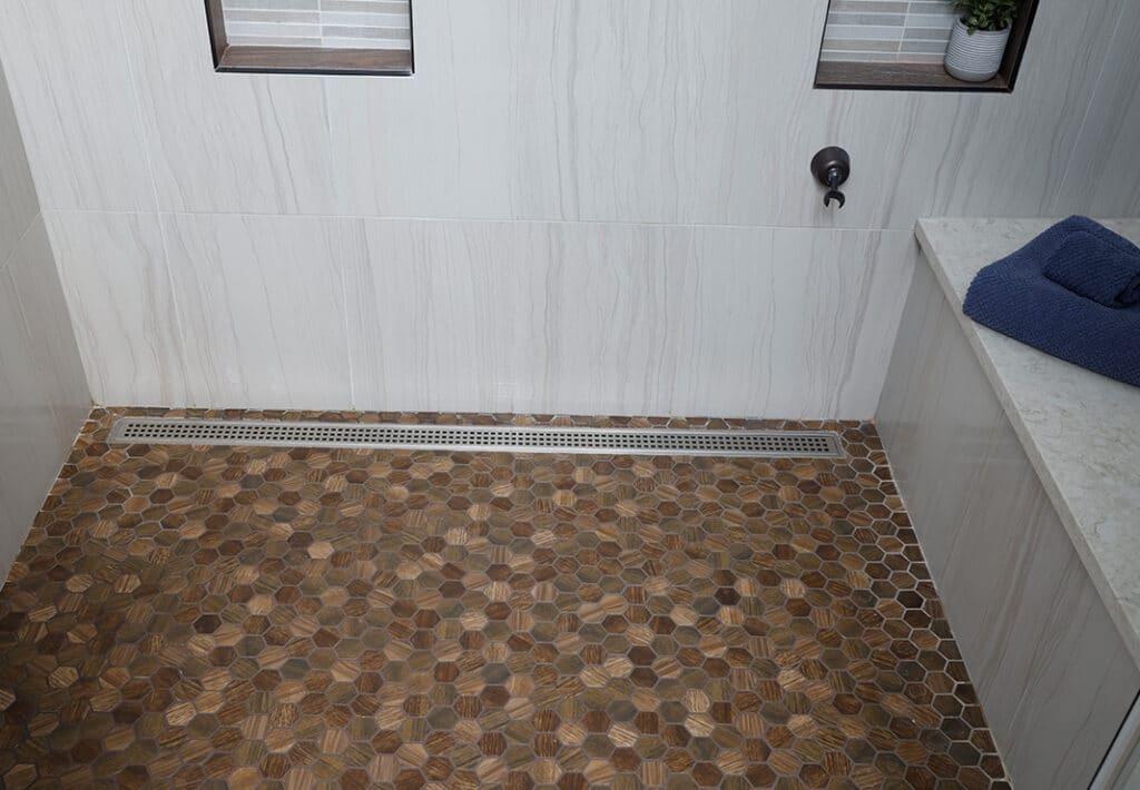
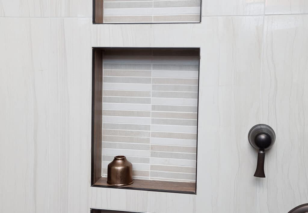
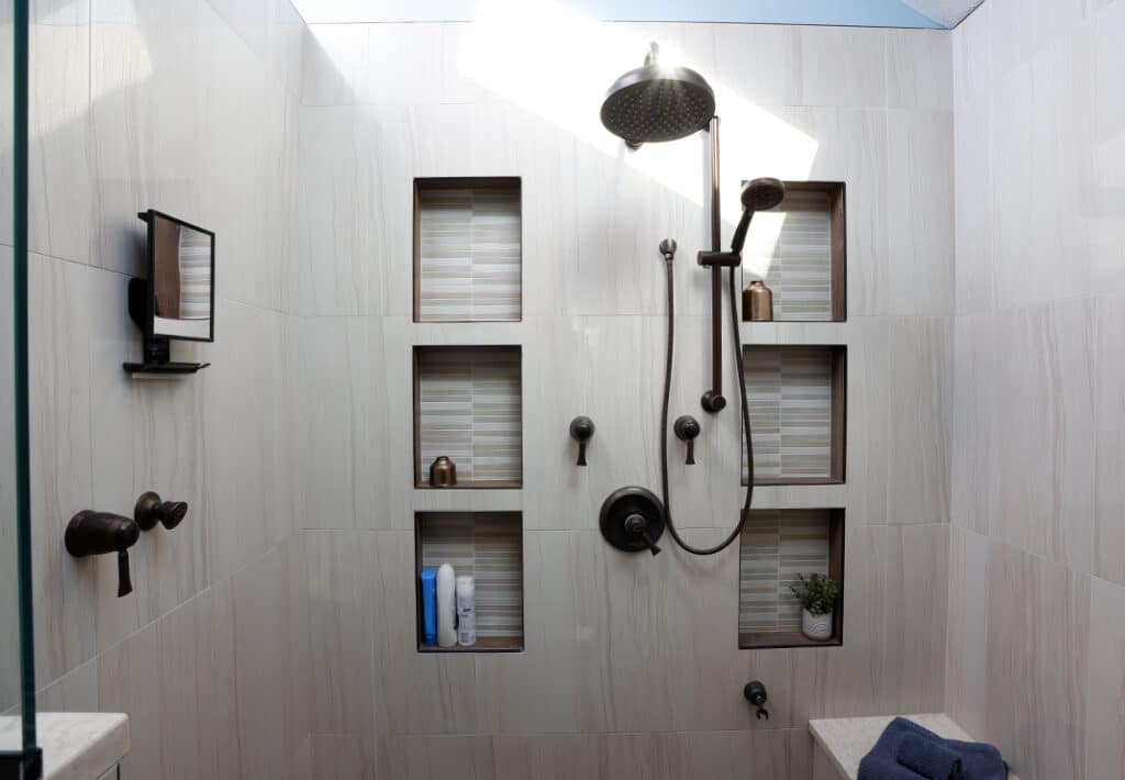
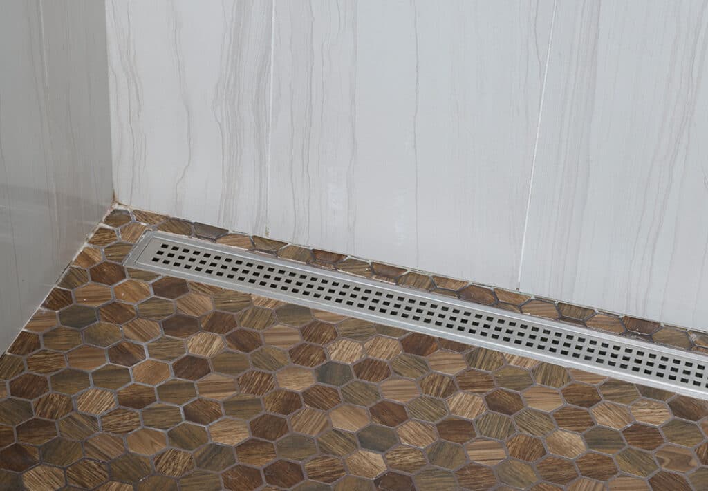
Eliminating the oversized corner tub allowed for better use of the room’s existing space, including a spacious shower with niches and a built-in seat. To keep the area neutral, the homeowners chose a mix of Emser 12″ X 14″ and mosaic tile and a sleek linear drain to finish the space.
The high pitch of the ceiling made installing a rainfall showerhead tricky. To achieve the rain-shower effect, we installed the showerhead running the plumbing up the shower wall and then adding a shepherd’s arm to give it more reach. A hand-held sprayer and other spray heads on the shower’s sidewalls complete the Voss shower ensemble.
Creating a balanced space, we used base cabinets for the vanity, built a soffit to meet the custom valance with undercabinet lighting and installed his-and-her countertop storage cabinets on both ends to frame the space.
To provide the extra storage the homeowners wanted, we installed a large cabinet with built-in laundry bins, linen shelves and other easy-access storage. In addition to the spacious countertop cabinets, the vanity also features drawers and doors to keep everyday necessities organized. The mix of stock and custom appointments gives the new space a luxe, premium feel—everything the homeowners wanted, on time and budget.
