- Bathroom Before
- Bathroom After
Today’s new-build home designs feature master baths as part of a master bedroom suite—but that was not the case 70 years ago. In my experience as a designer, I see modern-day homeowners re-interpret space and get creative with remodeling projects to make the most of the good stuff that they have in their older homes. This project is a great example of putting a fresh, creative spin on an older home.
In this home, the master bathroom is located in the hallway right off of the kitchen. As we approached this remodeling project (which included kitchen, master bath and sunroom) we worked to tie the renovated spaces together, creating a seamless flow from room to room.
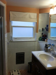
The bathroom had never been remodeled—the space was cramped with one sink, a tub and toilet. The homeowners wanted to eliminate the bathtub, install a walk-in shower and gain two sinks. In every respect, they wanted functionality as much as a clean, updated design.
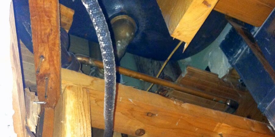
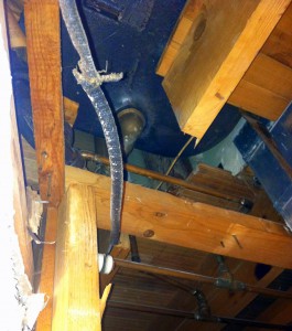
Much like the kitchen, this bathroom required a complete gut, down to the studs. When we started in on that tear-out phase, we had a surprise waiting for us overhead: Directly above this master bathroom is an upstairs bathroom. When we removed the ceiling we found the upstairs tub sitting directly on a joist that had been severed and notched out. This could have turned into a precarious situation if the cut joists ever failed to support the weight of the upstairs tub. Our carpenters worked to “sister” the joists together to make the beams structurally sound. This solution required that the ceiling be dropped a few inches to allow for the HVAC ductwork to run underneath. We were fortunate to be able to fix the structural issue and make a minor design change without compromising the homeowners’ goals.
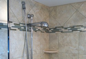
We also found plumbing and HVAC running in the walls where the old shower was and where the new shower was to be installed. Our designers adjusted the plans to eliminate shower niches and installed corner shelves instead.
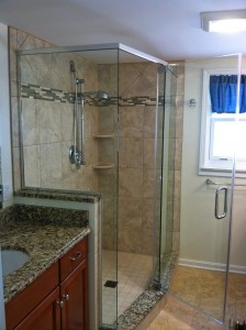
The new bathroom layout opened up the room for a lighter, brighter and more spacious feel; and the smart design maximized that space, including more counter area and linen storage. The homeowner selected the same cabinetry and countertops as they had for the kitchen: The cabinets (Waypoint 450S in Maple Cognac) and granite countertops (New Venetian Gold) were complemented by tile flooring: 13×13 porcelain tile Marazzi Artea Oro, square installation.The bathroom still had the original mud-based tile on the floor. We usually don’t remove mud-based tile, but when the shower curb was removed we saw that the subfloor was rotted. We first removed all of the tile to repair the subfloor and to ensure that anything that was rotting was replaced creating a safer, more structurally sound floor.
The finished bathroom makes wonderful use of the space—by eliminating the tub, the homeowners got everything they really wanted, including two sinks, counter space and linen storage.We installed a spacious walk-in shower with a frameless clear glass shower enclosure with a hinged door. The homeowners chose a custom tile design for the shower area which included: On the shower floor: 3×3 CRV Color Blox Mosaic Sandbox A1101 with square installation; and on the shower walls: 13×13 porcelain tile Marazzi Artea Avoria featuring a mosaic accent in stone and glass tile in Spa. The fixtures included a Moen 3867 4-function hand shower and Moen T3111 trim, both in chrome.
The best is yet to come,In my final blog of this series we’ll take a look at the sunroom…
Beth Orr
