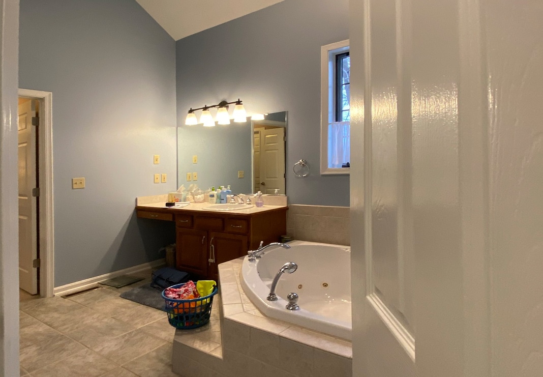
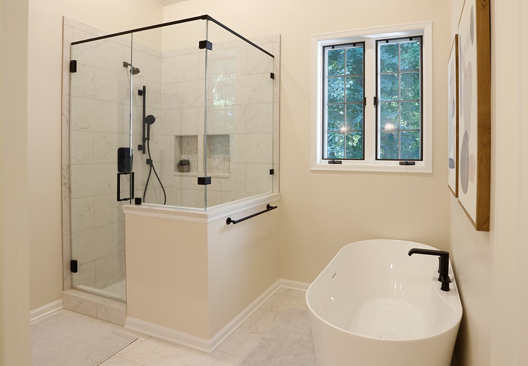
Transforming an outdated, cramped bathroom to a spacious, spa-like primary bathroom with striking contrast: This remodel begins with a more efficient, space-optimizing layout and uses organic surfaces and fixtures in lighter colors for a clean, fresh finish.
The homeowners were ready to reimagine their primary bathroom with its awkward layout and dated fixtures, including the stall shower, which had to go. Their wish list: A soaking tub and oversized shower, double vanities with convenient built-in storage and sleek new surfaces and tile while maintaining the separate toilet room and linen closet. The remodeled space checks all the boxes.
Primary Bathroom
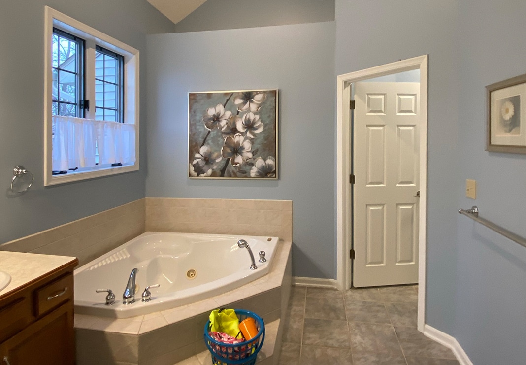
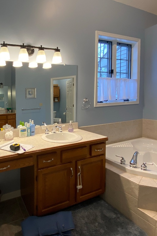
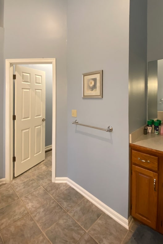
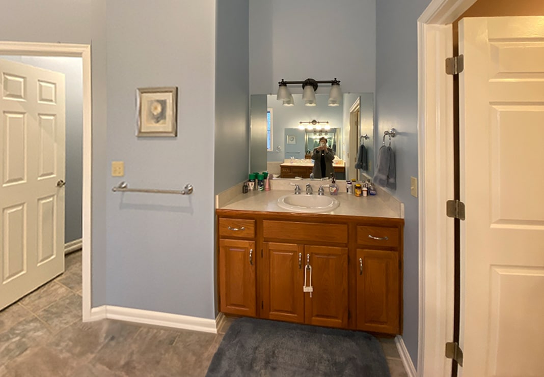
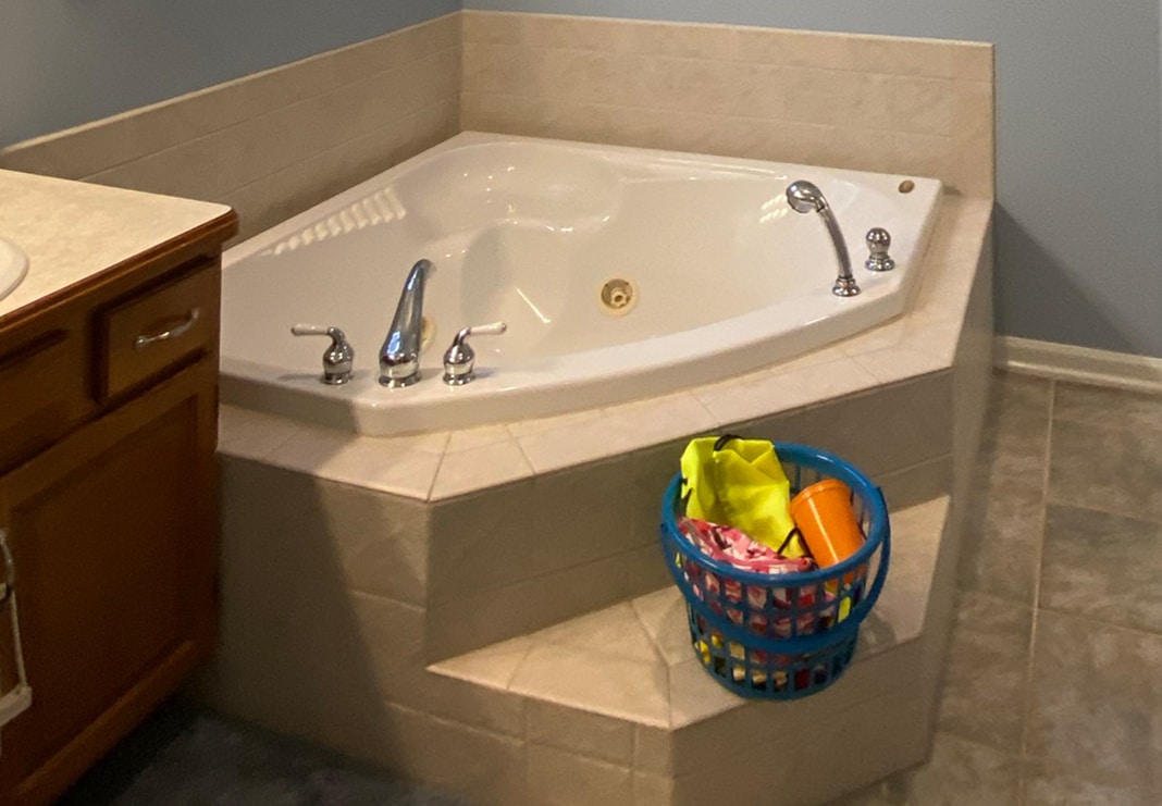
The outdated, builder-grade primary bathroom needed a major refresh: While the bathroom had ample square footage and lofty ceilings, its dark colors, huge corner Jacuzzi tub and split vanities made the room cramped.
Check out this amazing before and after. Click and drag the line on the image below.
Working within the existing footprint—but without the shower stall, dividing wall and garden tub—we had a wide-open space to re-orient the room.
Click and drag the lines on the images below to see the before and after comparison.
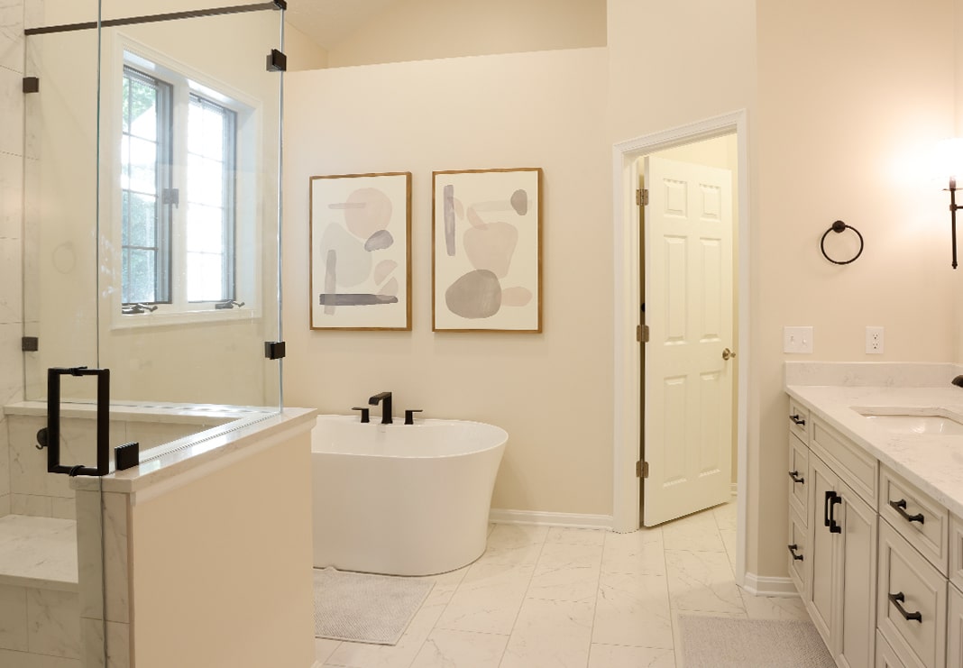
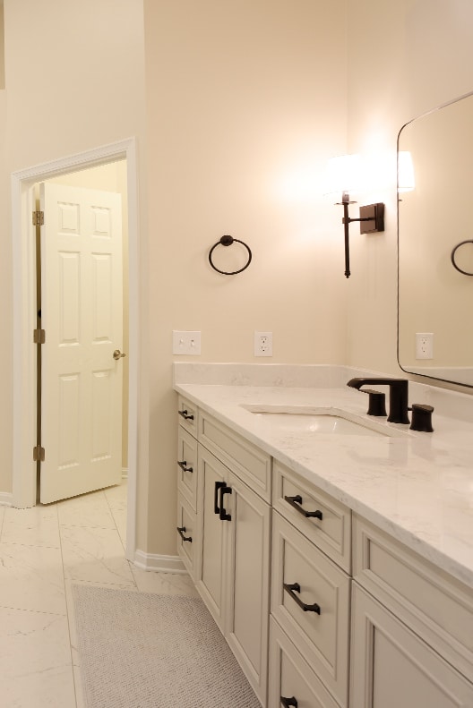
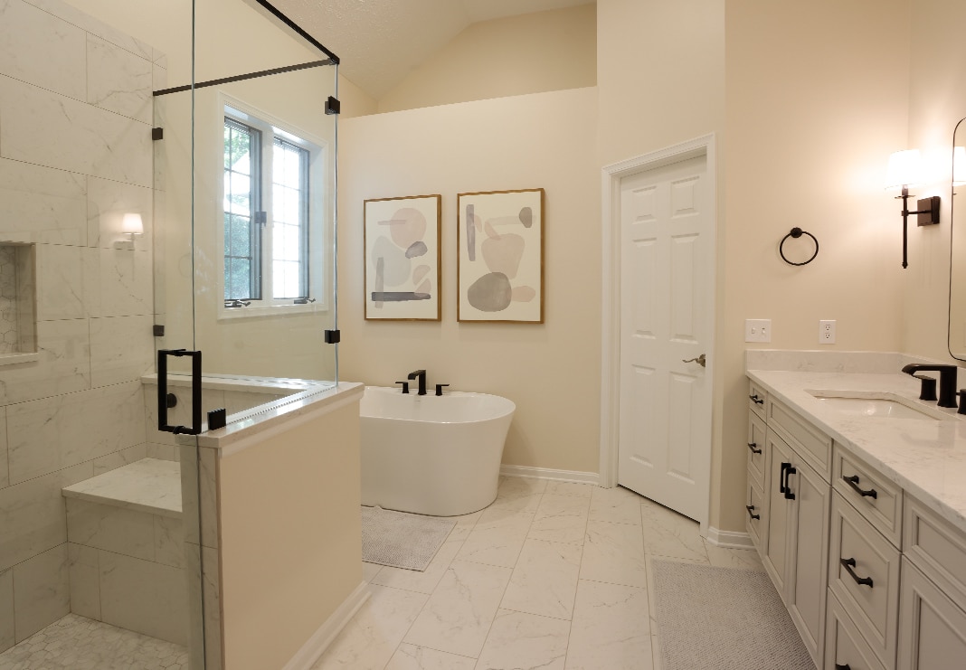
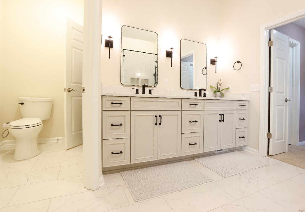
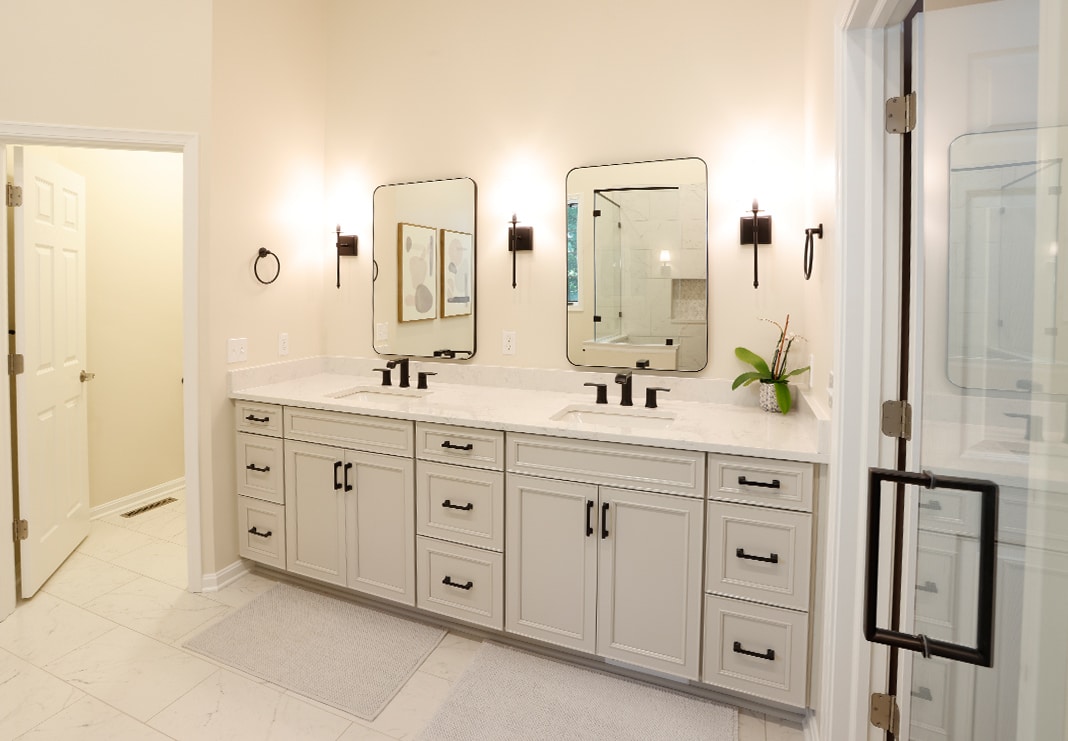
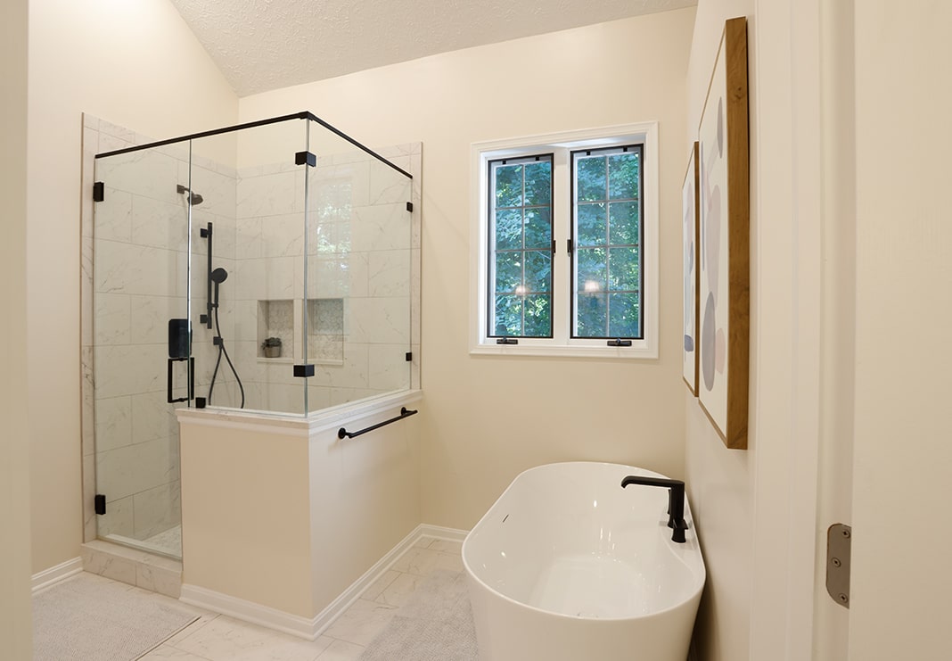
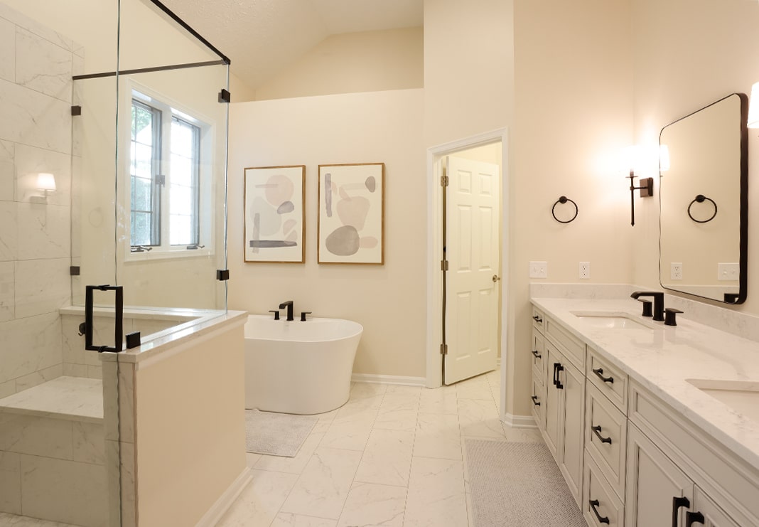
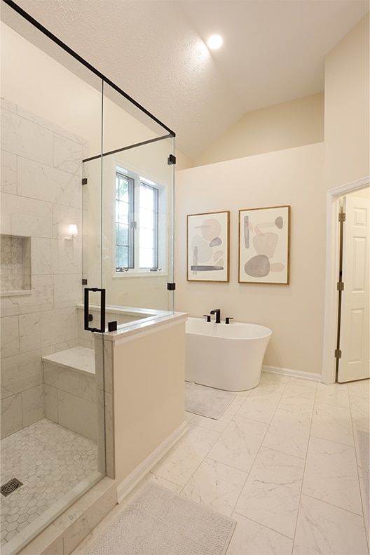
The new layout includes one shared vanity with double sinks, a spacious walk-in shower, a soaking tub, a private toilet room and a linen closet for storage. On the floor, 12” x 24” Vallelunga Carrara tile in a honed finish creates a beautiful, waterproof foundation with a visual harmony that sets the tone for the updated bathroom.
The Vanity
The existing bathroom’s split vanities took up too much space and felt disjointed. Plus, the cabinets and surfaces were worn and outdated. The new vanity cabinets and surfaces feature lighter hues with matte black hardware and fixtures for contrast to create a fresh, bright space. The homeowners selected bathroom vanity cabinets (Waypoint 540F) in Harbor with Corian Quartz (Ashen Grey) surfaces. Kohler Caxton Rectangular Undermount Sinks in white create a clean aesthetic offset by Moen faucets (Genta T6708BL) in matte black. All cabinets and drawers are customized with pullouts, built-in plugs and other space-saving upgrades. Simple, black-framed mirrors and light sconces complete the vanity.
Click and drag the line on the image below to see this amazing before and after.
The Shower
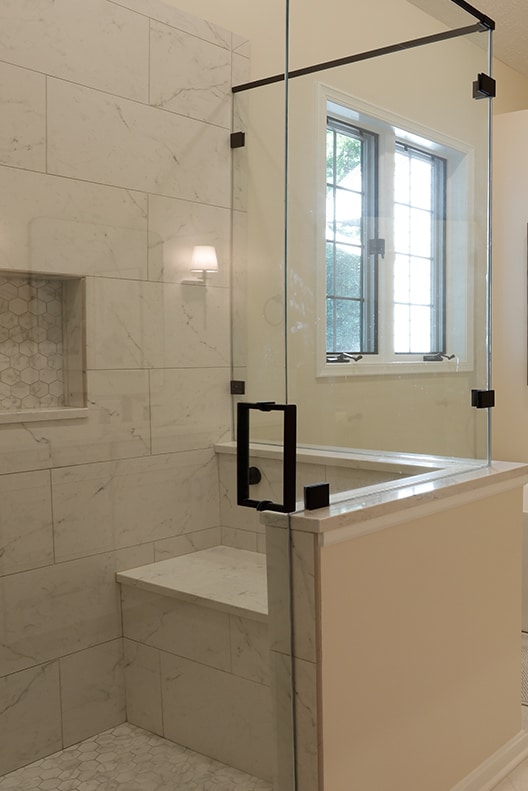
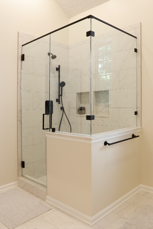
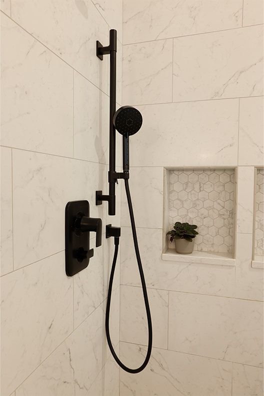
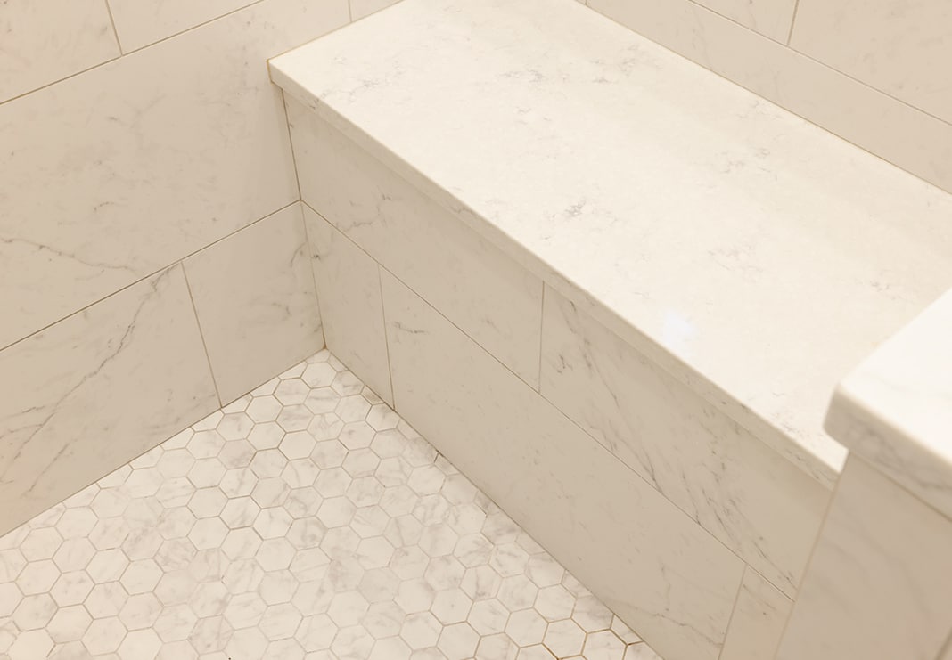
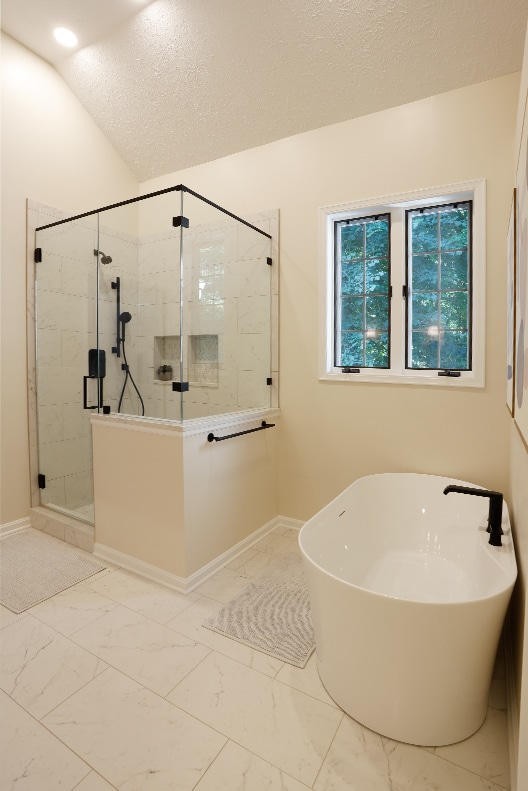
The old stall shower had seen better days. For a fresh update and seamless look, the homeowners chose the same classic porcelain tile used on the bathroom floors for the shower walls: Vallelunga Carrara in a honed finish (VALCARR1224H). The 12” X 24” tiles are installed in a half-offset pattern for visual pop with coordinating bullnose 3” x 24” trim set with TEC grout (Silverado 949).
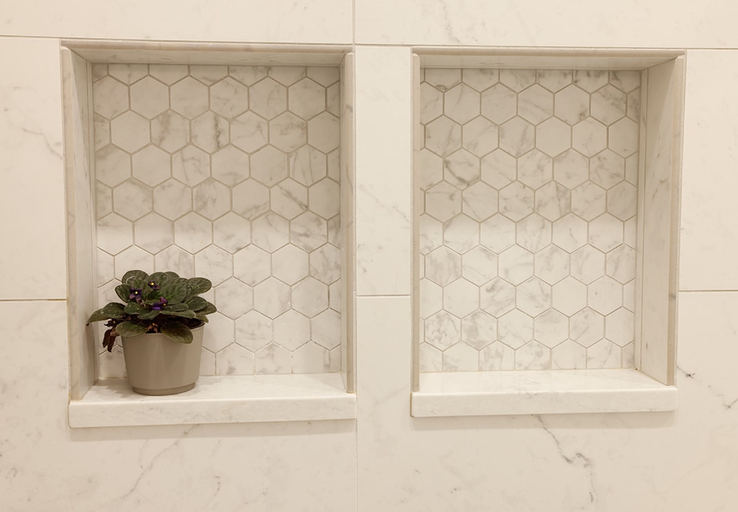
On the shower floor and in the back of the niches: Tileanatolia La Marca Carrara Gioia 2” hexagon mosaic in a honed finish (ANALMCGHEX2H). The same Corian Quartz from the countertops is used on the shower bench top, curb, niche ledge and knee wall caps. A custom glass enclosure (76”x 80”) is framed by Moen Genta Shower Trim with Delta Awaken G90 Multi-Function Shower Head, both in matte black, for consistency.
The Tub
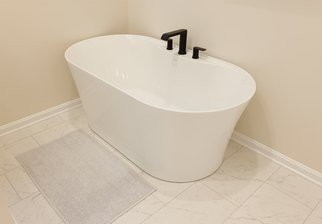
The massive Jacuzzi tub was at the top of the homeowners’ demo list. Deleting the huge fixture created loads of space for the primary bathroom’s new feature soaking tub: the Fleurco Alto Petite Tub. Measuring only 58” X 31-1/2” 23”, it is the perfect blend of form and function in a slim profile that works beautifully in the space. The new tub features a contemporary deck-mounted Moen Genta Roman Tub Faucet in matte black.
Check out this amazing before and after. Click and drag the line on the image below.
A Final Look at The New Primary Bathroom
This beautiful primary bathroom remodel delivers on its promises with clean lines, a light, bright color palette, upgraded surfaces, custom storage and modern fixtures.
Click and drag the line on the image below to see the final before and after of this primary bathroom transformation!
